How to design new iPhone 6 Plus images resolutions in Photoshop

Designing for iPhone 6 screen resolution and dimension

Compared to Android, designing screens and creating assets for iPhone use to be easy. For a ling time we’ve only had to deal with two densities, and only 2 screen dimensions. The iPhone 6 Plus introduces a new screen dimension and a new HD screen. It’s a fairly typical 1920 x 1080 format, once popular with LCD TVs. This post is a place for me to log all the new sizes, and also to compare the require assets against Android’s require set of densities. The strange this is, for the iPhone 6 Plus, the graphics have to be provided much larger than the 1920 x 1080px screen resolution, as they are set at x3 standard resolution and then scaled down to fit the hardware.

iPhone 6 Plus screen size / dimensions

  • iPhone 3 – 480 x 320px
  • iPhone 4(s) – 960 x 640px
  • iPhone 5(s) – 1136 x 640px
  • iPhone 6 – 1334 x 750px
  • iPhone 6+ – 1920 x 1080px (scaled down from 2208 x 1242px)

iPhone 6 plus launch image resolution dimensions

  • iPhone 4 launch images: 640 x 960px
  • iPhone 5 launch images: 640 x 1136px
  • iPhone 6+ launch images: 1242 x 2208px and 2208 x 1242px (the iPhone scales this down)

iPhone 6 plus Retina HD image resolution densities Vs Android density pixels

  • iPhone 3 / Android MDPI | 100% | 1x
  • iPhone 4, 5, 6 Retina / Android XHDPI | 200% | @2x
  • iPhone 6+ Retina HD / Android XXHDPI | 300% | @3x

Some devices scale as well

Android and iOS makes it easy to create different resolutions by requiring graphics at easy scales x2, x3, x4, but manufacturers make screens to fit the design of their devices and x2, and x3 does always fit what they want. Therefore, some devices artificially scale the resolution up or down, for instance the new iPhone 6 Plus requires x3 graphics, but only has a 1080 x 1920. However, the graphics you supply to the developer still need to be x3 size for Android.

This is fine for icons, but is an issue if you’re providing full screen images as the aspect ratio may be different.

See my guide for How to start designing Android apps in Photoshop & what is a dp?

How to start designing Android apps in Photoshop & what is a dp?

Google Android Screen and Icon size illustration

July 2014 EDIT: Android’s “L” design guidelines now supply templates in Adobe Illustrator, making it even harder for designers user to Photoshop or Fireworks. They don’t provide an answer for how you should crop and optimise your assets for the developer (I assume they’d rather you didn’t and just use their native stuff).

See www.google.com/design/

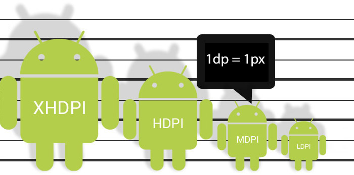
July 2014 EDIT: On consideration of comments from NexogenDev, I have removed the more explicit reference to 72dpi in the graphic above to “1dp = 1px” as this is a more literal starting point and probably better. My point was that Android supplied templates and assets tend to open by default in Photoshop as 72dpi, but dpi in general is misleading in this context.


Android screen resolution and density

I found it hard to know where to start designing for Android in Photoshop.

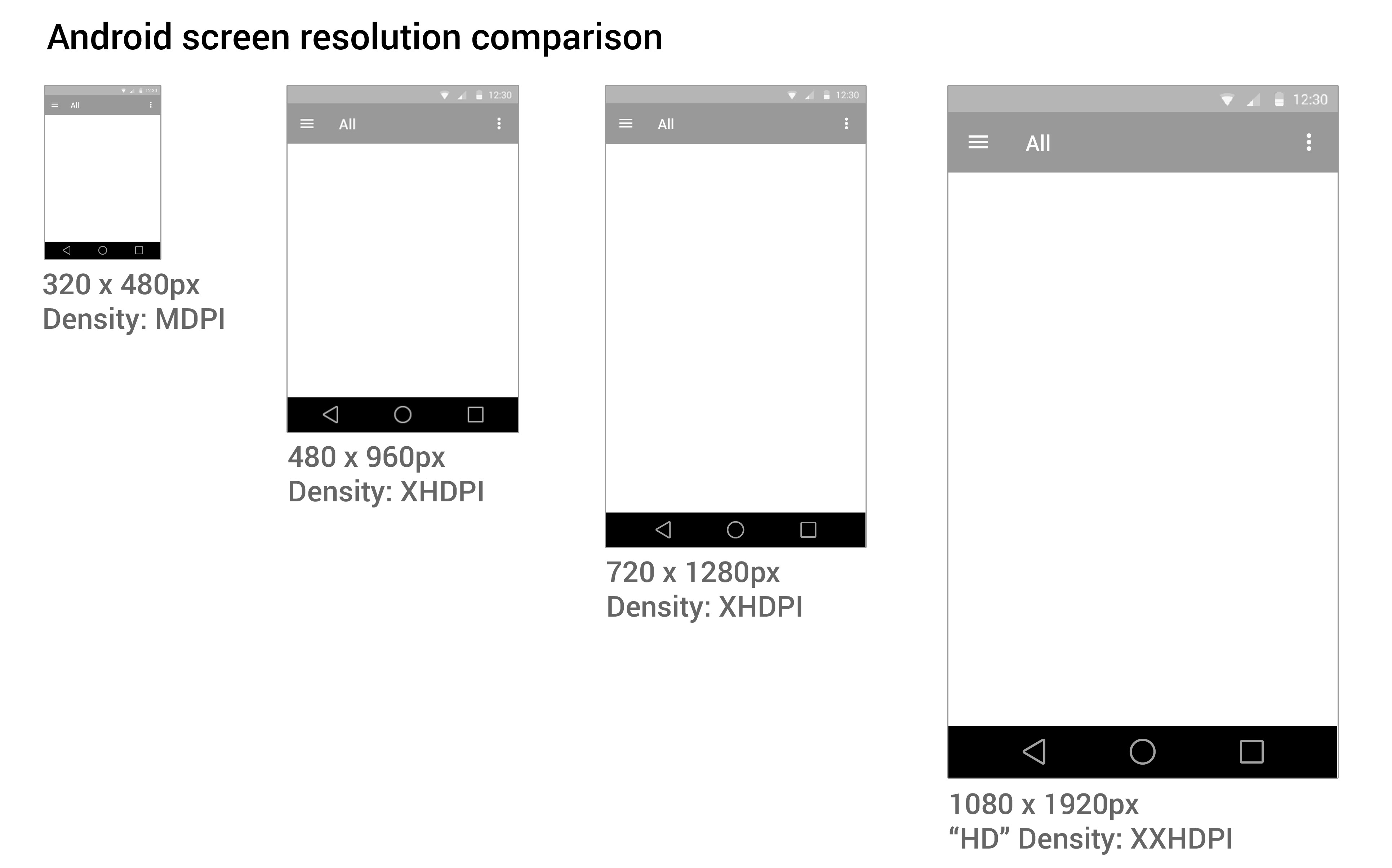
Google tries to help by providing extensive Android user Interface Design Guidelines.  There are many devices running Android that have different screen sizes and shapes. There are also different screen densities, which means the quality of the definition of the screen or how many pixels fit in the same sized area on the screen – e.g. medium screen density has 160 pixels in every inch on the device’s screen, whereas an extra high density screen has twice as many, 320 pixels, crammed in an inch. To cover the different densities you need to supply graphics and icons at various densities.

Creating a design that will work for all these devices can be daunting. You also need to create different density icons and graphics.

1. Minimum handsetscreen size

I started with a minimum mobile handset size screen first. Starting with the smallest and most limited screen size first makes sure your content and UI will fit, removing any features that aren’t completely necessary to the core purpose of the app. Then you can work out how your app will behave on larger and tablet sized screens. You need to decided if your app is going to stretch to fit larger screens, or if you’re going to have a completely different layout and design for tablet sized screens.

2. Photoshop image size

I choose to start with a small mobile handset and a small 7″ tablet screen as a base for design and then think of how that could scale elagantly.  You may need to create portrait and landscape versions if you plan on allowing users to change orientation.

Here are some Photoshop templates

3. Download Android design templates

If you are new to designing for Android, and are confused by dpi, I STRONGLY RECOMMEND you use native Android styling and assets, rather than doing a completely custom design at first.

See www.google.com/design/

It is important to keep the icons at the same proportion to maintain the correct “hit” area for the user’s finger.

downloads_stencils

4. Scale down

It’s easier to work at the higher pixel density, XXHDPI. It is always advisable to create icon art as vectors in “Smart Objects, or as “shapes” in Photoshop so they can be scaled up or down without loosing quality.

The benefit of working at XXHDPI is that you can be sure you are not loosing any quality.

XXHDPI – 300% – x3.o
XHDPI
 –  200% – x2.o
HDPI –  150% – x1.5
MDPI – 100% – x1.0
LDPI – 75% (don’t bother with this!) – 0.75

When using vectors, you may want to adjust your line art to tighten up any half pixels or it can look blurry at the edges (if you’re a perfectionist like me).

5. Workflow

  • Create you design PSD at XXHDPI
  • Crop out your graphic assets and icons as separate PSDs
  • Scale them down to the various densities: XHDPI, HDPI, MDPI

My method is to design one PSD, crop out the icons assets as PSDs, then scale them to the different densities. I often start with a PSD at XXHDPI or MDPI (providing my artwork is vector and can be scaled up or down), then I crop out the icons and assets out, then resize them.

The reason this is easier is that when you need to make design changes, you don’t have to change multiple PSDs.


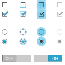
What the frakk is a DP?

Here’s what I discovered after a few hours of scratching my head and moaning…

  1. “dp” is a magic, made-up measurement that only exists in the world of The Matrix & Tron.
  2. Android icons are 32dp x 32dp @ the medium density MDPI
  3. Android supply sample icons (Edit: they don’t any more the gits) and if you open an icon from the MDPI folder in Photoshop, the icon is 32px x 32px with “image size”.
  4. SO, in Photoshop:1dp = 1px @ MDPI – 100%
    1dp = 1.5px @ HDPI – 150%
    1dp = 2px @ XHDPI – 200%
    1dp = 3px @ XXHDPI – 300%
    1dp = 4px @ XXXHDPI – 400%
  5. It doesn’t matter what DPI you have set in PHOTOSHOP, it’s the canvas size (the number of pixels available) that counts.

If you have a better way of getting started designing in Android, or if I’ve made an errors, please let me know.

Here are some Photoshop templates at MDPI and HDPI to give you an idea.

Please see my new guide: How to design for new iPhone 6 Plus resolutions in Photoshop

Attention to detail – tablet & mobile app design

Obsessive, fussy… Me?

When designing an appdesigners take great care over the UI and the fine details. Apple provide a lot of built-in UI styling in the SDK for developers to produce apps of a consistent quality. However, when Apple create their own apps they add an extra layer of detail and finish that is not supplied in the SDK, this extra quality is hard to achieve out-of-the-box.

Designers are fussy by trade, and communicating this obsessive level of detail via email or Skype to a remote developer can be challenging. I have great sympathies for developers, espcially when I find myslf sending them the following documents with design revisions… 😉


iOS app design revisions

iOS app design revisions


Kevin was as keen as me to get this right, so I hope doesn’t he hate me too much 😉

Music brands (plus a couple that are not)

I’ve been collecting a board of brands, mostly around music. There’s a definite resurgence of the graphic logo rather than a logotype alone, which makes practical sense when it comes to designing a small graphic for an app icon (like the fin of Grooveshark, or the cloud of Soundcloud). Aweditorium got around this by emphasising “AWE” on their icon. You’re onto a winner if you can claim a single letter – and happne to be a dominant social network: “f”, “p”, “t”,”v”, and “w” are gone now of course ; )

I’m impressed by the stand-out of Pinterest’s cursive “p”, Beats Aduio circle, and the clarity of thisismyjam.com branding.

As well as researching music brands, I also find it’s good to have a set of brands to study and admire just because they’re cool.

Semantic html & CSS

Some spring cleaning on Last.fm to clean up the typogoraphy on the site. A small change, but one that will make me very happy ; )

Current Last.fm style sheet (as of Jan 2011)

The first step is to make the heading levels more distinct, so there is a clearer visual hierarchy. Heading levels should have the same effect as the old eye test, noticably diminishing in size. The current site headings are a bit samey. This helps the bowser to understand how the page is divided and gives a “vertical rythm”, making it easier to scan down the page to find omething specific.

Secondly, we need to clean up the CSS and html, so that the structure of the content follows the intended visual and semantic hierarchy . H1 for page title, H2 to divide content in main themes/sections, and H3 headings to title separate under each H2. These changes will make the page legible without the stylesheet, which is not only good practice, but also frees the content for use in multiple contexts (such as mobile/tablet).

New Last.fm style sheet

As these changes effect the structure of the site we can’t just roll them out site-wide. They’ll be included as we update various sections of the site, the first being Last.fm Charts.

A note on accessibility

CSS gurus say you should not use units like “px” or “em”. It is naughty. In this case I have used united px values as a guiding principle, the CSS will probably be unitless.

The right way to develop an app

Many businesses want to develop apps but don’t have in-house resource. As an in-house designer I’ve designed a fair few apps and worked with both in-house teams and external agencies. Obviously, building a strong in-house team is best, but it’s often hard to find to recruit at the moment. In my humble experience, this is the best steps to plan your project. I have seen this done in reverse!

  1. Define what use cases and objectives you want to satisfy
  2. Choose an app development agency
  3. Have a good relationship with app development agency
  4. Come up ideas
  5. Define a Solution
  6. Choose the technology
  7. Set a deadline
  8. Find a commercial partner to co-fund (if applicable)

The new design landscape

Some interesting articles – I’ve had a lot of experience using externl agencies to develop apps , this articles outlines why that model doesn’t often lead to a great product:

The End of Client Services

…it’s very hard for a design studio to create digital products on a contract basis because the messy timelines and continual course corrections that are required to launch a truly effective software product are anathema to the way clients like to be billed. No matter what a design studio promises, it’s very likely that in its first iteration a digital product will take longer to complete, will cost more, and will be less effective than originally promised. The most critical time for designers to be involved in a digital product is all the time, but it’s perhaps most important for them to stick around after the launch, when they can see how a real user base is using it, and then amend, refine, revise and evolve it. But it’s at just about this time that most studios are preparing invoices and shuffling their staff on to other clients’ projects. – Khoi Vihn

And this article is a call out to designers to ditch their own studio or freelance dreams in favour of joining (or starting) a start-up in this new app landscape:

Dear Graphic and Web Designers, please understand that there are greater opportunities available to you.

The internet, at this time in history, is the greatest client assignment of all time. The Western world is porting itself over to the web in mind and deed and is looking to make itself comfortable and productive. It’s every person in the world, connected to every other person in the world, and no one fully understands how to make best use of this new reality because no one has seen anything like it before. The internet wants to hire you to build stuff for it because its trying to figure out what it can do. It’s offering you a blank check and asking you to come up with something fascinating and useful that it can embrace en masse, to the benefit of everyone.

Your press checks are bullshit
Your personal logo is bullshit
Your employer is bullshit
Your studio is bullshit

I’m not suggesting that you shouldn’t start your own company. I just think that for a lot of designers, from what I’ve seen, this is jumping the gun. Unless you have a friend who is an engineer, it is going to be difficult for you to find someone of quality to build something for you, the professional landscape for those people is just too competitive right now for much of that. But I guarantee you’ll develop relationships with engineers if you go work at a startup, and from working relationships good conversations brew and companies are born.

Full article

GUI matrix – consistency of brand assets on different platforms

In an effort to maintain consistency and quality of our application icons, I have been collating a GUI (Graphical user interface) reference doc. As we produce applications on different devices and platforms, we need to take native UI styles and features into account. Although there can be no “generic” iconon all platforms, we can still achieve a consistency of drawing shape and general ‘character’ of icons across apps. For instance: to create tab and activity icons in iOS you  provide white shapes on transparent backgrounds, the “blue gloss” styling is added dynamically within the app.

This matrix is more of “how are we doing” document to see if Last.fm style shines through the veneer of native UI styling. The grid shows platforms in columns (names removed for confidentiality of work in progress) and the rows display the various activity states: rest, hover, press)

Testing in the lab at Flow Interactive

My favorite place: testing stuff in the lab behind a one-way mirror. I moderated a couple of the sessions, which were with existing LFM users. We hired the excellent user research fascilities at Flow Interactive in Clerkenwell, mostly because they have air-con and a fridge full of coke.

20110706-123235.jpg

We made notes on post-its, one observation per note, with quotes from users to back up observations. We used rolls of brown paper to collect and store the notes for taking away later, the paper was divided into the broad themes we were testing. Back at the office we sorted the post-its more thoroughly into columns under more exacting topics. Several people were taking notes so we had to de-dupe, however it was important to keep similar comments if made by different users, as this indicates that the issue might be more common to a wider group.

The death of a thousand notes

20110708-105931.jpg

Affinity Sorting

The next step is to do an “affinity sort” to look at each comment individually and sort them into groups based on perceived patterns, rather than features. It’s important to start quite freely and not to place a heading above the group or draw a conclusion too quickly. It’s basically finding groupings based on a gut feeling that different users were having similar issues. In this research session we were testing different features, such as “Events & Festivals” and “Artist Library”. In afinity sorting I noticed that a user who couldn’t find  their recommended events was probably having a similar issue to a user who couldn’t find their recommended artists in the “library” section. These two notes were moved from their former “feature” headings into a new group called: “Issue with finding personal recs”. The issue had nothing to do with events or radio, it was a issue around users needing a uniform place to access all their personalised info.

BEFORE: Basic sorting by feature or topic

20110712-114148.jpg

AFTER: Sorted by affinity – patterns emerge

Affinity sorting notes from a user experience research session.

Immersive, gesture based app models.

It’s very easy to get lost when designing an app, but when you’re designing for a touch-screen experience, with gestures replacing clicks and scrolling, it’s even more complicated. Touch-screens introduce physical concepts to help the user navigate: spatial planes that you can “swipe” across, representations of physical objects, and zooming in and out and content. This makes the user flow in and out of content very tricky.

Immersive Vs productivity apps

In a productivity app, like email, its better if a user can drill in and out of tasks in a straightforward way. Therefore the folder based metaphor of desktop operation systems makes sense. But for a more immersive experience where you want the user to get “lost” in the experience, you need a more “open’ and loose heirachy. In my experience, “Open” is very hard to develop… as it’s harder to anticipate all the possible routes and outcomes, so the UI presents consistent behavious where ever the user is.

In this example I’m looking at an immersive touch-screen way to explore music artists. A list of artists is presented as a photo grid (or quilt), and the user can zoom into the grid to look at an individual artist. They can then swipe left and right to see the next artist in the grid. This mixes two existing navigation metaphors: picture thumbnail gallery and a page-turn magazine experience. Phew.

But now the hard bit…

Every artist has similar, or related, artists. Daft Punk has: Justice, deadmau5, Digitalism, etc. We want to encourage the user to follow these connections and explore more artists freely, but at the same time, need to give them a clear way back to the start of the app.

Browsing music artists using touch gestures model 1

Model 1

The user zooms in on an artists, then when the click on a related artists, that opens another grid. In the programming model, each artist opens as a new level in the app, and each related artist grid is another level on top. Phew! The layers build and build, and for to get back to the start, do they have to press “back” through each of these layers?

Browsing music artists using touch gestures model 2

Model 2

The user can zoom in and out of the grid to see artists, but if they want to click on a related artists, that launches a new grid in a new session. To get back, the user goes from grid to grid. It’s more like a concept of islands of artists, than levels. This will be much easier to develop, as each time you press to see a set or related artists, you are clearing he grid before, much like performing a new search.

If this comes across as an incoherent ramble, it is because my mind has been broken by too long in front of the whiteboard!

From Print to web to app design

Flipboard iPad app
Flipboard iPad app

I’ve had the opportunity to move from print design to web design to app design.

Looking back over these very different mediums, each has a learning curve, each has very different thinking and best practice. But the hardest part is that going from one medium to another requires you to “forget” the thinking of the previous medium.

“Your must un-learn what you have learned” – Yoda

In print there are categories and indexes to organise your content, on the web you can slice and filter the content dynamically by combinations of categories and tags, with apps (on touchscreen devices) you have a new interaction model based on “direct manipulation”, where utility needs to be more focused and access to content needs to be flatter and more direct.

One app – one function.

In the web world, if you wanted to offer 5 different things you’d have 5 sections on your site, in the app model, it’s better to make five different apps and focus them clearly around one task, defined by an application definition statement. It’s not a hard rule, more a principle that will help to make a better, more straightforward app.

The magazine metaphor

The iPad has ignited a great deal of excitement and activity from the  news and magazine nedia, who are eager to find a new avenue for thier content in the face of years of  competition from the free web.

Certainly, apps like Flipboard have shown there is great potential in the magazine browsing metaphor for consuming any kind of content, in fact trad publishers are signing up to delver their content through Flipboard (Lonely Planet Mag, Washington Post).

The Ecomonist iPad app

The challenge for these companies is to make the most of this potential without reverting to print thinking when it comes to content structure. The periodic “issue” may make sense and feel comfortable commercially, but seem anachronistic on an iPad constantly wired to the web. Wired and The Economist deliver periodically, despite the fact their websites have “live” content.

It’s a bit of a downer to open an app to find there’ll be nothing new for another week or month. Just like discovering just missed your favourite TV show only to find they don’t do “on demand” and have to wait for a scheduled repeat. Old skool.

How start designing an iPad / iPhone app

iPad app think-maps and user work-flow diagrams
  1. Read the iOS Human Interface Guide lines
    Apple know what they’re talking about, and it’s better to be inspired by built-in apps than by copying competitors. One word of warning though… don’t assume that all functionality in built-in apps is available in the SDK. It ain’t always!
    iOS Human Interface Guidelines
  2. Write an “Application Definition Statement”
    An ADS helps you to focus the app and keep it simple. You need to define the:
    • USP – what makes it a cut above the rest?
    • Purpose of the app
    • Who is the app for?

    Then, if at any point you think of other features (or if some smart-alec starts pitching in), alwasy check it against the core purpose of the app, to make sure you’re not overcomplicating things and bloating the app.

  3. Write a feature list
    of all the things users might like. I brainstorm this through think-maps and work-flow diagrams to think through the various uses of this app, and the processes people use in the real world to achieve the same tasks. Compare the feature list against the ASD and focus the app to core features. Do I really need to offer offline browsing, when the core purpose is user is out and about and needs to look something up”.
  4. Work out the key screens
    Make quick paper prototypes to help think through different models and identify which key screens need designing to show a user through a task (or tasks).
  5. Prototype
    Create paper prototypes the most successful models to test with users. Alternatively,  you can put your flat designs into the “Photos” app, to give users a more hands-on experience.
  6. Test, iterate, and test again
    I prefer batches of 5-10 users. Keep iterating until every user is sailing through the tasks your app is designed to fulfill, and when you feel confident enough to swear on a stack of bibles you’ve nailed it.
  7. Design your final UI
    The lovely chaps at www.teehanlax.com have created an Adobe Photoshop layered PSD of the iPad and iPhone GUI, which will save you a million years. My tip would be to use this for designing only. When it comes to building the app, use as much of the built-in UI assets and styling as available, rather than slicing all the graphics from your design.
    Here’s the iPad GUI

Monograms

Monogram of E and G and a heart shape

Whenever I design a logo, I always look for an opportunity for a monogram.

Mongrams are great for extending the uses of a logo and if there’s a need for a smaller version, such as icons or badges and labels in the real world.

The example above is the identity I’m working on for a rather chic catering & events company, but I’m still not quite allowed to shout about it yet, I can’t help let a few ambiguous designs out of the bag ; )

Choosing colours with clients

Colour samples for website and brand

Above are 4 sample colour ways for a new brand and website. Choosing colour is a complex problem, not only are there countless choices, there are also: gut reactions, personal tastes & physical differences in each person’s perception of colour to take into account.

With everything I do, I take inspiration from what the client gives me, in this case it was the photography of the food this company produces, as well as the table wear they use to present their food. I then select complimentary and accent colours to use as highlights, rollovers or side-boxes, to give site contrast and pace.

http://kuler.adobe.com/#create/fromacolor

One handy tool is Adobe’s http://kuler.adobe.com which has user generated pallets as well as a tool to find complimentary or contrasting colours based on the standard principles of colour theory. I use “triad” to give a strong contrast.

Mostly though, I use my own judgement. This tool just helps to play around a little.