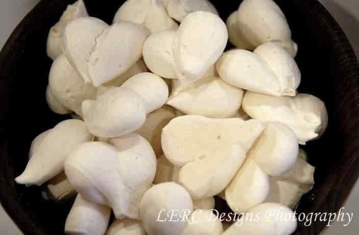
“Inspired by Graham’s logo design, we have created a small heart meringue” Marie-Laure Preynat – Director at Easy Gourmet Ltd.
“Inspired by Graham’s logo design, we have created a small heart meringue” Marie-Laure Preynat – Director at Easy Gourmet Ltd.
![]()

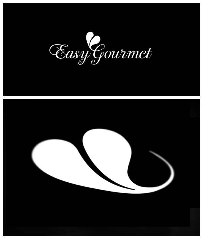
A new logo for catering brand “Easy Gourmet” for their new deli counter opening soon in Balham, South London.
![]()

Easy Gourmet Catering’s new CMS site is live. I designed and developed the site, as well as creating a new logo and brand. Still some holes in the content, but it’s good to get it live to let Google start indexing.
I started what I though would be the slow process of switching the DNS with the current host (the mammothlyg expensive Netbenefit) only to find things happened super quick. Then had to migrate 8 pop email accounts and set up the necessary forwarding the client was using – which meant learning how to migrate pop email FAST! Always a good way to learn 😉
The design and build of the site took 2 months and was completed in January, however putting the content has taken much longer. Easy Gourmet had great help from my friend Michael, who is an excellent editor and travel writer. However, this kind of content is quite personal to the business and needed a lot of involvement and consultation with the client, Marie, and running a successful catering company keeps her very busy.
The most exciting part of this project is the SEO opportunity. The old site was poorly structured and not at all optimised. I did an audit of the 40 most likely customer search queries in Google for page rank (e.g. Wedding caterer”, “Catering London”, “wedding reception catering”). I found only the exact company name “Easy Gourmet Catering” returned a page 1 listing, and that was compromised by a competitor with a similar name in the second position. For all the other search terms there was no listing at all. The new CMS structure and some basic copy alone should give this site a decent presence in search results, but with Michael’s rich copy and some “white hat” optimisation tricks of mine, I think this site will start to be SEO competitive. Google generally takes between 7-14 days to re-index a change on a site; there is an unconfirmed theory that Google is slow to react because it “sandboxes” changes.
Easy Gourmet Catering is a successful business now, even without the aid of natural search listings, woth this new site it should explode! If, that is, people really choose caterers from the web, or if it’s more of a word-of-mouth reputation based business.

![]()
I spent some time last night drawing the final logo artwork for Easy Gourmet. The font is Bodoni Script Pro by Parachute, chosen for the classic heritage of Fuller Benton’s Bodoni, and the script fulfilled the client’s desire for curviness and femininity. I converted the font to outlines in Adobe Illustrator so I could attached the “Heart signature” to the flourish of the “G”.
If you’re unfamiliar with Bézier curves, they are tool to draw curves and make shapes in a computer. A shape in a drawing program, such as Abode Illustrator, is made of points called “vectors” connected by lines, called “paths”, and filled with either a colour or a blend of colours called “gradients”. Initially you draw a shape using a shape tool (ovals, rectangles) or using a virtual pen tool. To change or “edit” a shape you click on or near the edge of the shape, this brings up the points as little black squares, clicking on one of these squares reveals the “control points”, which are like little sea-saw levers. Over time, using these control levers becomes quite intuitive, although at first they can drive you nuts.

It’s a skill I picked up creating hundreds of clipping paths for images at Dorling Kindersley, where the famous style was text flowing around cut out images on white backgrounds. The only way to do this then was a cruder version of the curves in the “path” tool in Photoshop.
Bézier curves were developed by Pierre Bézier (Wikipedia), a French engineer who pioneered computer-aided design at Renault where the curves were used to design care bodies.
The Wikipedia page on Bézier curves has really nice animations on the maths behind the little handles and pivots you use to control the curve. I don’t understand them, but they are pretty in a geeky sort-of-way…


In the photograph I was using to draw this logo, which represents the decoration made from a drop of cream in a fruit coulis, it looked like a leaf. They are in fact hearts. So I have updated my Illustrator rendering for this logo mark. The shape is more feminine now and will compliment the image of the (still secret) company and it’s owners. Original design is below.


I had good meeting last night to agree the new logo for a (not to be named yet, but look really closely at the pics and you might be able to make it out) catering company and to discuss colour ways.
It was way too early to be coming up with designs for the site but, as I always get over-excited and had done a whole bunch of work to test out the new logo. Generally it’s not good practice to show such early design work to clients as it can confuse the issue, rather than presenting complete work that you are confident in. Also, if you show to many options you can end up getting asked for: “a bit of this design A mixed with a bit of that design B”, which might not work well together – and then you have a camel on your hands!
In this case I had a good feeling about the work so far and I thought it would be helpful to show the client how the identity would work in a real context. And I thought “hey, they’re chefs, they understand about mixing the right ingredients”.
20 minutes later and not only was the logo signed off, but we were well on our way to agreeing the website look and feel. This was followed by Guinness at Wiltons Music Hall. I was very happy : )

I’m just showing off really ; ) … trying to make this whole “designer” thing seem glamourours. It’s actually just a lot of squinting at screens for long hours getting eye-strain and swearing furiously at feedback emails!
Whenever I design a logo, I always look for an opportunity for a monogram.
Mongrams are great for extending the uses of a logo and if there’s a need for a smaller version, such as icons or badges and labels in the real world.
The example above is the identity I’m working on for a rather chic catering & events company, but I’m still not quite allowed to shout about it yet, I can’t help let a few ambiguous designs out of the bag ; )

Above are 4 sample colour ways for a new brand and website. Choosing colour is a complex problem, not only are there countless choices, there are also: gut reactions, personal tastes & physical differences in each person’s perception of colour to take into account.
With everything I do, I take inspiration from what the client gives me, in this case it was the photography of the food this company produces, as well as the table wear they use to present their food. I then select complimentary and accent colours to use as highlights, rollovers or side-boxes, to give site contrast and pace.

One handy tool is Adobe’s http://kuler.adobe.com which has user generated pallets as well as a tool to find complimentary or contrasting colours based on the standard principles of colour theory. I use “triad” to give a strong contrast.
Mostly though, I use my own judgement. This tool just helps to play around a little.
In the photograph I was using to draw this logo, which represents the decoration made from a drop of cream in a fruit coulis, it looked like a leaf. They are in fact hearts. So I have updated my Illustrator rendering for this logo mark. The shape is more feminine now and will compliment the image of the (still secret) company and it’s owners. Original design is below.

So, someone at a party says: “you’re a web designer right?”… a bottle of fizz or two later and I’m offering ideas, sketches, free stuff. You know how it goes ; )
Might turn into something good. These are some initial designs for a brand element. I cannot reveal more.