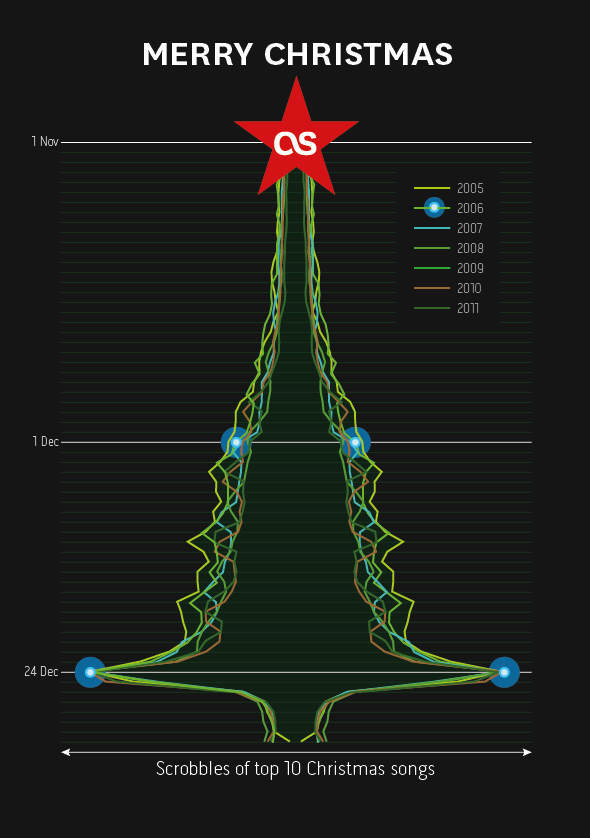
My dear colleague @dawhiting had the idea of looking at the scrobble graphs for the top 10 Christmas songs leading up to the 24th Dec. Over the last few years there has been a consistent spike. I did a bit of “pretty” work and now we have this year’s Christmas card design.
Blog
Last.fm 10 years of scrobbling logo
The Audioscrobbler software is 10 years old and Last.fm is celebrating this revolutionary innovation.
The logo takes elements from exisiting branding assets.
Sketch
scrobble: skrob·bul (ˈskrɒbəll) [verb]
To automatically add the tracks you play to your Last.fm profile with a piece of software called a Scrobbler
If I’m not scrobbling the music I hear, it doesn’t count!
Scrobbler tablet & mobile music app design – icon family V1
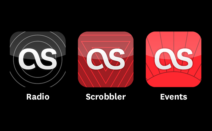
Following the iOS design principle of “do one thing really well” we decided to spilt the Last.fm service into three distinct apps which serve clearly different use: radio streaming, exploring and scrobbling your music collection, and finding events to see. This meant coming up with a family of icons that were different enough to be distinct, yet belonged together and clearly reflected the brand.
The solution was inspired in part by the style of exisiting brand illustrations, but simplified and using geometric shapes. Each icon has a loose concept:
Radio: (Obvious!) is personal radio, so radiating waves… no brainer.
Scrobbler: The Scrobbler enhances your local music collection with Last.fm UGC tagging data and creates automated personal playlists. The icon shows inverted triangles, representing focusing lots of music down to the point of the tracks you really want to listen to.
Events: The icon shows a horizon with points radiating out, representing the points of a globe where you can see your music live.
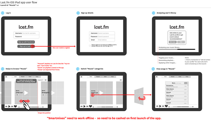
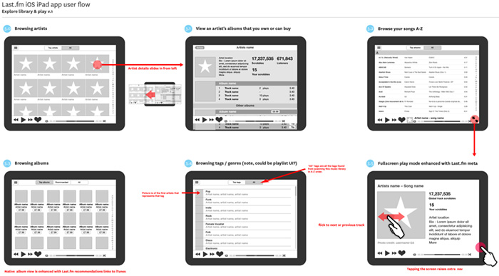
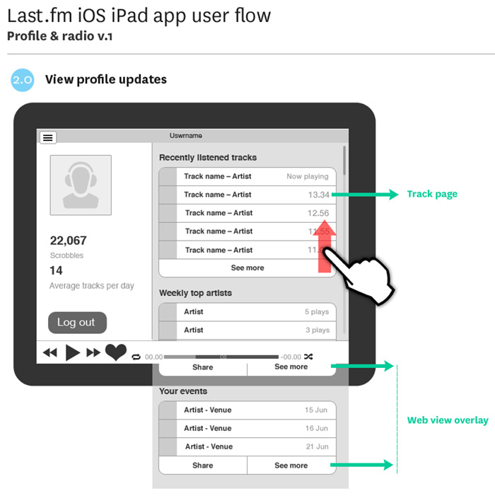
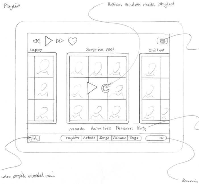
Scrobbler tablet & mobile music app design – wireflows
Attention to detail – tablet & mobile app design
Obsessive, fussy… Me?
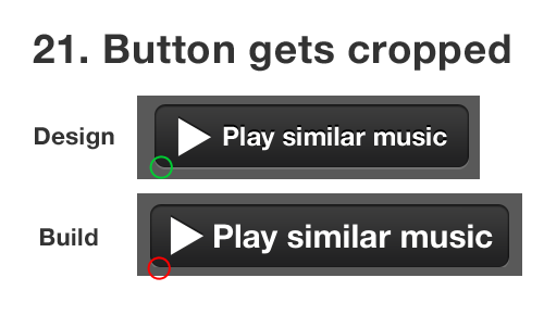
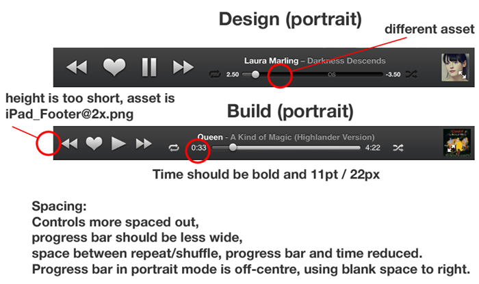
When designing an appdesigners take great care over the UI and the fine details. Apple provide a lot of built-in UI styling in the SDK for developers to produce apps of a consistent quality. However, when Apple create their own apps they add an extra layer of detail and finish that is not supplied in the SDK, this extra quality is hard to achieve out-of-the-box.
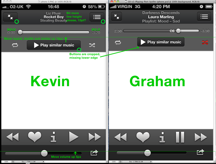
Designers are fussy by trade, and communicating this obsessive level of detail via email or Skype to a remote developer can be challenging. I have great sympathies for developers, espcially when I find myslf sending them the following documents with design revisions… 😉
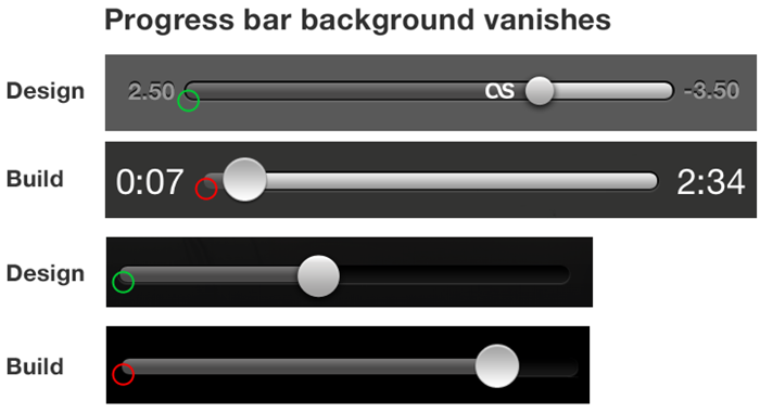
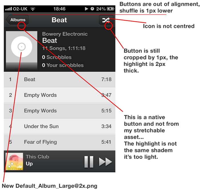
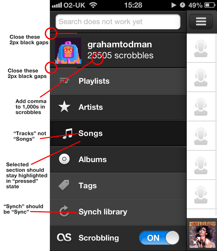
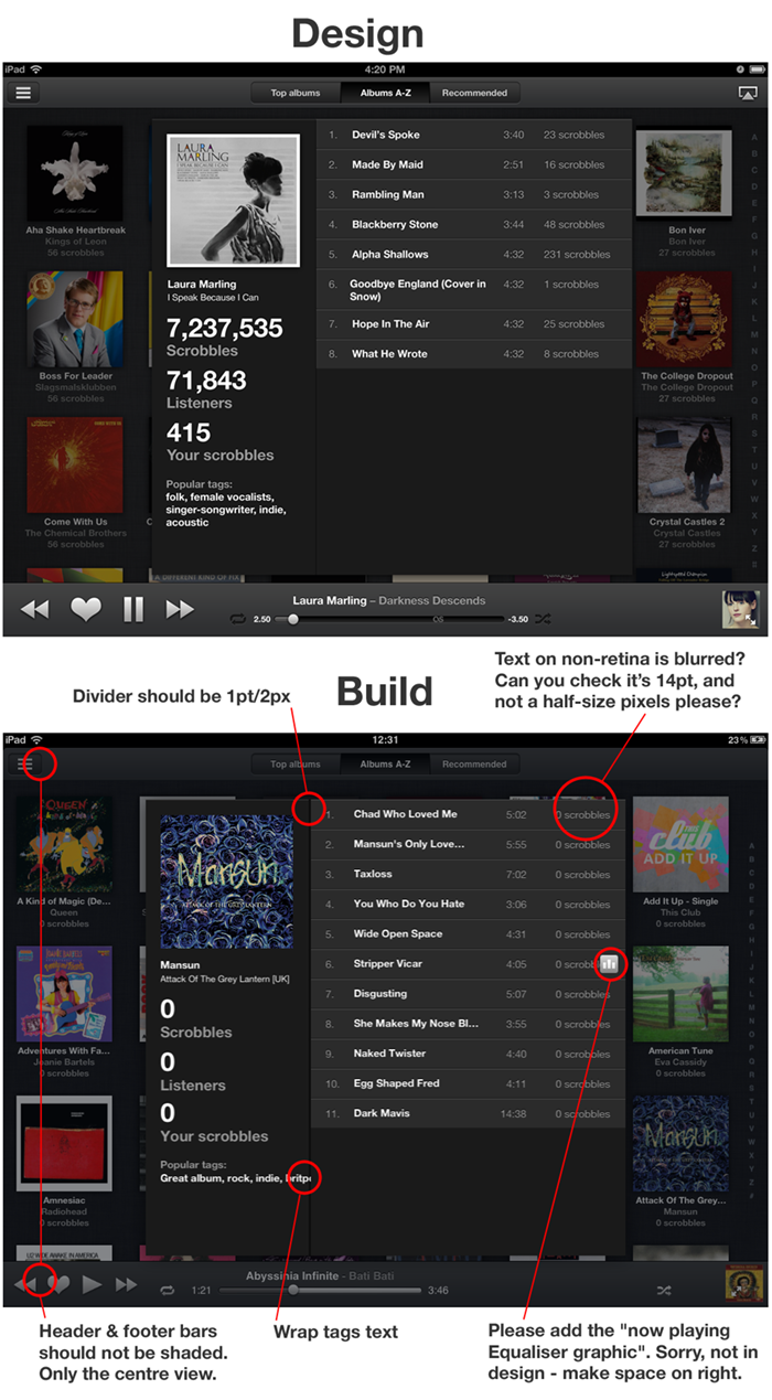
Kevin was as keen as me to get this right, so I hope doesn’t he hate me too much 😉
Smart playlisting music app – demo
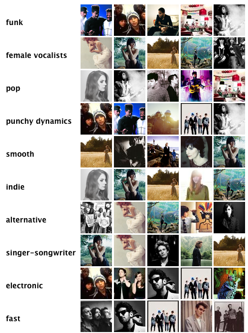
I’ve been working with our MIR team (Music Information Retrieval) on the new instant playlisting engine, designed to provide instant playlists from collections of any size.
The guys have created a playlisting demo which you can try out against your Last.fm profile. Please ty it out give us your feedback. You can also read Mark Levy’s background to the technology on the Last.fm blog.
My part in this has been to think about the user experience and ensure that the catagories we choose to create fit with the natural expectation and behaviors that people use when making their own playlists. This engine will form part of a new iOS product I’m designing for Last.fm.
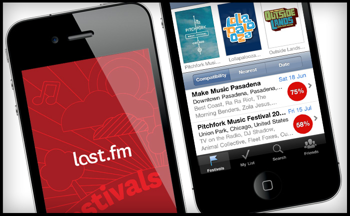
Last.fm Festivals iOS app – wins W3 Silver Award


Last.fm Festivals app won a 2012 W3 Silver Award for the Music & Audio Mobile App category and a 2012 Mobile WebAward from the Web Marketing Association. You can download the app on iTunes here.
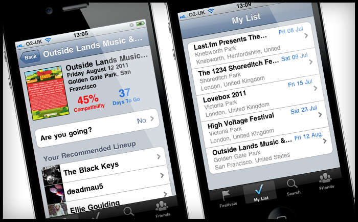
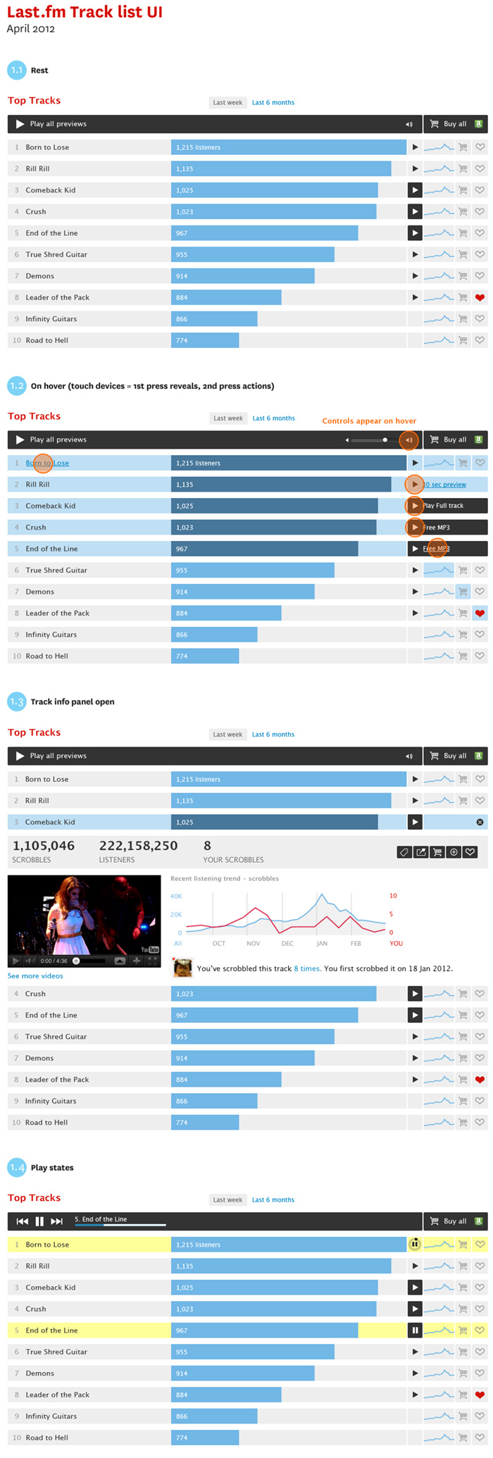
Prototype music track list UI
New playable track list UI style for artists and catalogue pages.
Objectives:
- Make a distinction betwen full playable tracks and 30 second previews
- Create a player module to play all tracks avaible
- An expandable ajax panel to get track info, stats and content in position to increase engagement.
- Add improved e-commerce features, including the ability to buy a list of tracks in one.
RIP Neil Armstrong
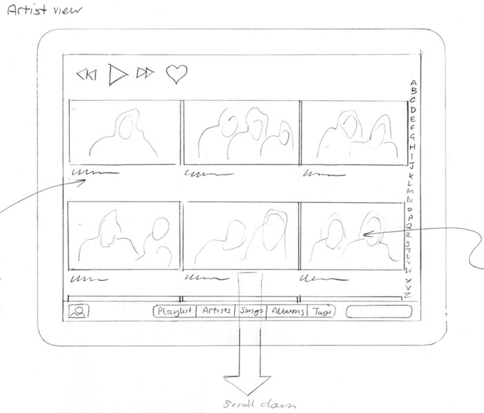
Scrobbler tablet & mobile music app design – sketches
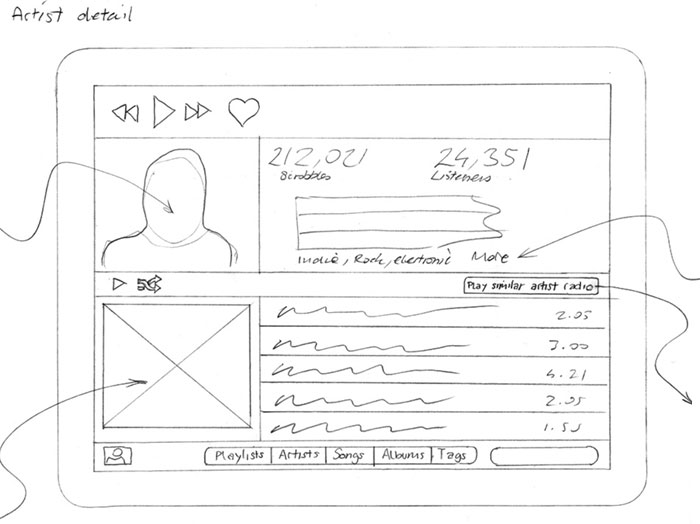
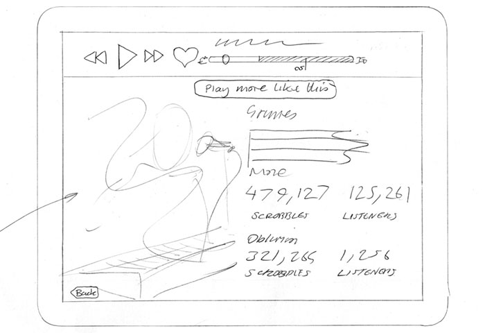
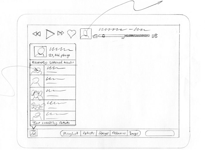
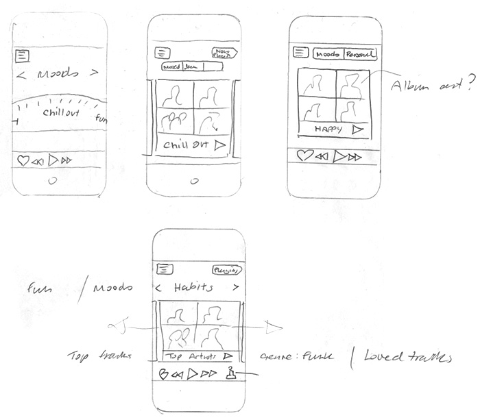
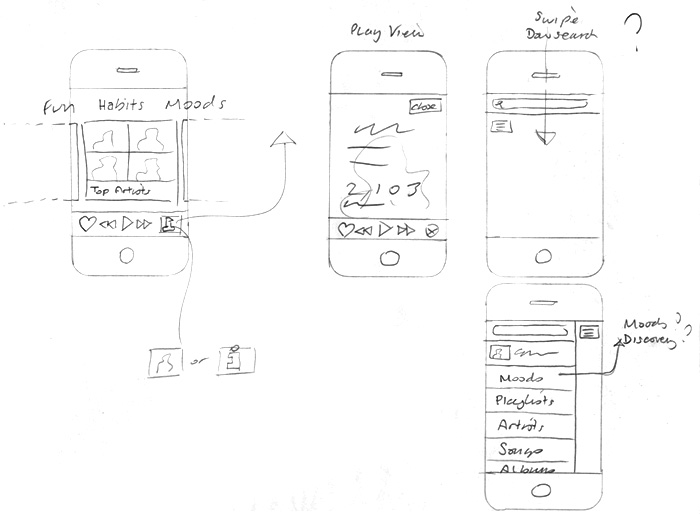
Here are some sketches on an iOS app I’m currently working on, laying out possible ways to interact with your local music collection using listening data.
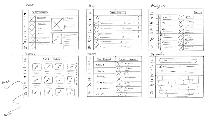
or even better, here…
MOODmongr – music mood analysis & machine tagging
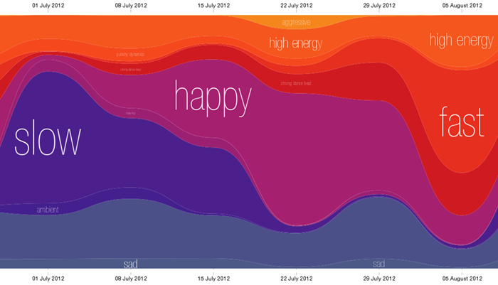
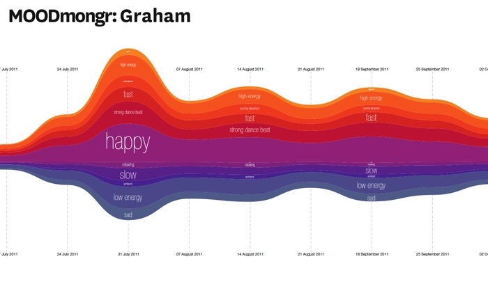
Continued from my previous post, my data team colleague Mark Levy has adjusted the mood chart to only show the percentage of moods in total music listening per week, removing the scaling that showed how much music a user was listening too. This makes it easier to see the variance in mood.
Here is my Moodmongr report or you can give the Mood report a try yourself.
Last.fm Chrome plugin design
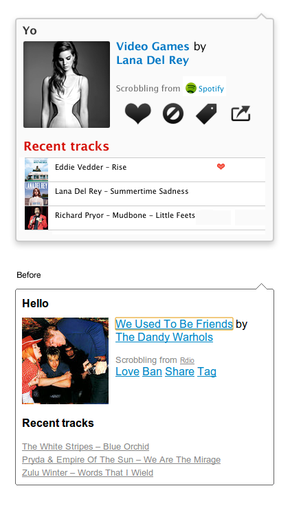
Helping out @marekventur style up his Last.fm plug in for Chrome. It’s a 10% project (* staffers are given 10% of their time to work on self-driven projects, providing the work is related to music data (I have been told off for spending too much time working on a diorama of Jabba’s palace for my Star Wars figures)
Quick icons for hack day
![]()
![]()

Getting out of the office
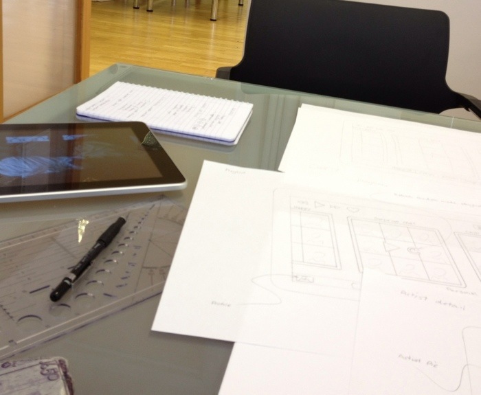
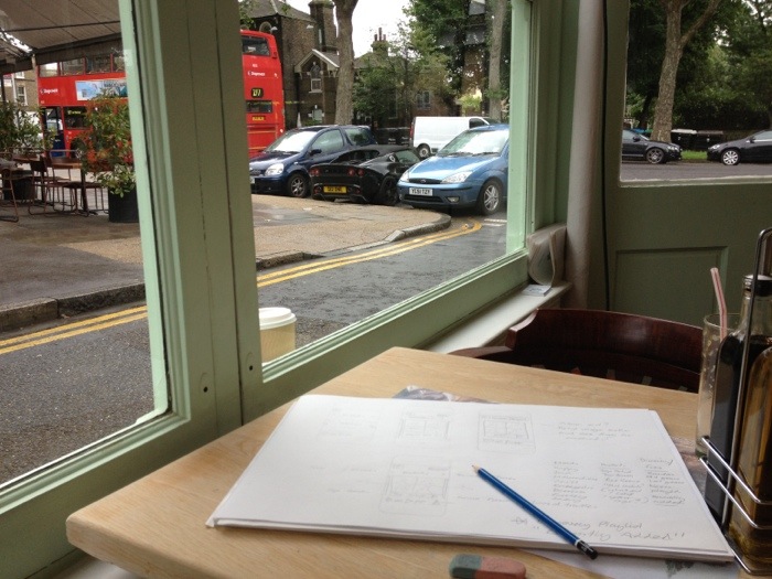
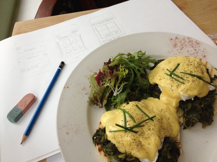
Got out of the office today to work on the IA of the universal iOS music app. I’ve done the iPad, now thinking of iPhone scaling.
I found Chambers restaurant in Victoria Park offered a more inspiring view than the office, where I face two guys called David and Steve. Had eggs for brain food.
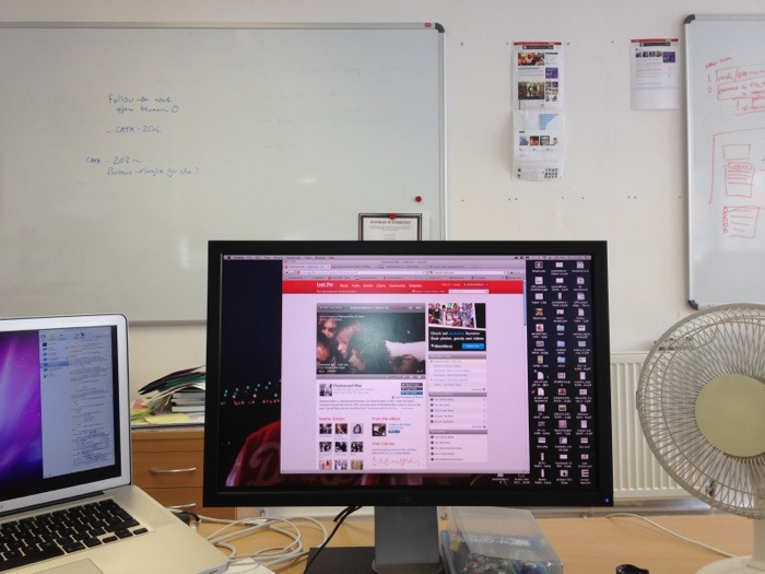
Here’s my normal day-to-day view. Hmm
Music Hack Day – MOODmongr
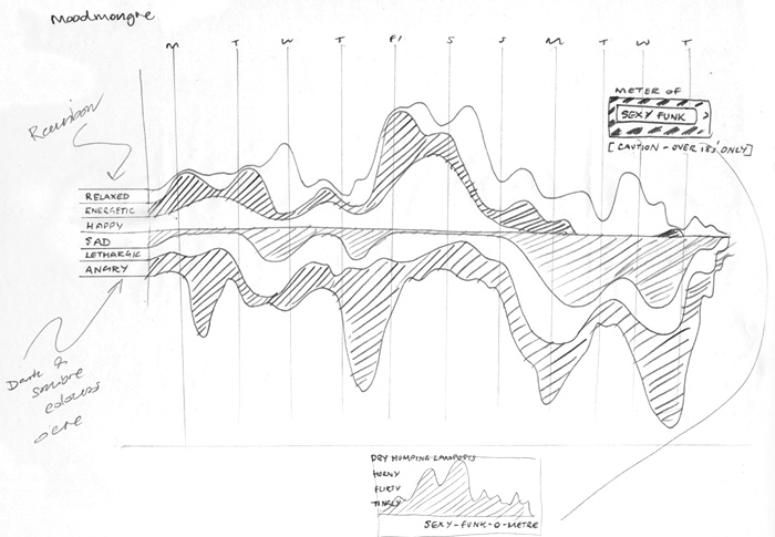
Sketch for an idea for a hack day at Last.fm. The theme is “user profiles”. I’m working on a project with Mark Levy, who leads the Music Information Retrieval team, to chart the mood of a user’s listening over time using new audio analysis tagging. We will be testing it on the team first!
I call it MOODmongr
The results
In general, the moods were pretty even across the year’s listening of my test group; my team mates. This was largely due to the fact that we all have varied music tastes and use radio steams and playlists for variety. However there were a few spikes and points of interest:
Justgo Music – more effects please
In this iteration we are moving away from the flat navigation styling, and adding some depth and detail. I’m designing an iOS app at the moment, so I’m at home doing this stuff. Although, I think clean and minal is a better way to go online as, like the “little black dress”, it never goes out of fashion.
Visit Justgomusic.com
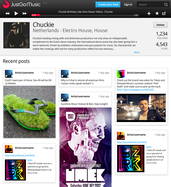
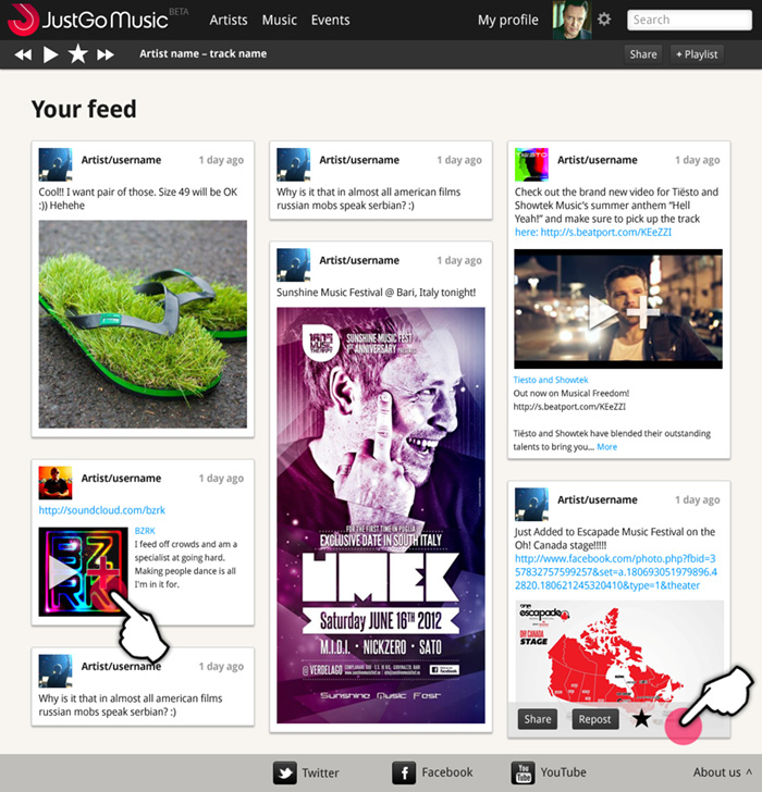
JustGo Music – Beta design specification
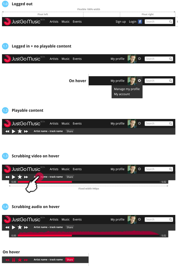
Responsive design for navigation
Here is some work I’ve been doing on the Beta site for JustGo Music, which has just gone live. We’re worknig in agile, so designing by component rather than finished pages. The UI designs feature responsive behaviour for tablet and mobile, and a baseline grid to align posts across columns. See justgomusic.com
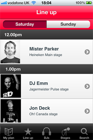
Escapade Festival iPhone / mobile App
My friends @JustGoMusic needed some help tidying up their app for the Escapade Dance Music Festival. The app needed to be submitted to iTnes the next day, so I had great fun coming up with icons under the stopwatch.
You can download the App here

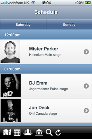
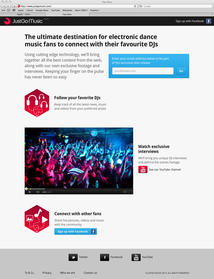
JustGo Muusic Beta sign-up page live
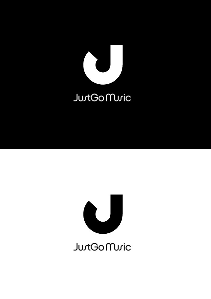
Electronic music site logo – we have a winner!

Phew, got there in the end.
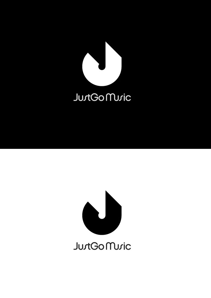
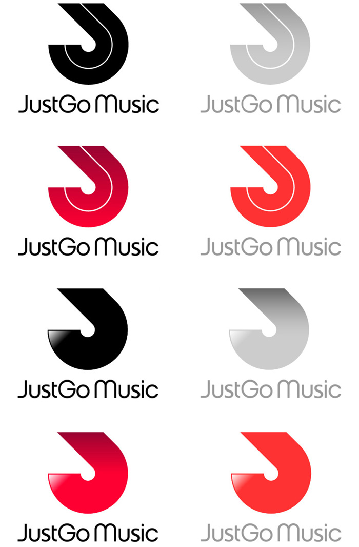
Electronic music site logo – detailing & colour
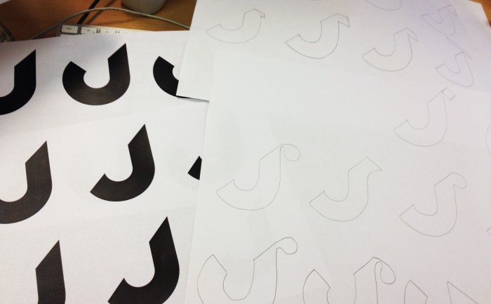
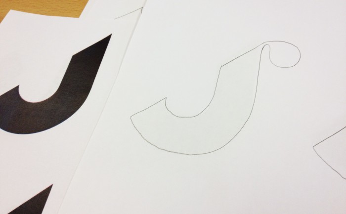
After some thought, the client decided they actually quite like the rotated “J” logo, an wanted to see some development on that version with colour option. Nearly there. Replaced the funky Chalet “S” with a customised “S” from Lucida.
Electronic music site logo – fine tuning
Electronic music site logo – 3rd iteration
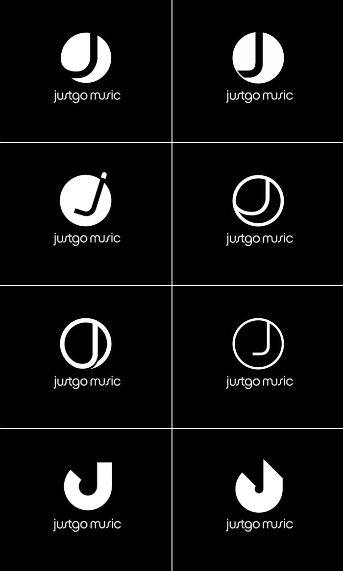
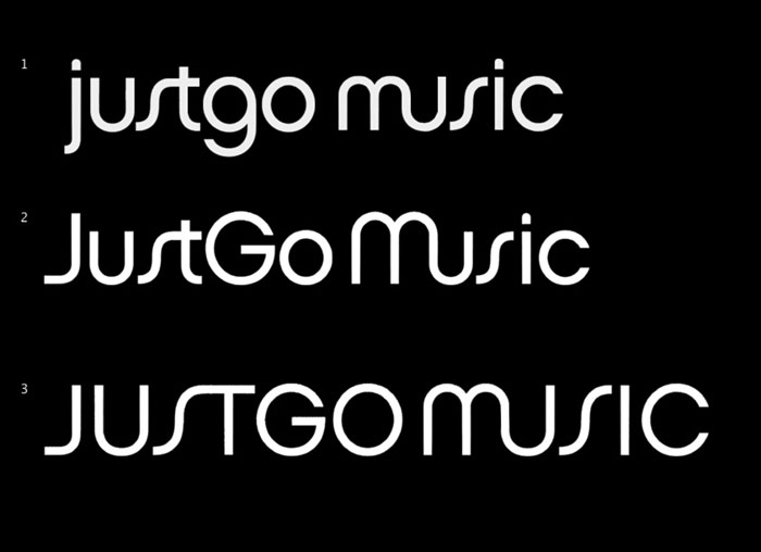
In the second iteration I was asked to try a more minimal logo based around the “J”. We also had a font we really liked called Chalet London 1970 by House Industries.
The client liked the last two ideas, a combination of the clean J shape with a bit of movement.
After some thought, the client decided they actually quite like the rotated “J” logo, an wanted to see some development on that version with colour option. Nearly there. Replaced the funky Chalet “S” with a customised “S” from Lucida.

Electronic music site logo – initial concepts
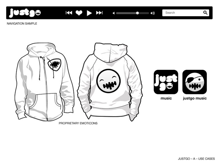
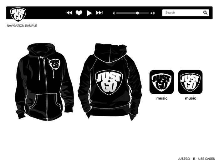
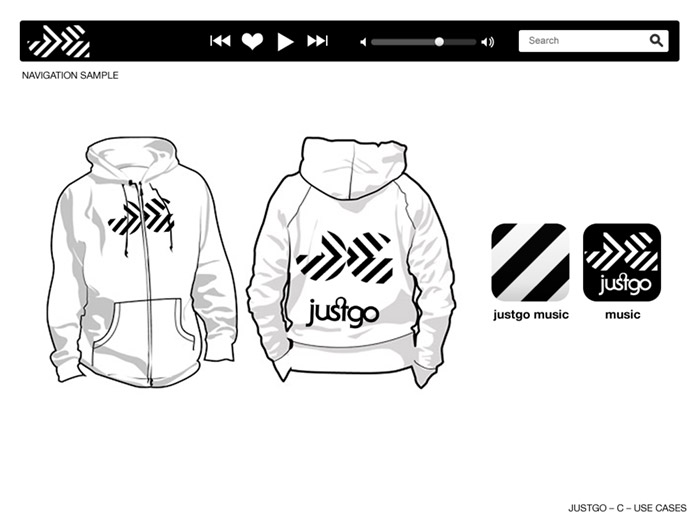
Thanks to Jake Burke for the hoodie vector art template
It’s funny, I can’t see a lead balloon in there ; )
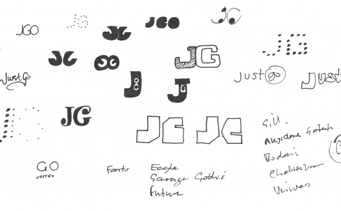
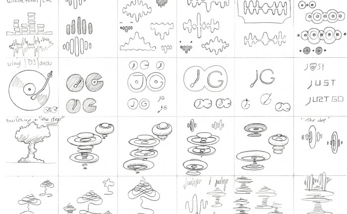
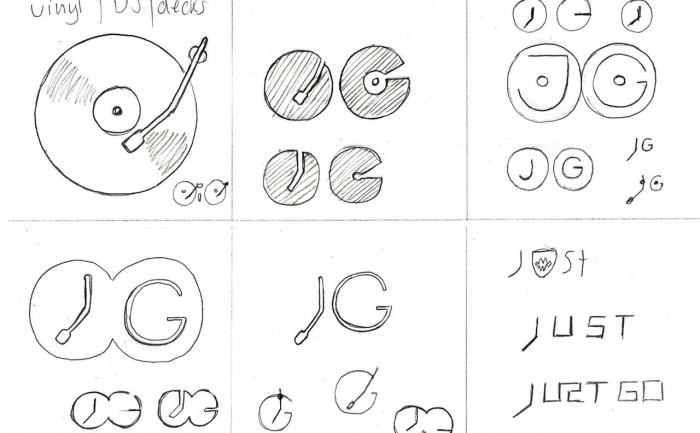
Electronic music site logo – sketches
I’ve been working on the branding of a new product creating a social space for the electronic dance music scene.
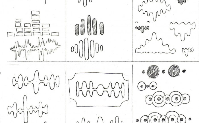
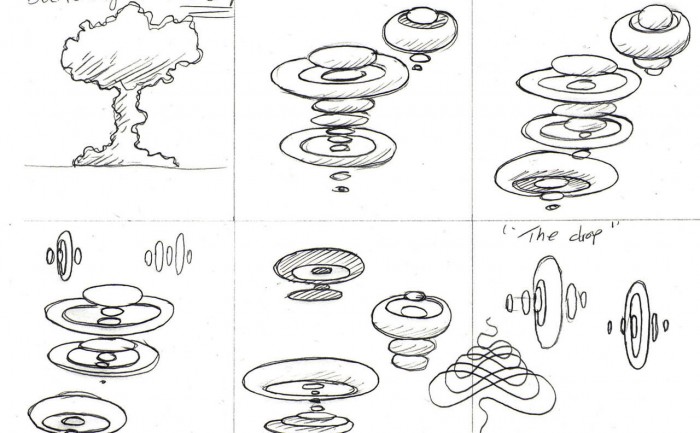
Morphological matrix
After doing some research into the scene and some broad thinking on possible themes that might add personality to the brand, I start to sketch ideas using a “morphological matrix” as a way of organising the ideas, it also helps to make those lateral connections. Here’s the matrix as a whole…
