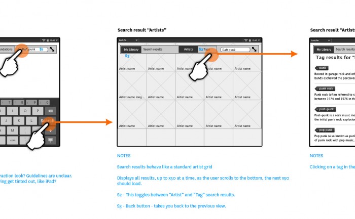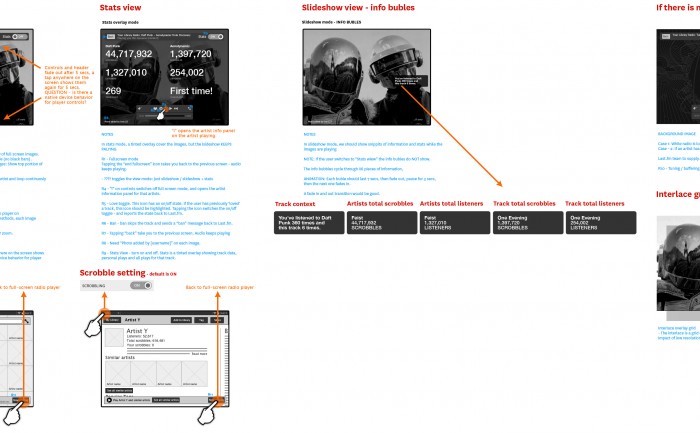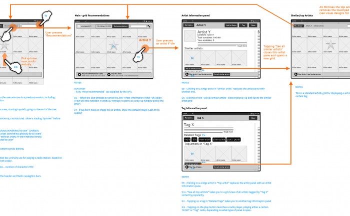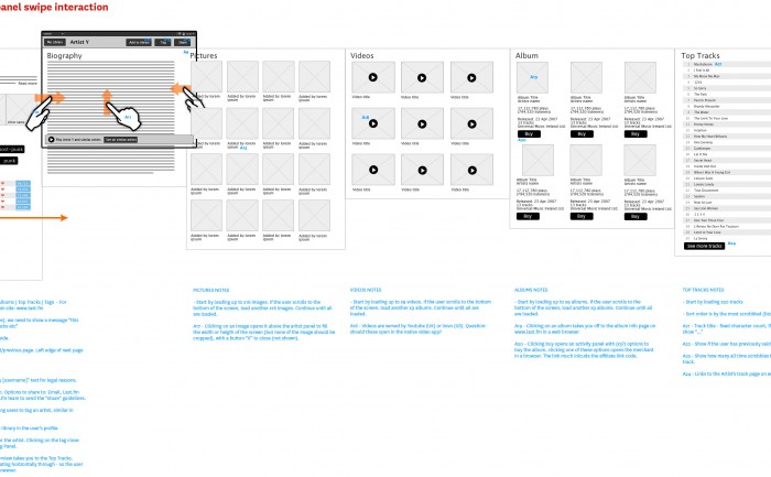
Asset Mapping prototype web app for managing buildings, sites or whole cities

Asset Mapping wireframe

Timeline_View-AssetMapping-GTdesign-20140114

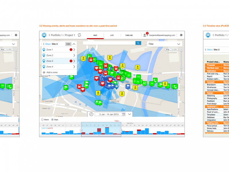
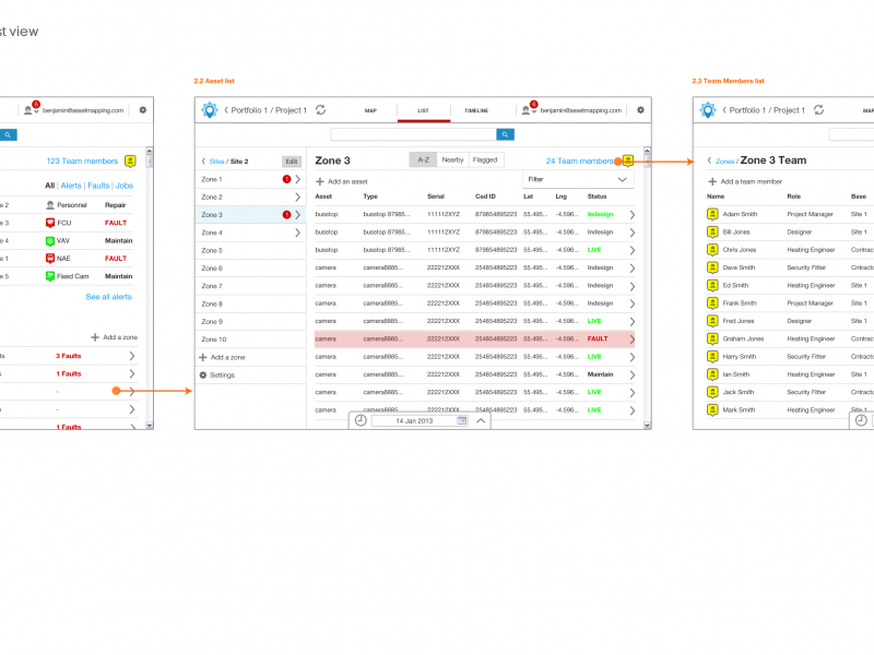
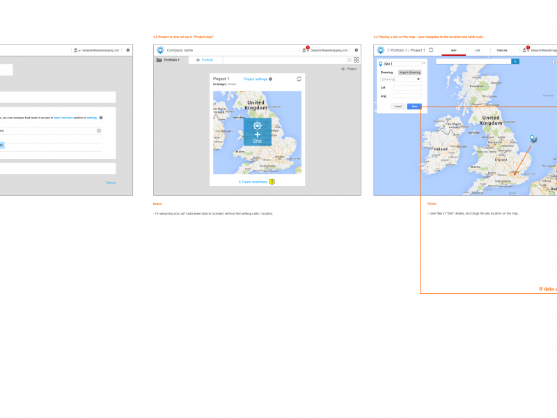
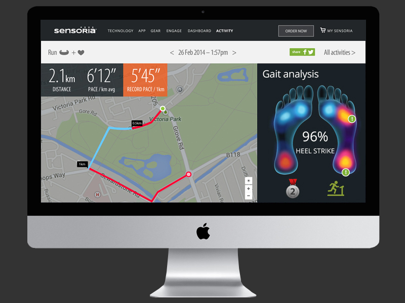
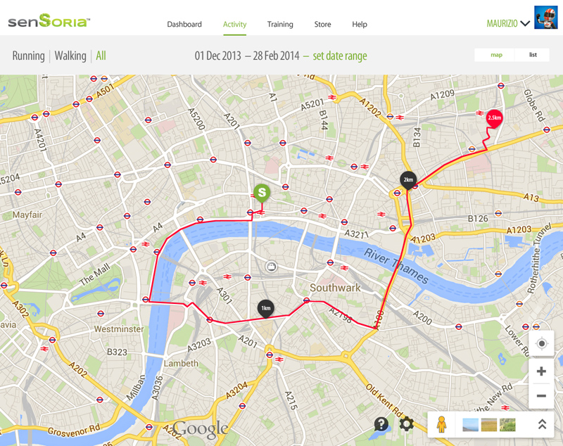
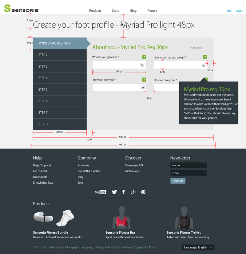
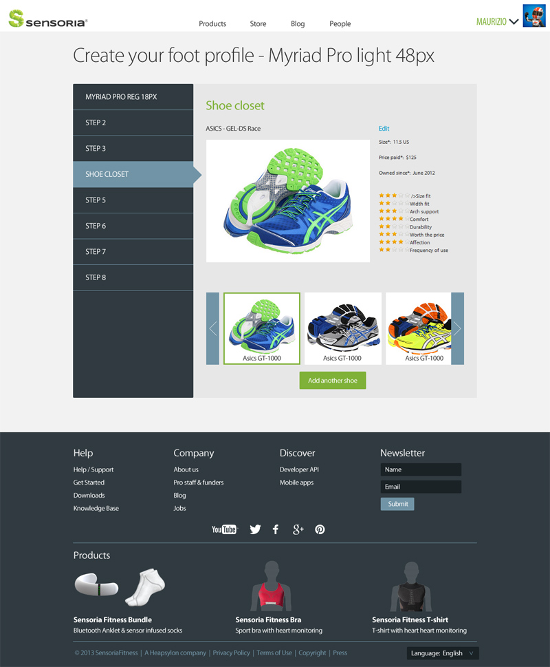
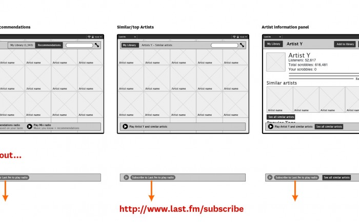
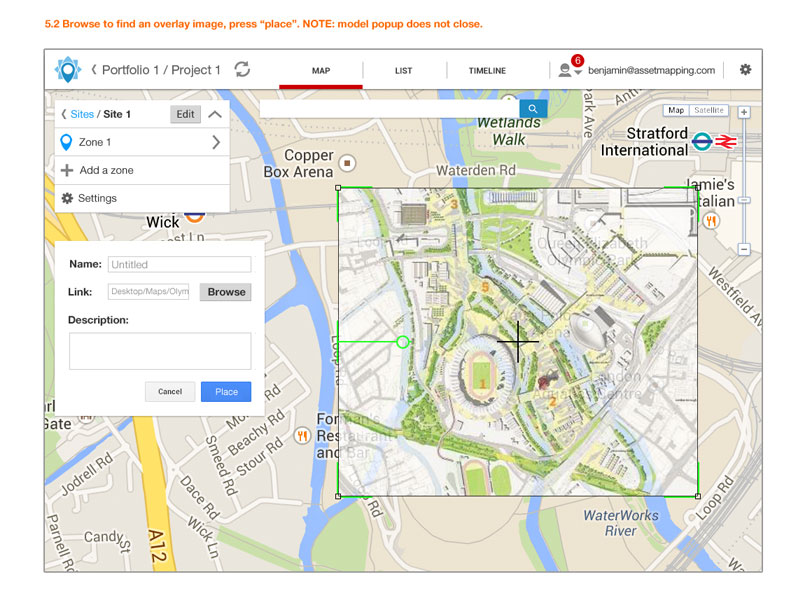
Wireframe prototype for Asset Mapping. If you are responsible for a new building development or are in charge of city planning, keeping track of the installation and maintenance of hundreds of security cameras, air conditioning units, lights, etc is a massive juggling act. Asset Mapping is an app that centralises all assets feeds and displays everything on an easy to use map and timeline of repairs.

A mobile or tablet version of the app would help contractors find the right place to fit an asset, and it will be easier to find and repair an asset that needs servicing later.

The app creates a real time secure Google map of the physical assets of new developments or buildings or even cities, such as: security cameras, air conditioning units, etc. The CAD file or plan of the development is given Google map coordinates. The app then links up with real time API feeds of the status and location of all assets in one place.

My main role here was information architecture and to prototype the interface. My approach was to break out a navigation structure by themes, separating the modes of viewing the information (by: list / map / table / time) from the hierarchy of asset information (site / zone / level / asset type ).

It is a very complicated piece of software with lots of moving parts, made simple by use of sorting, filtering and folder style navigation.

See Assetmapping.com for more information.

Asset Mapping prototype asset geo tracking app

Project_New_Start-AssetMapping-GTdesign-20140123

How to start designing Android apps in Photoshop & what is a dp?

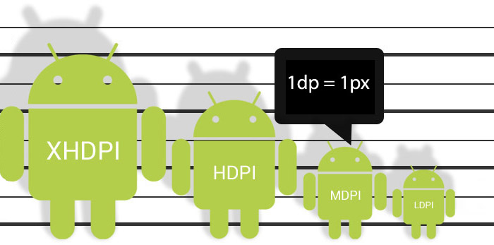
Google Android Screen and Icon size illustration

July 2014 EDIT: Android’s “L” design guidelines now supply templates in Adobe Illustrator, making it even harder for designers user to Photoshop or Fireworks. They don’t provide an answer for how you should crop and optimise your assets for the developer (I assume they’d rather you didn’t and just use their native stuff).

See www.google.com/design/

July 2014 EDIT: On consideration of comments from NexogenDev, I have removed the more explicit reference to 72dpi in the graphic above to “1dp = 1px” as this is a more literal starting point and probably better. My point was that Android supplied templates and assets tend to open by default in Photoshop as 72dpi, but dpi in general is misleading in this context.
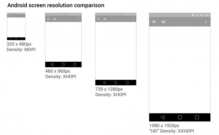
 

Android screen resolution and density

I found it hard to know where to start designing for Android in Photoshop.

Google tries to help by providing extensive Android user Interface Design Guidelines.  There are many devices running Android that have different screen sizes and shapes. There are also different screen densities, which means the quality of the definition of the screen or how many pixels fit in the same sized area on the screen – e.g. medium screen density has 160 pixels in every inch on the device’s screen, whereas an extra high density screen has twice as many, 320 pixels, crammed in an inch. To cover the different densities you need to supply graphics and icons at various densities.

Creating a design that will work for all these devices can be daunting. You also need to create different density icons and graphics.

1. Minimum handsetscreen size

I started with a minimum mobile handset size screen first. Starting with the smallest and most limited screen size first makes sure your content and UI will fit, removing any features that aren’t completely necessary to the core purpose of the app. Then you can work out how your app will behave on larger and tablet sized screens. You need to decided if your app is going to stretch to fit larger screens, or if you’re going to have a completely different layout and design for tablet sized screens.

2. Photoshop image size

I choose to start with a small mobile handset and a small 7″ tablet screen as a base for design and then think of how that could scale elagantly.  You may need to create portrait and landscape versions if you plan on allowing users to change orientation.

Here are some Photoshop templates

3. Download Android design templates

If you are new to designing for Android, and are confused by dpi, I STRONGLY RECOMMEND you use native Android styling and assets, rather than doing a completely custom design at first.

See www.google.com/design/

It is important to keep the icons at the same proportion to maintain the correct “hit” area for the user’s finger.
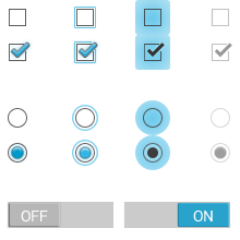
downloads_stencils

4. Scale down

It’s easier to work at the higher pixel density, XXHDPI. It is always advisable to create icon art as vectors in “Smart Objects, or as “shapes” in Photoshop so they can be scaled up or down without loosing quality.

The benefit of working at XXHDPI is that you can be sure you are not loosing any quality.

XXHDPI – 300% – x3.o
XHDPI
 –  200% – x2.o
HDPI –  150% – x1.5
MDPI – 100% – x1.0
LDPI – 75% (don’t bother with this!) – 0.75

When using vectors, you may want to adjust your line art to tighten up any half pixels or it can look blurry at the edges (if you’re a perfectionist like me).

5. Workflow

  • Create you design PSD at XXHDPI
  • Crop out your graphic assets and icons as separate PSDs
  • Scale them down to the various densities: XHDPI, HDPI, MDPI

My method is to design one PSD, crop out the icons assets as PSDs, then scale them to the different densities. I often start with a PSD at XXHDPI or MDPI (providing my artwork is vector and can be scaled up or down), then I crop out the icons and assets out, then resize them.

The reason this is easier is that when you need to make design changes, you don’t have to change multiple PSDs.


What the frakk is a DP?

Here’s what I discovered after a few hours of scratching my head and moaning…

  1. “dp” is a magic, made-up measurement that only exists in the world of The Matrix & Tron.
  2. Android icons are 32dp x 32dp @ the medium density MDPI
  3. Android supply sample icons (Edit: they don’t any more the gits) and if you open an icon from the MDPI folder in Photoshop, the icon is 32px x 32px with “image size”.
  4. SO, in Photoshop:1dp = 1px @ MDPI – 100%
    1dp = 1.5px @ HDPI – 150%
    1dp = 2px @ XHDPI – 200%
    1dp = 3px @ XXHDPI – 300%
    1dp = 4px @ XXXHDPI – 400%
  5. It doesn’t matter what DPI you have set in PHOTOSHOP, it’s the canvas size (the number of pixels available) that counts.

If you have a better way of getting started designing in Android, or if I’ve made an errors, please let me know.

Here are some Photoshop templates at MDPI and HDPI to give you an idea.

Please see my new guide: How to design for new iPhone 6 Plus resolutions in Photoshop
Attention to detail – tablet & mobile app design

Obsessive, fussy… Me?

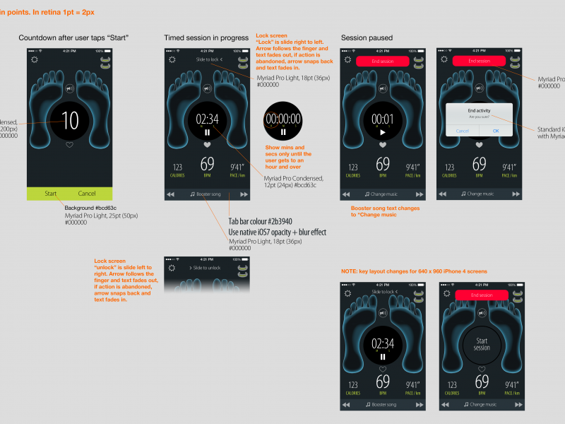
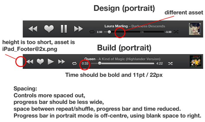
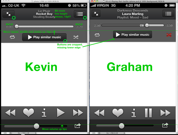
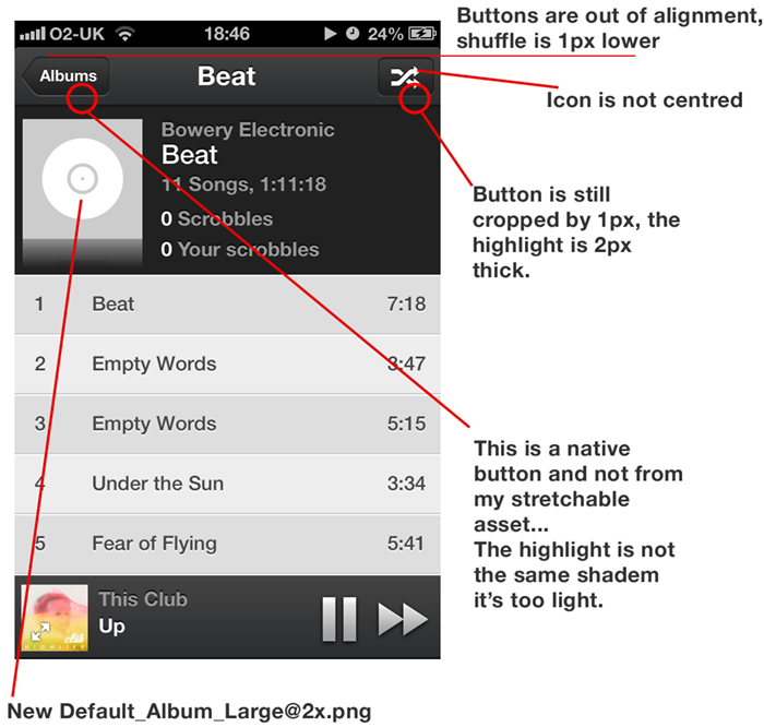
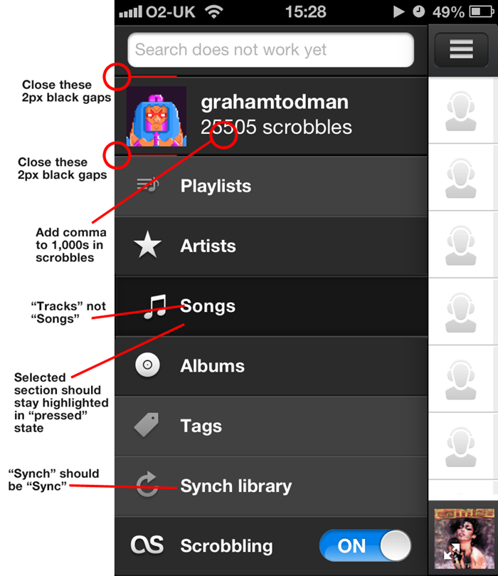
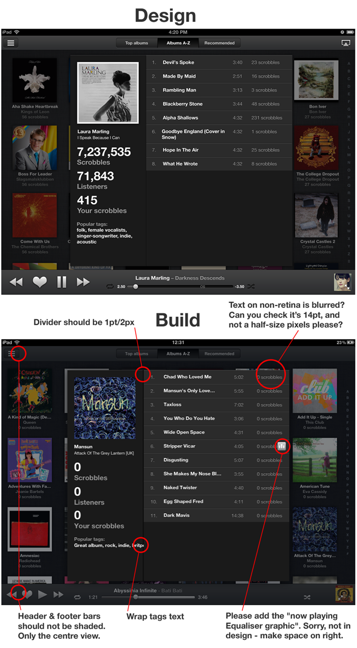
When designing an appdesigners take great care over the UI and the fine details. Apple provide a lot of built-in UI styling in the SDK for developers to produce apps of a consistent quality. However, when Apple create their own apps they add an extra layer of detail and finish that is not supplied in the SDK, this extra quality is hard to achieve out-of-the-box.

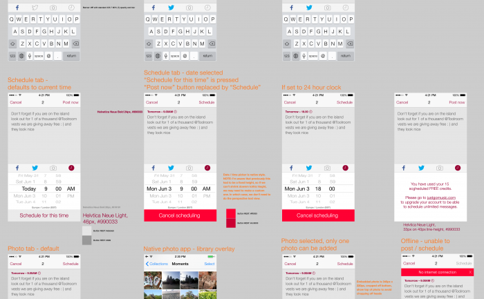
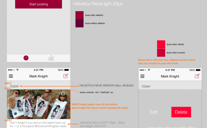
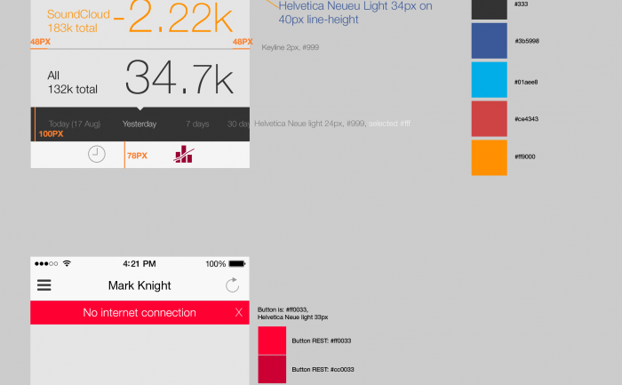
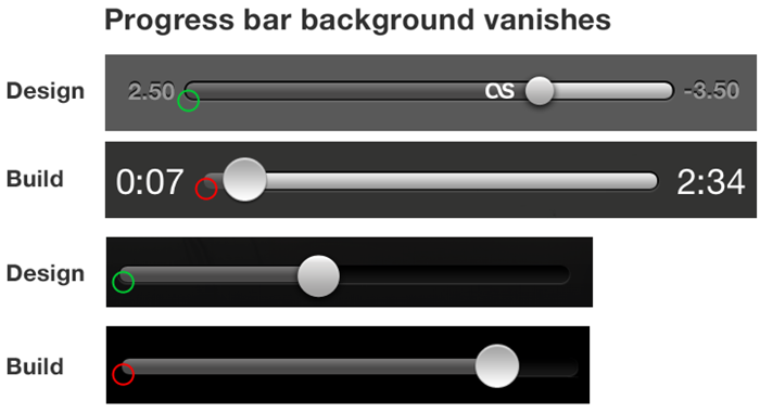
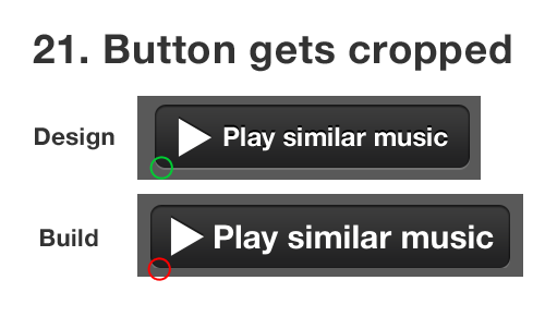
Designers are fussy by trade, and communicating this obsessive level of detail via email or Skype to a remote developer can be challenging. I have great sympathies for developers, espcially when I find myslf sending them the following documents with design revisions… 😉


iOS app design revisions

iOS app design revisions


Kevin was as keen as me to get this right, so I hope doesn’t he hate me too much 😉

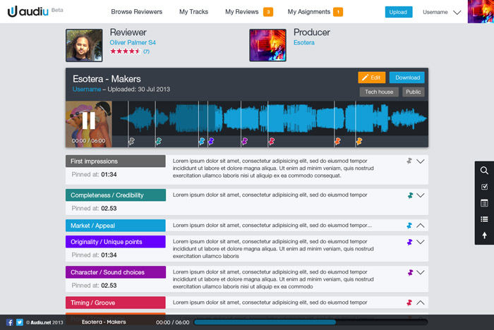
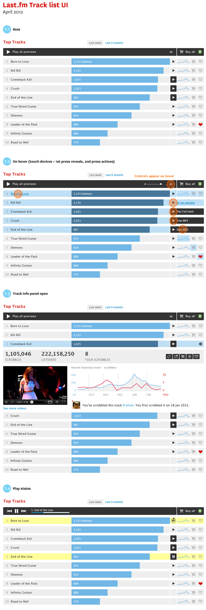
Prototype music track list UI

Last.fm track list player UI design

New playable track list UI style for artists and catalogue pages.

Objectives:

  • Make a distinction betwen full playable tracks and 30 second previews
  • Create a player module to play all tracks avaible
  • An expandable ajax panel to get track info, stats and content in position to increase engagement.
  • Add improved e-commerce features, including the ability to buy a list of tracks in one.

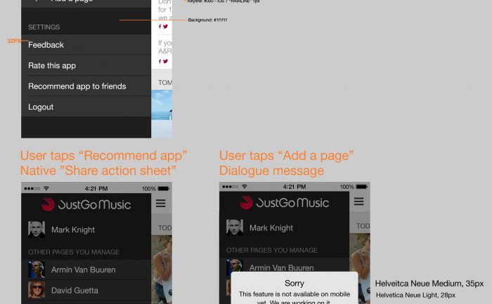
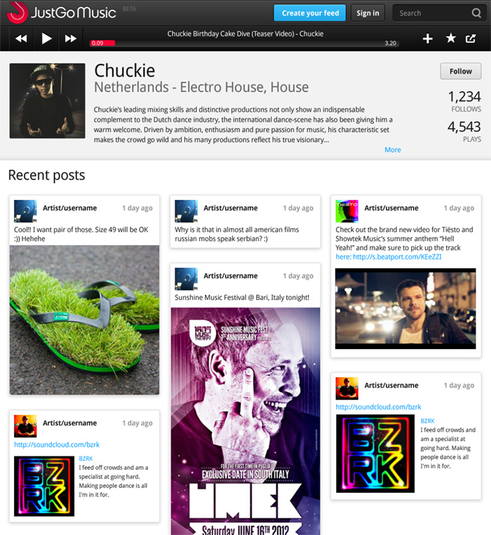
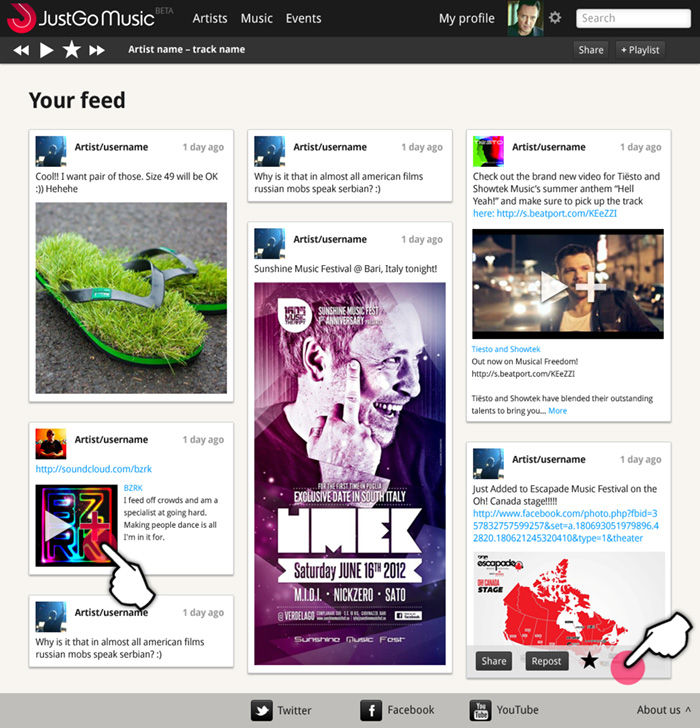
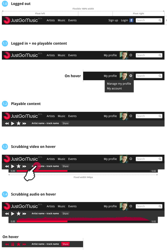
JustGo Music – Beta design specification

/blog/wp-content/uploads/2012/06/JustGoMusic-Feed-v4.png

Responsive design for navigation

Here is some work I’ve been doing on the Beta site for JustGo Music, which has just gone live. We’re worknig in agile, so designing by component rather than finished pages. The UI designs feature responsive behaviour for tablet and mobile, and a baseline grid to align posts across columns. See justgomusic.com

Radio hack day

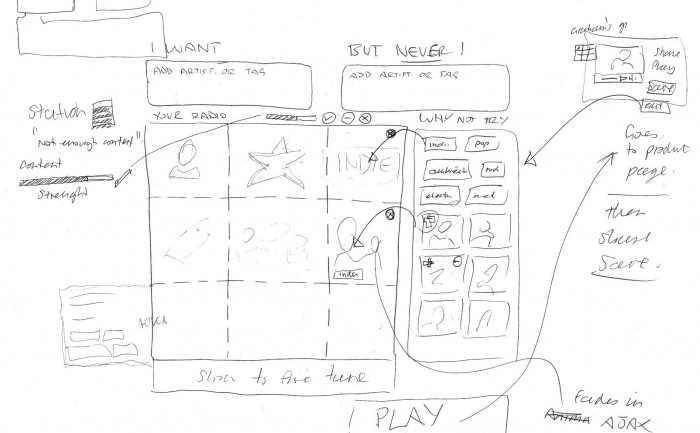
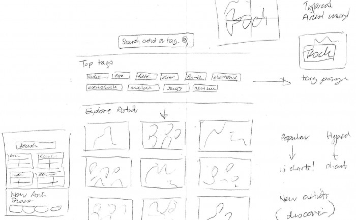
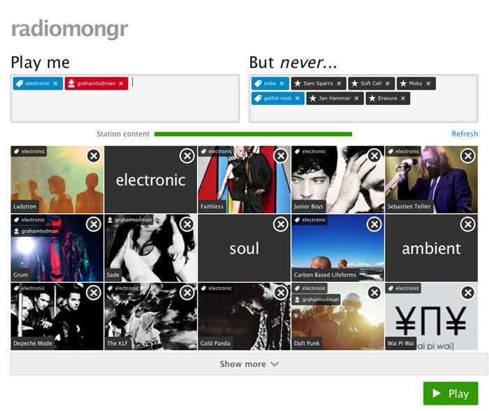
We had a hack day at Last.fm to develop ideas for better web radio products. I got together with @tdhooper @marekventur to design an interface for creating customised radio stations.
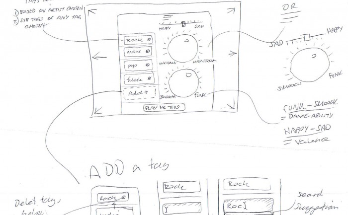
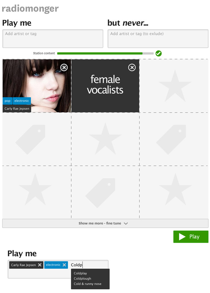
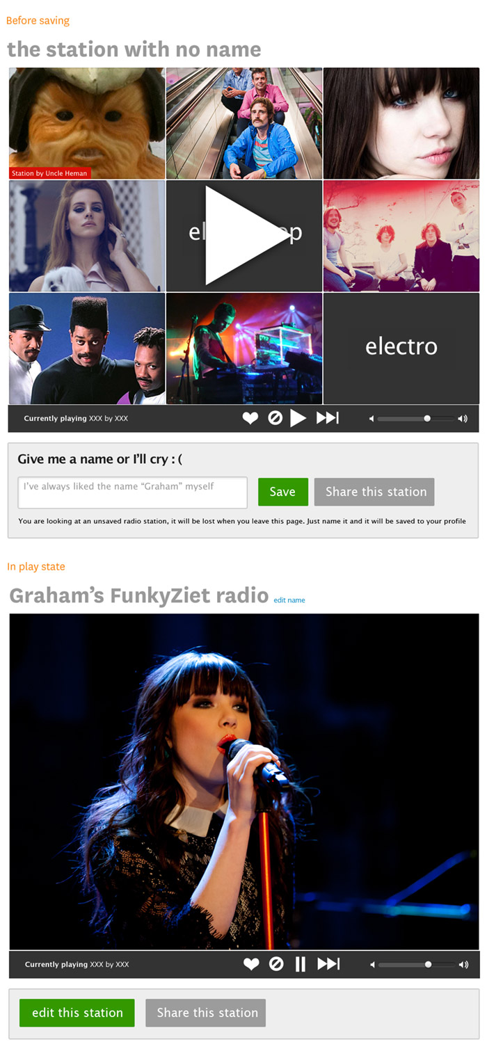
The interface consisted of two input boxes, one to put in what you wanted to play using a mix of tags, artists, and user profiles, and one that would exclude things you don’t like (e.g. Coldplay, Adele and “industrial house” in my case!). To get a flavour of the music the station would play, we added a quilt of artists and tags, that you could fine tune by deleting tiles from the quilt. Once you were happy, you could then play, save or share the station.

We called it “Radiomongr”. Unfortunately the prototype isn’t available for public viewing, but hopefully it can be used as a model for a releasable product at some point.

User interface design

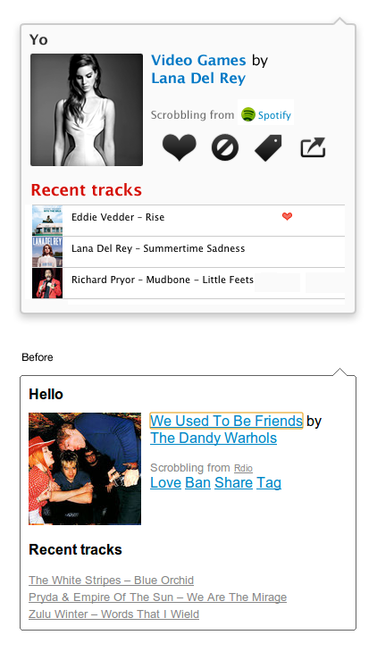
Play state

GUI elements

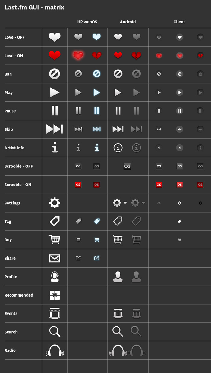
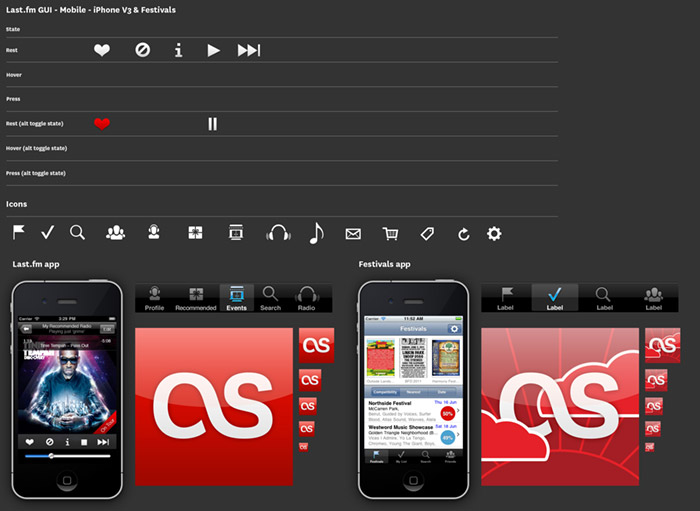
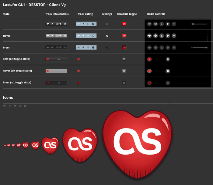
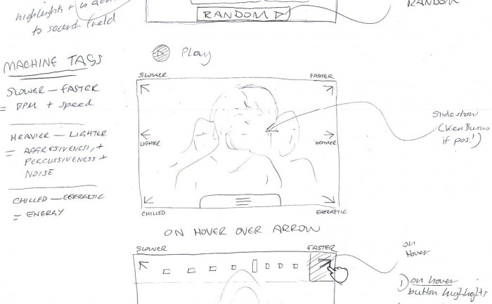
For services that work across multiple platforms it’s important to keep a consistent style across UI elements. Various platforms and operating systems have their own native UI elements, but you can still add brand characteristics. At the end of each project I put together a grid of all the UI elements, as a quick reference for any future project. There is also a master UI matrix comparing elements across platforms, i.e. how does a play icon look on iOS compared to Android, and can it still reflect the brand?
GUI - UI user interface elements matrix

iOS GUI schema

GUI - UI user interface elements for iOS apps

Desktop version schema

GUI - UI user interface elements for a desktop version

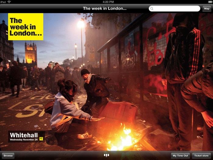
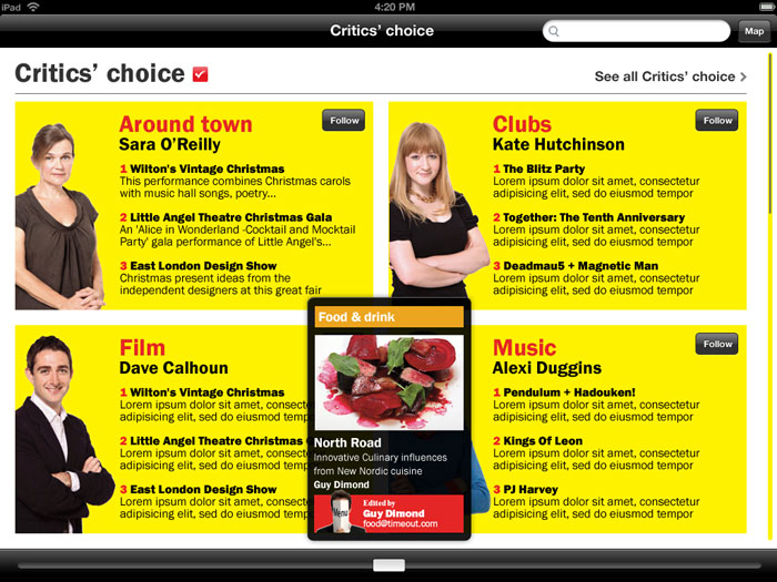
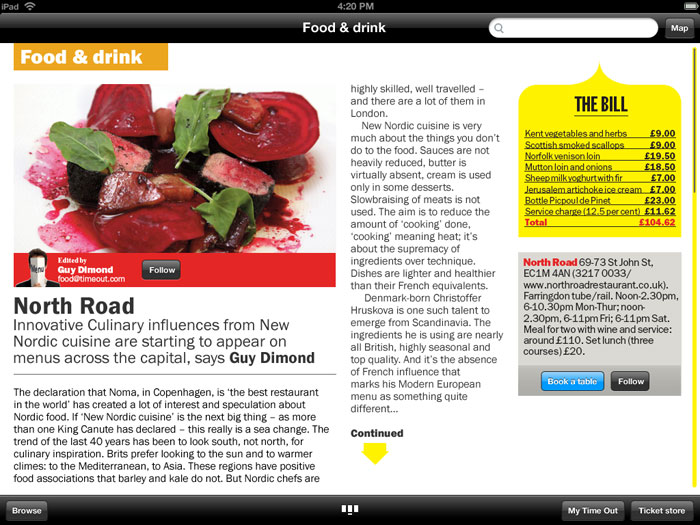
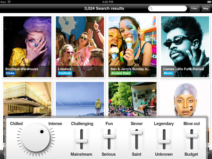
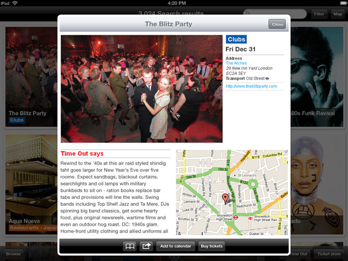
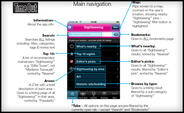
Time Out City Guide iOS mobile apps – User Reviews


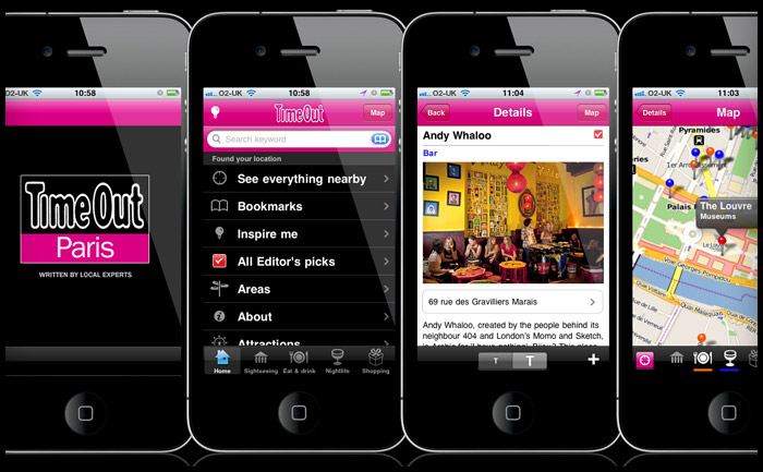
I’ve been checking the reviews for the Time Out Travel Guide apps I worked on last year. It’s good to think of someone using a product you’ve designed and even better that it’s helping them have a good holiday. Dubrovnik, London, New York, Paris, & Zagreb

iTunes reviews

Berlin – Take full advantage
This is a great app and successfully navigated us to some top spots in Berlin over Easter. Currently free, which is an absolute gift – take full advantage. By Sazzle_81

Paris – Discovered a new Paris
I have been to Paris hundreds of times and have even lived there, but I discovered a completely new side to it this weekend through this app. We followed the editor’s picks and used the what’s nearby part of the app and we had the best weekend ever! Next time I will plan more and use the bookmarks to organise each day. No Improvements necessary. By Dysynni

Berlin – Absolutely essential
We used this app around 10 times a day instead of getting charged for data raoming and it was brilliant. I would have paid for this so can’t believe it’s free. If you’re travelling to Berlin, why haven’t you downloaded it already!!! By Tom Hughes

Barcelona – Absolutley indispensible…
Almost flawless in execution, this app is all you need if you turn up to Barcelona without a guide book or any clue what to do.

We spent 6 days there and filled them with things we found on here. The user interface is superb, the ability to bookmark and then view on the map was genius, and all without using any data allowance.

Only occasionally was the GPS slightly off and one or two places weren’t quite where the map thought they were, but overall it’s the best and most useful city guide app that I’ve ever used. By Doug Bryson

New York – Amazing
It made my trip to New York much easier when wandering around. Offline map, great restaurant recommendations, nice photos. I am totally getting the London and Paris guides. Please make a Lisbon one. By syt8