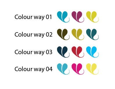
Above are 4 sample colour ways for a new brand and website. Choosing colour is a complex problem, not only are there countless choices, there are also: gut reactions, personal tastes & physical differences in each person’s perception of colour to take into account.
With everything I do, I take inspiration from what the client gives me, in this case it was the photography of the food this company produces, as well as the table wear they use to present their food. I then select complimentary and accent colours to use as highlights, rollovers or side-boxes, to give site contrast and pace.
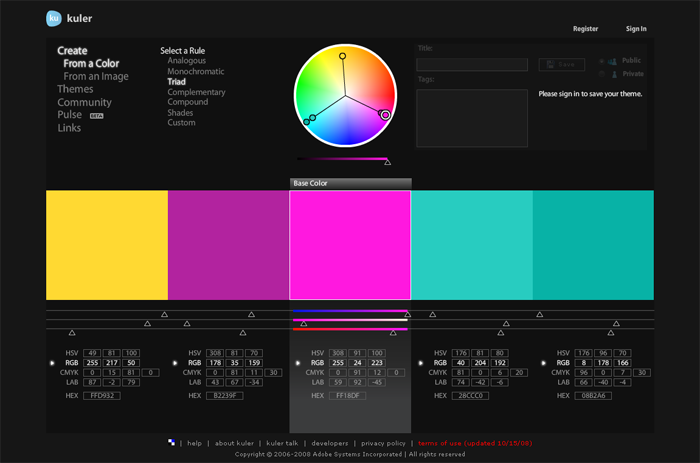
One handy tool is Adobe’s http://kuler.adobe.com which has user generated pallets as well as a tool to find complimentary or contrasting colours based on the standard principles of colour theory. I use “triad” to give a strong contrast.
Mostly though, I use my own judgement. This tool just helps to play around a little.
