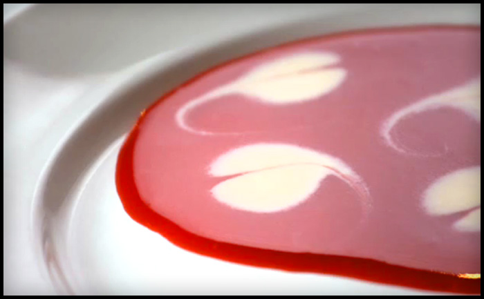
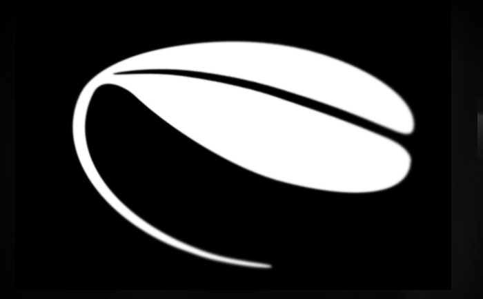
In the photograph I was using to draw this logo, which represents the decoration made from a drop of cream in a fruit coulis, it looked like a leaf. They are in fact hearts. So I have updated my Illustrator rendering for this logo mark. The shape is more feminine now and will compliment the image of the (still secret) company and it’s owners. Original design is below.


