- Read the iOS Human Interface Guide lines
Apple know what they’re talking about, and it’s better to be inspired by built-in apps than by copying competitors. One word of warning though… don’t assume that all functionality in built-in apps is available in the SDK. It ain’t always!
iOS Human Interface Guidelines - Write an “Application Definition Statement”
An ADS helps you to focus the app and keep it simple. You need to define the:- USP – what makes it a cut above the rest?
- Purpose of the app
- Who is the app for?
Then, if at any point you think of other features (or if some smart-alec starts pitching in), alwasy check it against the core purpose of the app, to make sure you’re not overcomplicating things and bloating the app.
- Write a feature list
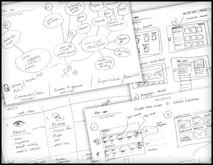
of all the things users might like. I brainstorm this through think-maps and work-flow diagrams to think through the various uses of this app, and the processes people use in the real world to achieve the same tasks. Compare the feature list against the ASD and focus the app to core features. Do I really need to offer offline browsing, when the core purpose is user is out and about and needs to look something up”. - Work out the key screens
Make quick paper prototypes to help think through different models and identify which key screens need designing to show a user through a task (or tasks). - Prototype
Create paper prototypes the most successful models to test with users. Alternatively, you can put your flat designs into the “Photos” app, to give users a more hands-on experience. - Test, iterate, and test again
I prefer batches of 5-10 users. Keep iterating until every user is sailing through the tasks your app is designed to fulfill, and when you feel confident enough to swear on a stack of bibles you’ve nailed it. - Design your final UI
The lovely chaps at www.teehanlax.com have created an Adobe Photoshop layered PSD of the iPad and iPhone GUI, which will save you a million years. My tip would be to use this for designing only. When it comes to building the app, use as much of the built-in UI assets and styling as available, rather than slicing all the graphics from your design.
Here’s the iPad GUI