It’s very easy to get lost when designing an app, but when you’re designing for a touch-screen experience, with gestures replacing clicks and scrolling, it’s even more complicated. Touch-screens introduce physical concepts to help the user navigate: spatial planes that you can “swipe” across, representations of physical objects, and zooming in and out and content. This makes the user flow in and out of content very tricky.
Immersive Vs productivity apps
In a productivity app, like email, its better if a user can drill in and out of tasks in a straightforward way. Therefore the folder based metaphor of desktop operation systems makes sense. But for a more immersive experience where you want the user to get “lost” in the experience, you need a more “open’ and loose heirachy. In my experience, “Open” is very hard to develop… as it’s harder to anticipate all the possible routes and outcomes, so the UI presents consistent behavious where ever the user is.
In this example I’m looking at an immersive touch-screen way to explore music artists. A list of artists is presented as a photo grid (or quilt), and the user can zoom into the grid to look at an individual artist. They can then swipe left and right to see the next artist in the grid. This mixes two existing navigation metaphors: picture thumbnail gallery and a page-turn magazine experience. Phew.
But now the hard bit…
Every artist has similar, or related, artists. Daft Punk has: Justice, deadmau5, Digitalism, etc. We want to encourage the user to follow these connections and explore more artists freely, but at the same time, need to give them a clear way back to the start of the app.

Model 1
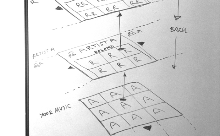
The user zooms in on an artists, then when the click on a related artists, that opens another grid. In the programming model, each artist opens as a new level in the app, and each related artist grid is another level on top. Phew! The layers build and build, and for to get back to the start, do they have to press “back” through each of these layers?

Model 2
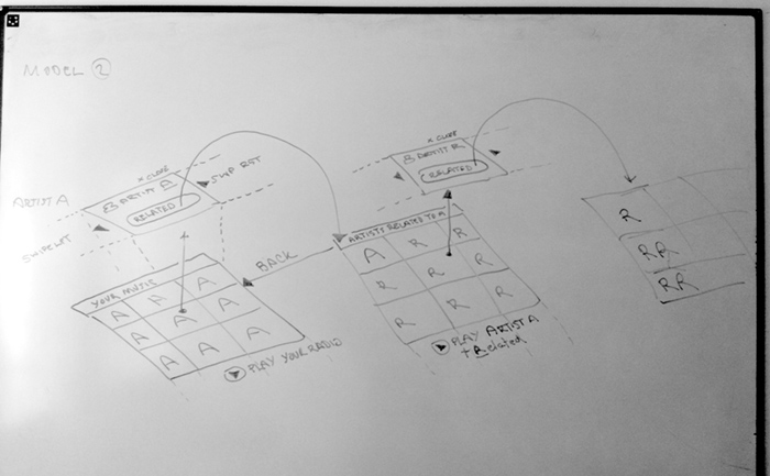
The user can zoom in and out of the grid to see artists, but if they want to click on a related artists, that launches a new grid in a new session. To get back, the user goes from grid to grid. It’s more like a concept of islands of artists, than levels. This will be much easier to develop, as each time you press to see a set or related artists, you are clearing he grid before, much like performing a new search.
If this comes across as an incoherent ramble, it is because my mind has been broken by too long in front of the whiteboard!