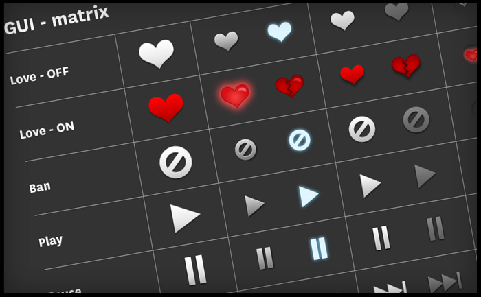
In an effort to maintain consistency and quality of our application icons, I have been collating a GUI (Graphical user interface) reference doc. As we produce applications on different devices and platforms, we need to take native UI styles and features into account. Although there can be no “generic” iconon all platforms, we can still achieve a consistency of drawing shape and general ‘character’ of icons across apps. For instance: to create tab and activity icons in iOS you provide white shapes on transparent backgrounds, the “blue gloss” styling is added dynamically within the app.
This matrix is more of “how are we doing” document to see if Last.fm style shines through the veneer of native UI styling. The grid shows platforms in columns (names removed for confidentiality of work in progress) and the rows display the various activity states: rest, hover, press)
