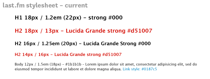
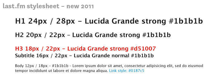
Some spring cleaning on Last.fm to clean up the typogoraphy on the site. A small change, but one that will make me very happy ; )

The first step is to make the heading levels more distinct, so there is a clearer visual hierarchy. Heading levels should have the same effect as the old eye test, noticably diminishing in size. The current site headings are a bit samey. This helps the bowser to understand how the page is divided and gives a “vertical rythm”, making it easier to scan down the page to find omething specific.
Secondly, we need to clean up the CSS and html, so that the structure of the content follows the intended visual and semantic hierarchy . H1 for page title, H2 to divide content in main themes/sections, and H3 headings to title separate under each H2. These changes will make the page legible without the stylesheet, which is not only good practice, but also frees the content for use in multiple contexts (such as mobile/tablet).

As these changes effect the structure of the site we can’t just roll them out site-wide. They’ll be included as we update various sections of the site, the first being Last.fm Charts.
A note on accessibility
CSS gurus say you should not use units like “px” or “em”. It is naughty. In this case I have used united px values as a guiding principle, the CSS will probably be unitless.