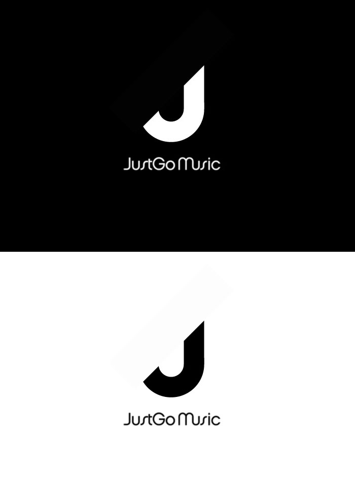
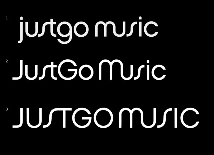
In the second iteration I was asked to try a more minimal logo based around the “J”. We also had a font we really liked called Chalet London 1970 by House Industries.
The client liked the last two ideas, a combination of the clean J shape with a bit of movement.
After some thought, the client decided they actually quite like the rotated “J” logo, an wanted to see some development on that version with colour option. Nearly there. Replaced the funky Chalet “S” with a customised “S” from Lucida.
