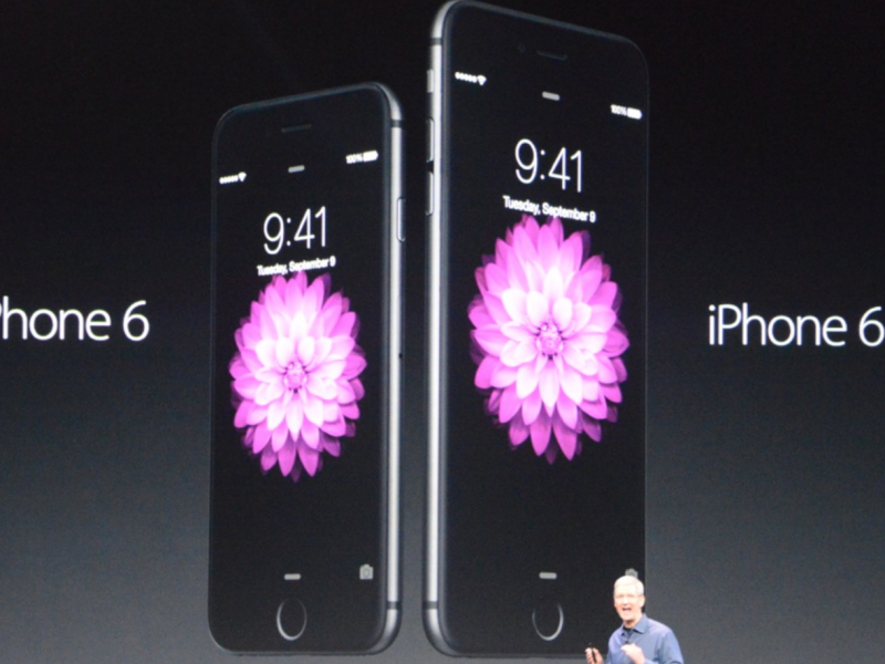
Compared to Android, designing screens and creating assets for iPhone use to be easy. For a ling time we’ve only had to deal with two densities, and only 2 screen dimensions. The iPhone 6 Plus introduces a new screen dimension and a new HD screen. It’s a fairly typical 1920 x 1080 format, once popular with LCD TVs. This post is a place for me to log all the new sizes, and also to compare the require assets against Android’s require set of densities. The strange this is, for the iPhone 6 Plus, the graphics have to be provided much larger than the 1920 x 1080px screen resolution, as they are set at x3 standard resolution and then scaled down to fit the hardware.
iPhone 6 Plus screen size / dimensions
- iPhone 3 – 480 x 320px
- iPhone 4(s) – 960 x 640px
- iPhone 5(s) – 1136 x 640px
- iPhone 6 – 1334 x 750px
- iPhone 6+ – 1920 x 1080px (scaled down from 2208 x 1242px)
iPhone 6 plus launch image resolution dimensions
- iPhone 4 launch images: 640 x 960px
- iPhone 5 launch images: 640 x 1136px
- iPhone 6+ launch images: 1242 x 2208px and 2208 x 1242px (the iPhone scales this down)
iPhone 6 plus Retina HD image resolution densities Vs Android density pixels
- iPhone 3 / Android MDPI | 100% | 1x
- iPhone 4, 5, 6 Retina / Android XHDPI | 200% | @2x
- iPhone 6+ Retina HD / Android XXHDPI | 300% | @3x
Some devices scale as well
Android and iOS makes it easy to create different resolutions by requiring graphics at easy scales x2, x3, x4, but manufacturers make screens to fit the design of their devices and x2, and x3 does always fit what they want. Therefore, some devices artificially scale the resolution up or down, for instance the new iPhone 6 Plus requires x3 graphics, but only has a 1080 x 1920. However, the graphics you supply to the developer still need to be x3 size for Android.
This is fine for icons, but is an issue if you’re providing full screen images as the aspect ratio may be different.
See my guide for How to start designing Android apps in Photoshop & what is a dp?