Retouching product photography in Photoshop

Product photography retouching in Photoshop

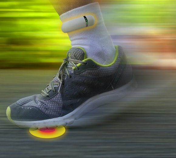
I used a bit of motion blur (it’s a running app, it’s forgivable!), I also increased saturation to make the green of the foliage match the logo.

Using Photoshop motion blur and saturation

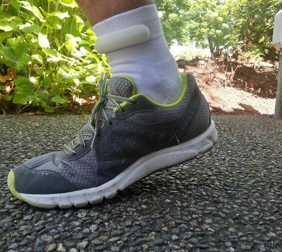
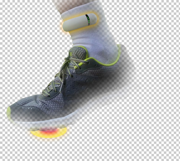
Cropping out the shoe on a masked copy of the layer

Then I masked out a copy of the original shoe image on another layer to have it un-blurred. The image is now more dynamic and blurring of the background helps shifts focus to the product.

03

Finally adding the copy, iPhone image and logo.

sensoria_indiegogo-text

Pre-order your Sensoria smart sock and fitness tracker

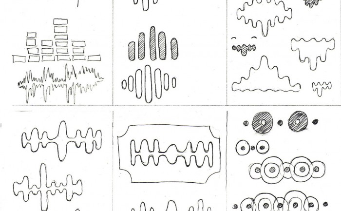
Electronic music site logo – sketches

I’ve been working on the branding of a new product creating a social space for the electronic dance music scene.

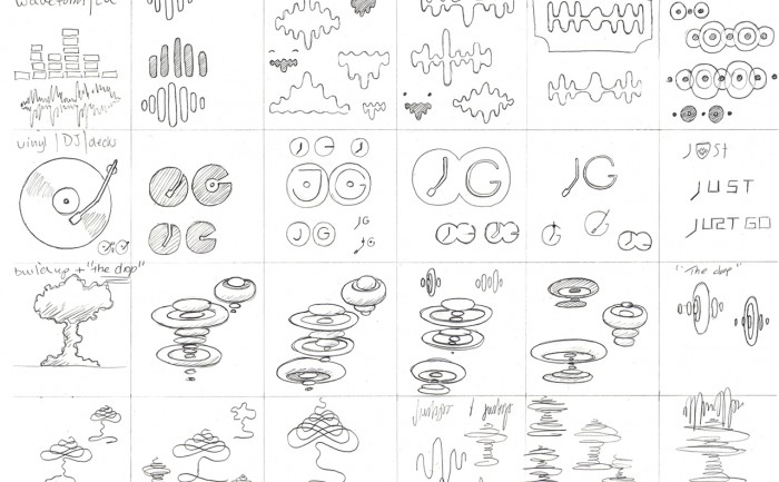
The current logo is the old "grpahic equaliser" - I developed that into a more abstract waveform, that then started to look look like the cut-out shape you see in a razor blade.


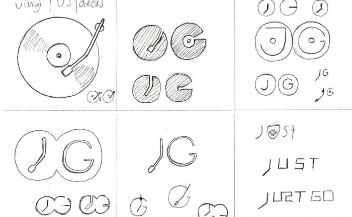
I have to get the whole DJ cliché out of the way. It was nice that the "J" could be worked into the arm of the deck.


Morphological matrix

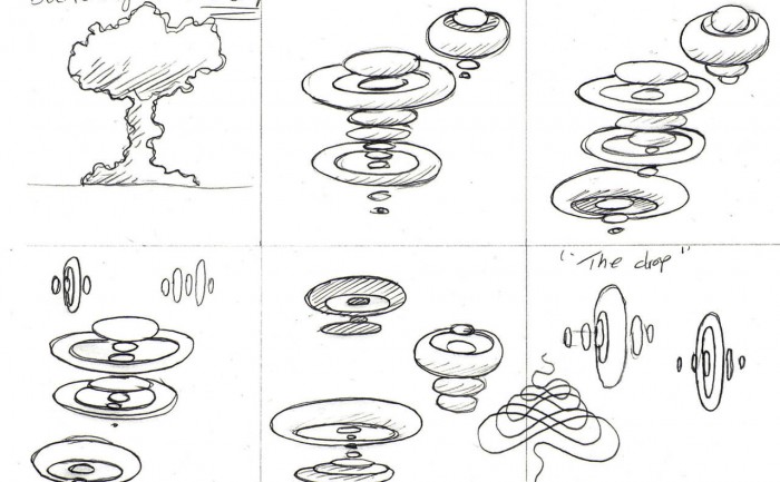
After doing some research into the scene and some broad thinking on possible themes that might add personality to the brand, I start to sketch ideas using a “morphological matrix” as a way of organising the ideas, it also helps to make those lateral connections. Here’s the matrix as a whole…

Last.fm Festivals “Brightest stars of 2012” infographic

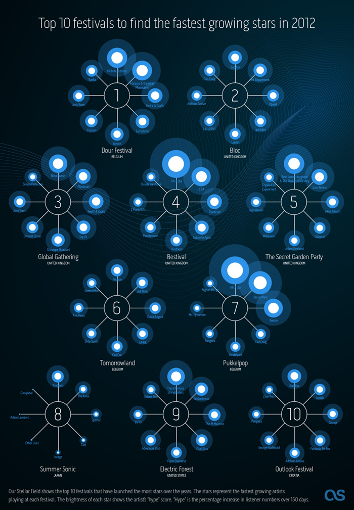
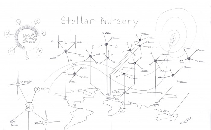
Last.fm Festivals 2012 infographic - Stellar Nursery

Last.fm can already recommend the most compatible festivals based on your current music taste, but what about discovering new music? We decided to use a bit of 10% time* to see if Last.fm listening data could be used to recommend the best festivals for seeing the future stars of summer 2012.

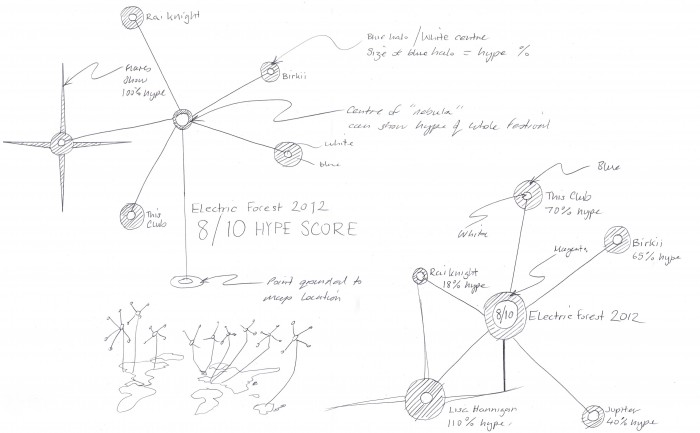
@Omar711, Last.fm’s data scientist, started by looking at new artists playing in festivals this summer to see which have a high “hype score”. Hype is our measurement of how fast an artist’s audience is growing over a short period of time. Then Omar looked at historical data for all festivals over the last few years to see how many artists had become successful (i.e. grew in audience) directly following the festival. This gave us a ranking of how influencial festivals were in growing new artists. We pulled out the top 10 for our infographic, and then highligthed the artists with the most hype.

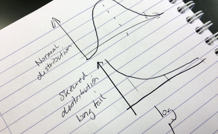
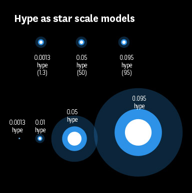
As we tend to call artists that have big audiences “stars” I thought I would use stars in my infographic (I find these dazzling leaps of lateral thinking exhausting). The hype scores would be represented as the brightness of the star. However, when I tried to convert the hype scores into percentages to scale the circles in my infographic, some were massive and other came out microscopic. So I called Omar over and he said “ah yes, skewed distrubution. Just use log or square root”.

Eh?

It must be strange for Omar to be working so closely with an idiot. A short math lesson later and I had a nice range of percentages to play with (and I felt a bit smarter, almost ready for my own PHD ;).

The difference between normal and skewed distribution.
Last.fm festivals infographic scale
Last.fm festivals infographic "star" scale

* staffers are given 10% of their time to work on self-driven projects, providing the work is related to music data (I have been told off for spending too much time working on a diorama of Jabba’s palace for my Star Wars figures)

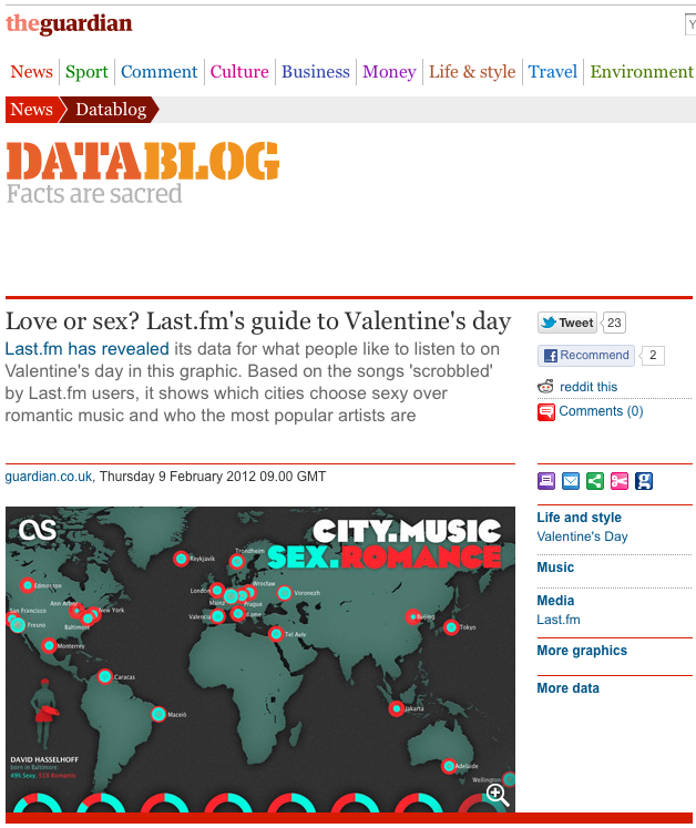
Last.fm Valentines infographic posted on the Guardian Datablog

Guardian Datablog features Last.fm Valentine's infographic

It may not seem like much, and it’s no yellow pencil, but this means more to me as I LOVE the Guardian Datablog. It’s a shame the colour fooked up in the screenshot they did. Don’t now what happened there.

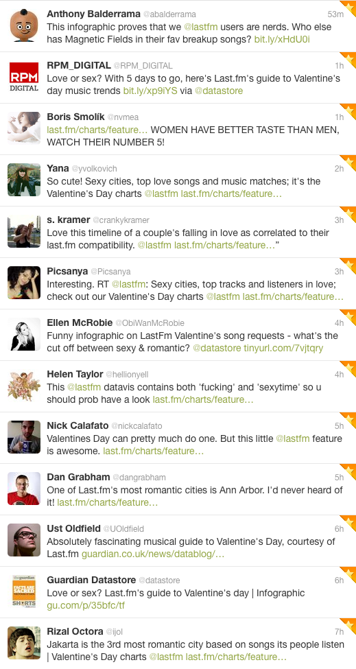
Some good tweet feedback too


Screenshot of tweets sharing and commenting on the Last.fm Valentine's Day infographic

Valentine’s Day Infographic on last.fm

Valentne's Day logo for Last.fm
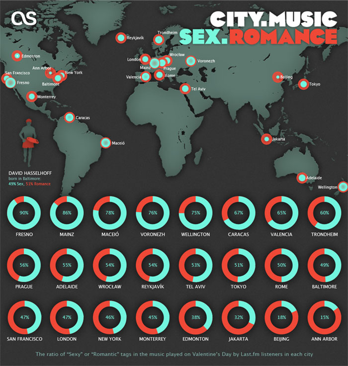
Valentine's Day Music Infographic for Last.fm - CITY. MUSIC. SEX. ROMANCE.

“We don’t have the time for psychological romance”
– Larry Blackmon, Cameo

As my missus will testify, I’m not very romantic and greetings cards make me nauseous. So I wasn’t looking forward to designing a feature for Valentine’s Day.

Then I realised it might be interesting to use music data to see if anyone else felt the same or if Valentine’s day was full of hopeless romantics playing “Somebody To Love” by Jefferson Airplane back-to-back like saps.

So I went to see Omar…

Omar the Oracle

I don’t pretend to understand what Omar does, I like to think his job involves “running things through the computer”. He is always very patient with me, even when I ask him silly questions like: “Do you think David Hasselhoff’s audience was affected by the drunken cheeseburger + floor-as-plate incident?” (it did, the Hoff gained an extra 400 scrobbles that week). Omar was more than happy to dig into the Valentine’s Day stats, especially when I said I wanted to compare the music tags “romantic” with “sex”. I’m always running the word “sex” through the computer and it never takes long.

To get a clean set of Valentine’s data to analyse, Omar compared the listening behaviour on 14 Feb over a number of years to the behaviour on any other day of the year, normalised it to remove erroneous “new release” spikes, thereby sifting out the tracks unique to Valentine’s Day. Then we went to work with the location and genre tags.

This gave us a list of cities ranked from Sexy to Romantic and the proportion of sexiness for each.

Looks like I need to head to Fresno on 14 Feb!

See the full feature on last.fm