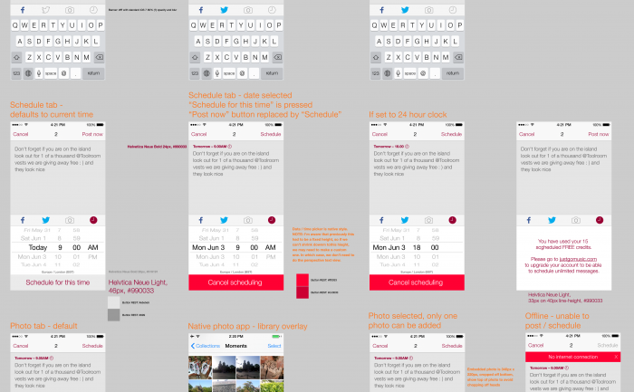
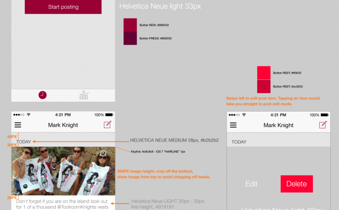
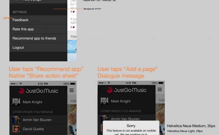
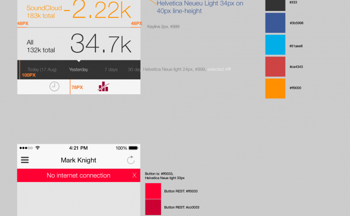
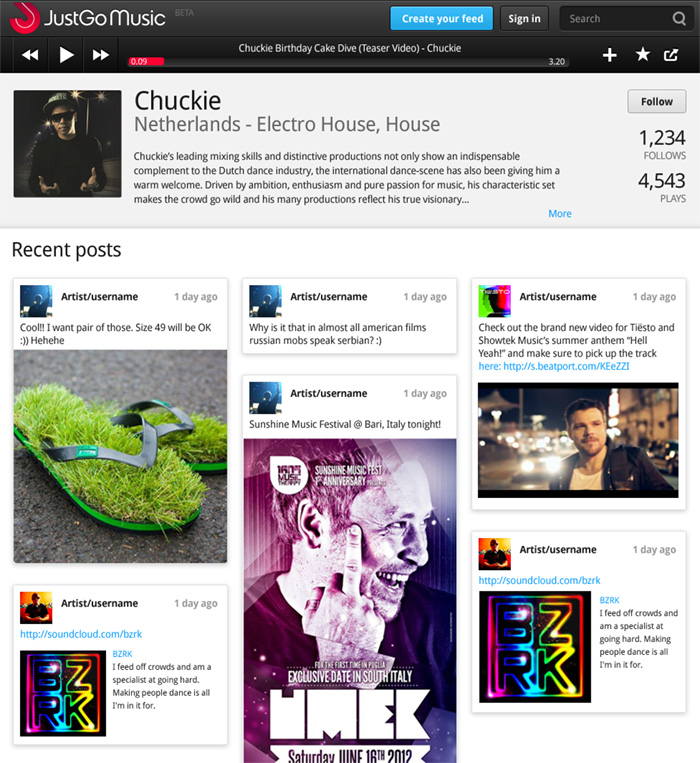
The JustGo Music app helps DJs manage their social media presence with combined posting to Facebook and Twitter, and engagement statistics.
Category: justgo
Justgo Music – more effects please
In this iteration we are moving away from the flat navigation styling, and adding some depth and detail. I’m designing an iOS app at the moment, so I’m at home doing this stuff. Although, I think clean and minal is a better way to go online as, like the “little black dress”, it never goes out of fashion.
Visit Justgomusic.com
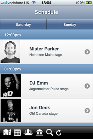
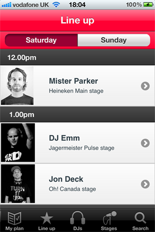
Escapade Festival iPhone / mobile App
My friends @JustGoMusic needed some help tidying up their app for the Escapade Dance Music Festival. The app needed to be submitted to iTnes the next day, so I had great fun coming up with icons under the stopwatch.
You can download the App here

Electronic music site logo – we have a winner!


Phew, got there in the end.
Electronic music site logo – detailing & colour
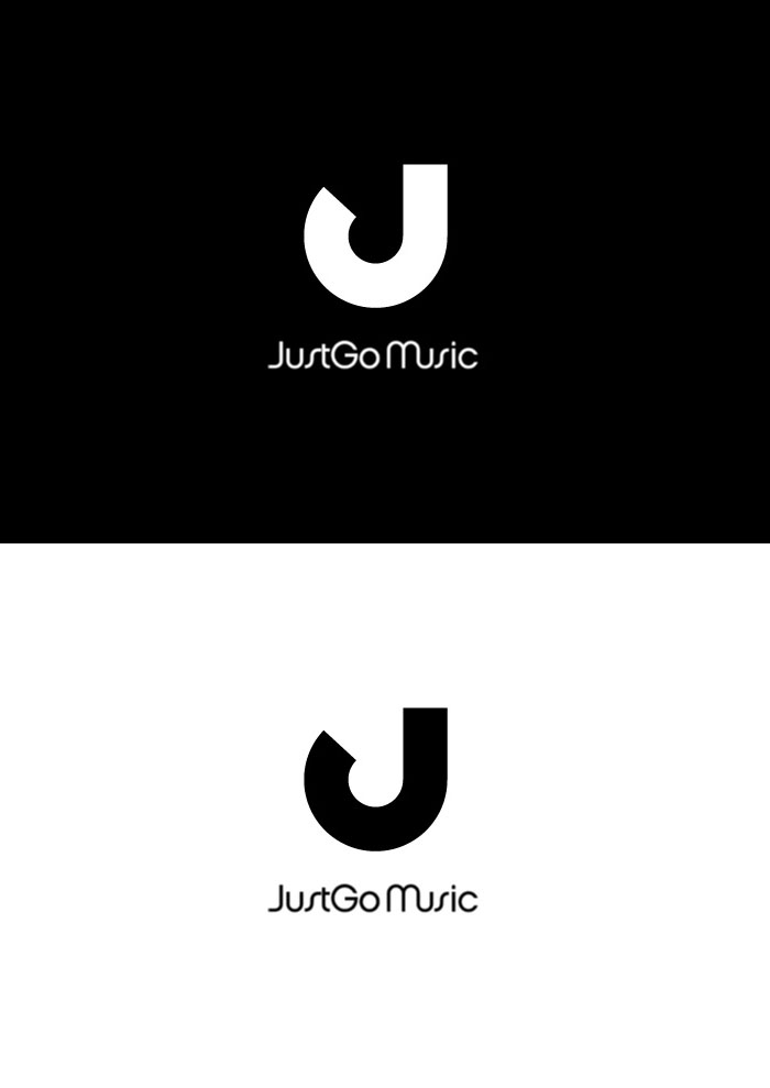
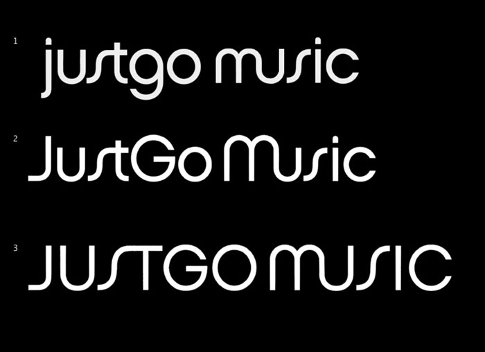
After some thought, the client decided they actually quite like the rotated “J” logo, an wanted to see some development on that version with colour option. Nearly there. Replaced the funky Chalet “S” with a customised “S” from Lucida.
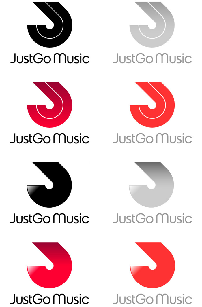
Electronic music site logo – fine tuning
Electronic music site logo – 3rd iteration
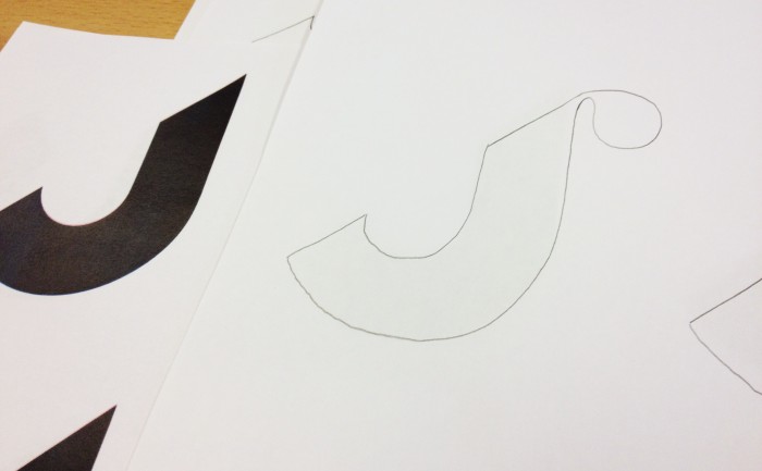
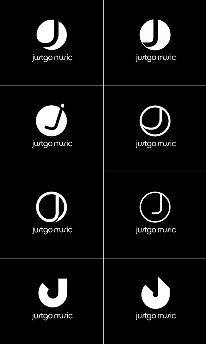
In the second iteration I was asked to try a more minimal logo based around the “J”. We also had a font we really liked called Chalet London 1970 by House Industries.
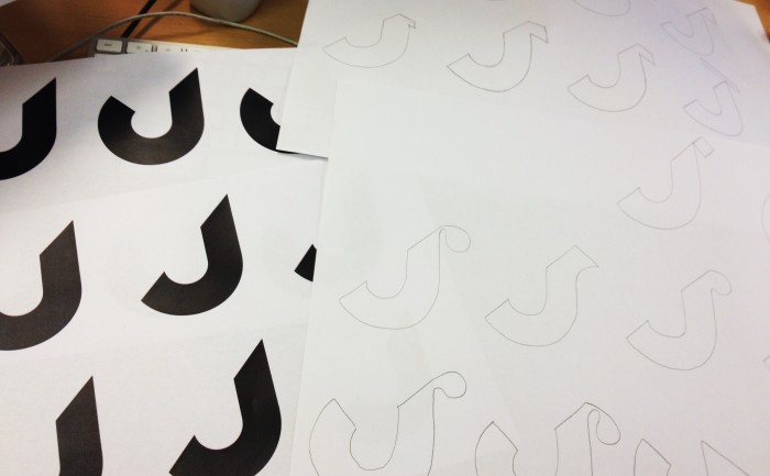
The client liked the last two ideas, a combination of the clean J shape with a bit of movement.
After some thought, the client decided they actually quite like the rotated “J” logo, an wanted to see some development on that version with colour option. Nearly there. Replaced the funky Chalet “S” with a customised “S” from Lucida.

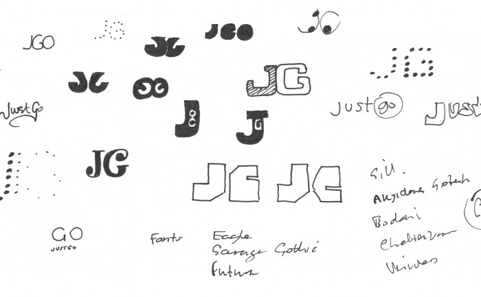
Electronic music site logo – sketches
I’ve been working on the branding of a new product creating a social space for the electronic dance music scene.
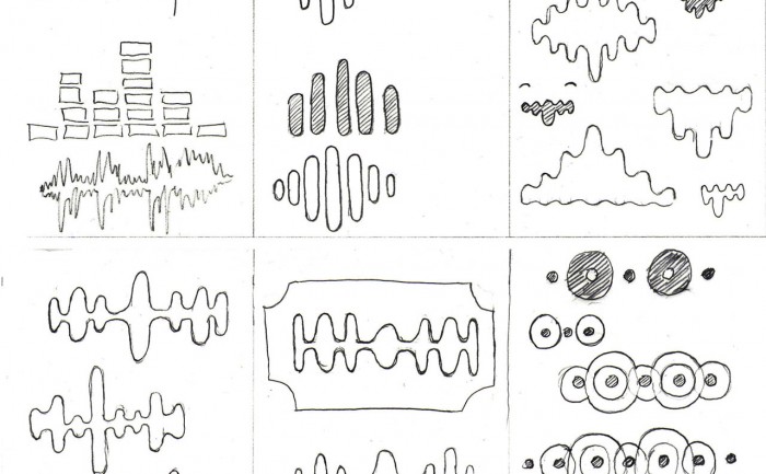
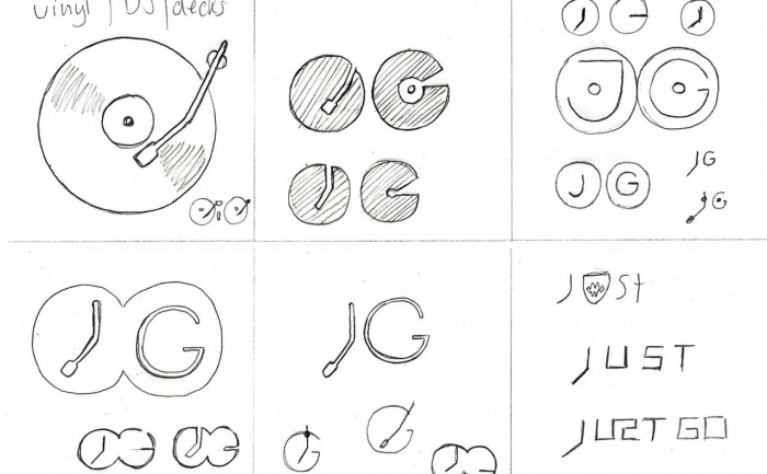
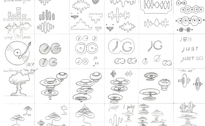
Morphological matrix
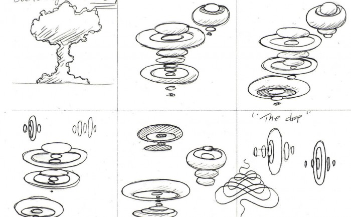
After doing some research into the scene and some broad thinking on possible themes that might add personality to the brand, I start to sketch ideas using a “morphological matrix” as a way of organising the ideas, it also helps to make those lateral connections. Here’s the matrix as a whole…
