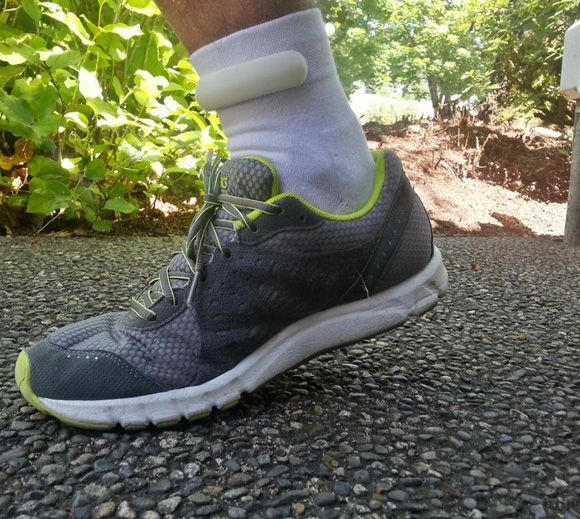
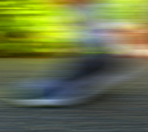
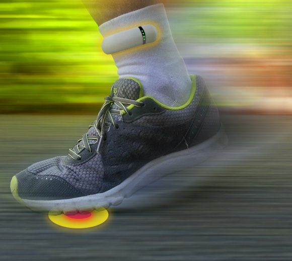
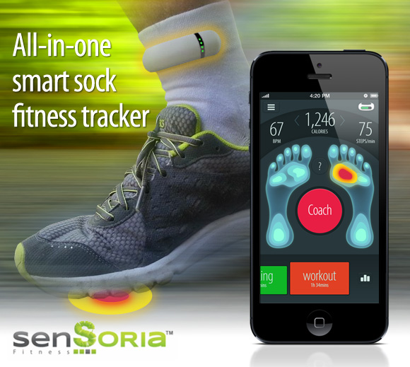
I used a bit of motion blur (it’s a running app, it’s forgivable!), I also increased saturation to make the green of the foliage match the logo.
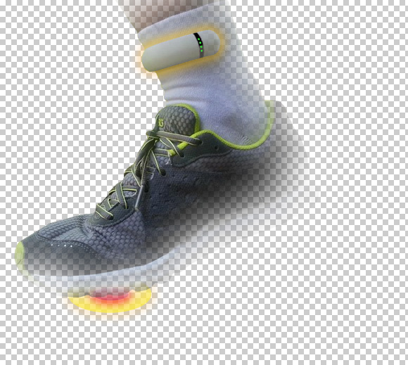
Then I masked out a copy of the original shoe image on another layer to have it un-blurred. The image is now more dynamic and blurring of the background helps shifts focus to the product.
Finally adding the copy, iPhone image and logo.
