Smart playlisting music app – demo

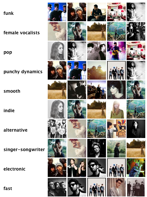
I’ve been working with our MIR team (Music Information Retrieval) on the new instant playlisting engine, designed to provide instant playlists from collections of any size.

The guys have created a playlisting demo which you can try out against your Last.fm profile. Please ty it out give us your feedback. You can also read Mark Levy’s background to the technology on the Last.fm blog.

My part in this has been to think about the user experience and ensure that the catagories we choose to create fit with the natural expectation and behaviors that people use when making their own playlists. This engine will form part of a new iOS product I’m designing for Last.fm.

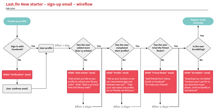
New starter email campaign user flow

New starter email user flow diagram created in Omnigraffle

This is a quick user flow to sketch out an email stratergy for communication with new starters, offering prompts to fill profiles, engage with the service, or hints and tips as a response to (or lack of) user activity.

The flow chart was done in Omnigrafle, with which I have a love/hate relationship. I think the auto alignment features are incredible, but as a designer it feels a bit like backseat driving.

Last.fm charts UX & visual design

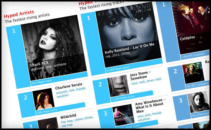
Last.fm Charts style

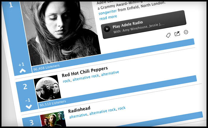
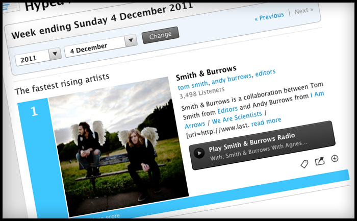
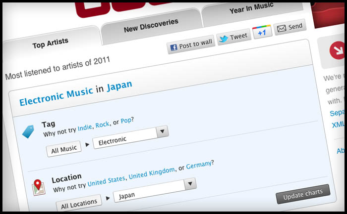
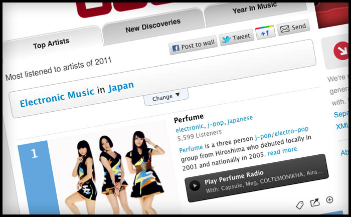
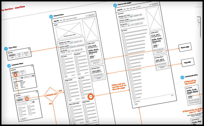
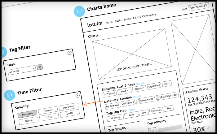
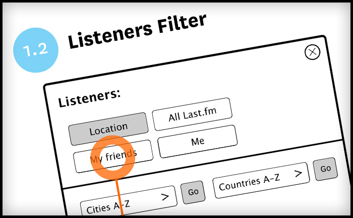
I’ve been working on a refresh of the “Charts” section of the Last.fm site, including a new filtering options for “Hype”, “Top Artists” and “Top Loved Track”. This first launch only includes filtering by date, a later release will include “genre” and “location” filters, so that you’ll be able to can see the best “electronic” music or “black death metal” in your home town. Have a play at last.fm

Last.fm charts UX and visual design

Last.fm charts UX and visual design

Last.fm artist charts UX and visual design

Last.fm artist charts wireframes and user flows

Last.fm charts UX wireframes and user flows

Last.fm charts UX wireframes and user flows

Last.fm charts UX wireframes and user flows

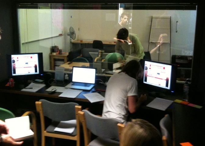
Testing in the lab at Flow Interactive

My favorite place: testing stuff in the lab behind a one-way mirror. I moderated a couple of the sessions, which were with existing LFM users. We hired the excellent user research fascilities at Flow Interactive in Clerkenwell, mostly because they have air-con and a fridge full of coke.
20110706-123235.jpg

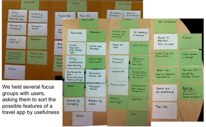
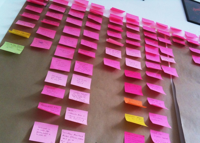
We made notes on post-its, one observation per note, with quotes from users to back up observations. We used rolls of brown paper to collect and store the notes for taking away later, the paper was divided into the broad themes we were testing. Back at the office we sorted the post-its more thoroughly into columns under more exacting topics. Several people were taking notes so we had to de-dupe, however it was important to keep similar comments if made by different users, as this indicates that the issue might be more common to a wider group.

The death of a thousand notes
20110708-105931.jpg

Affinity Sorting

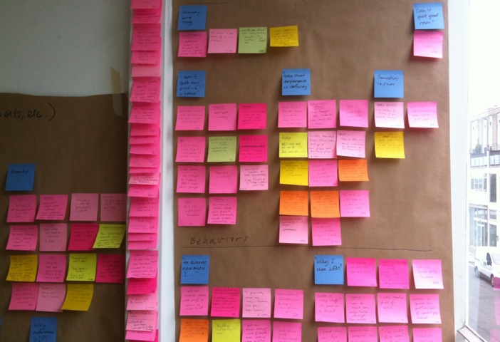
The next step is to do an “affinity sort” to look at each comment individually and sort them into groups based on perceived patterns, rather than features. It’s important to start quite freely and not to place a heading above the group or draw a conclusion too quickly. It’s basically finding groupings based on a gut feeling that different users were having similar issues. In this research session we were testing different features, such as “Events & Festivals” and “Artist Library”. In afinity sorting I noticed that a user who couldn’t find  their recommended events was probably having a similar issue to a user who couldn’t find their recommended artists in the “library” section. These two notes were moved from their former “feature” headings into a new group called: “Issue with finding personal recs”. The issue had nothing to do with events or radio, it was a issue around users needing a uniform place to access all their personalised info.

BEFORE: Basic sorting by feature or topic
20110712-114148.jpg

AFTER: Sorted by affinity – patterns emerge
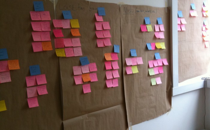
Affinity sorting notes from a user experience research session.