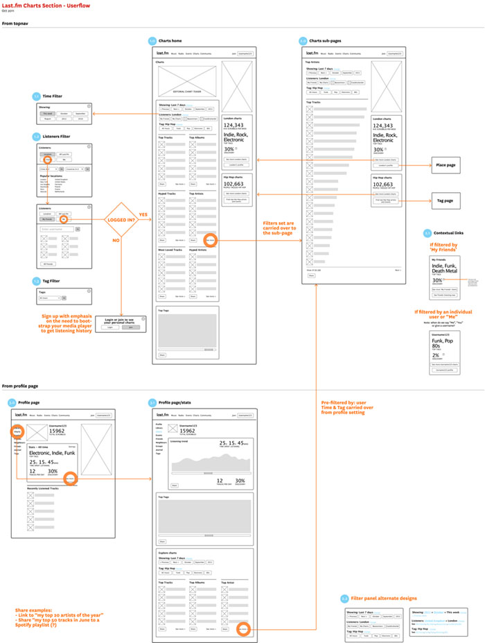
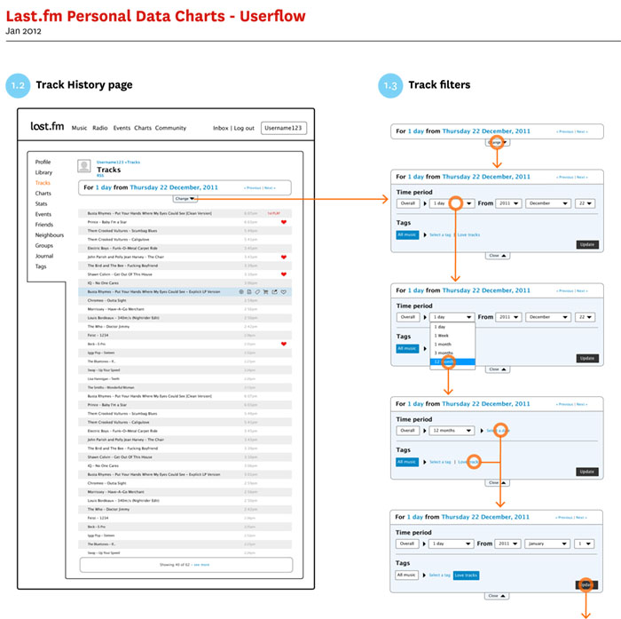
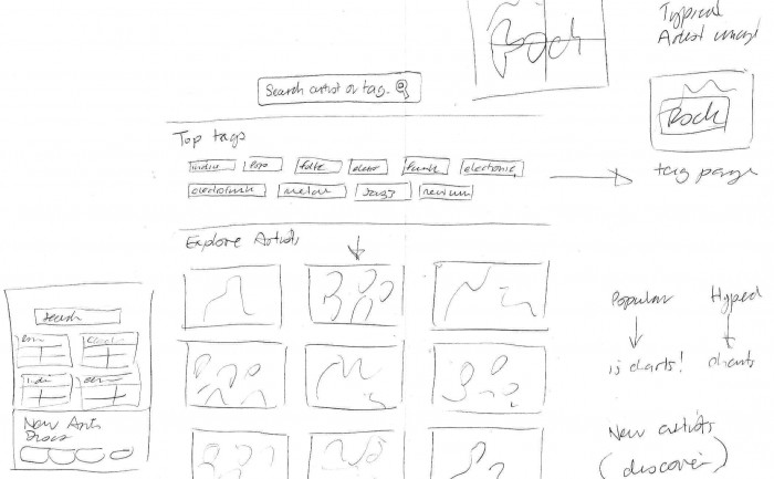
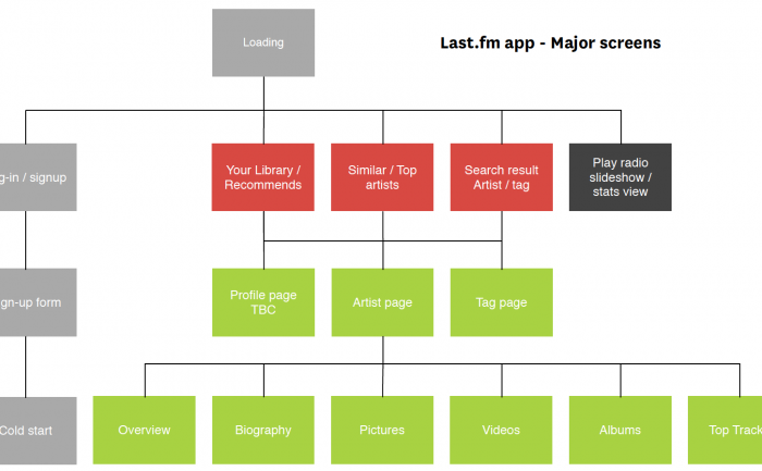
The plan for the new charts page was to make it more dynamic by including location and tag/genre filtering. In addition to this we were considering intergrating personal user listening charts. Although user charts were for a later iteration, this wireframe needed to workout the overall IA to prepare for the later development work.
Category: user flow
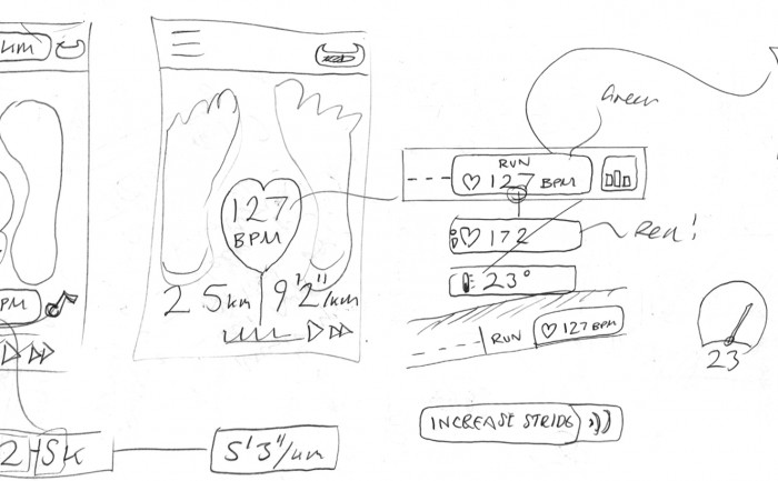
Sensoria Fitness iPhone app UI design – Sketches
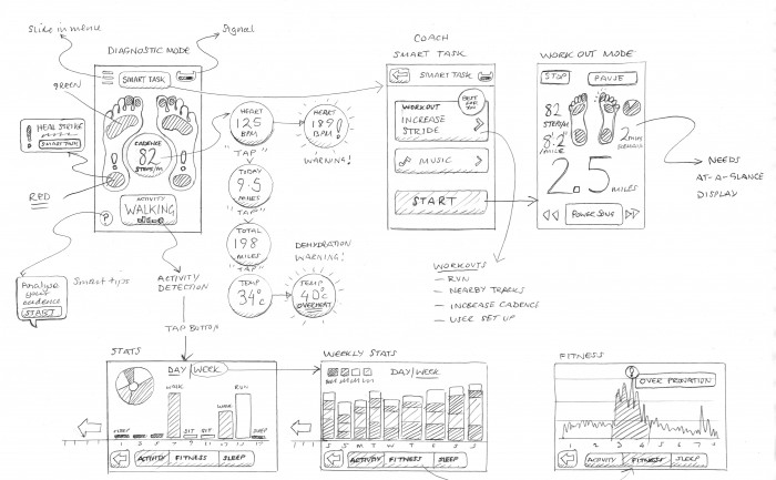
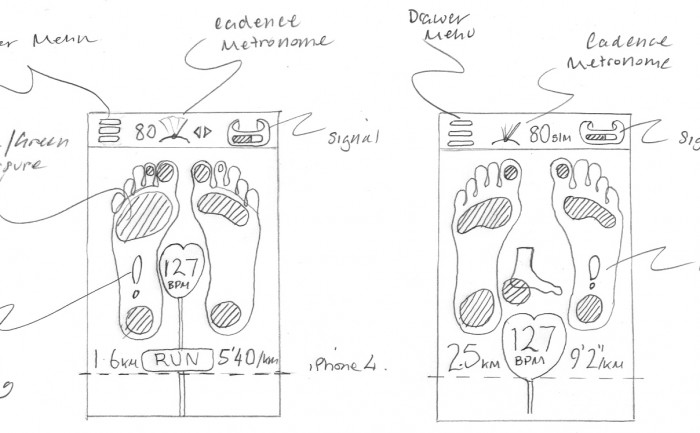
I’m very excited to be working with Heapsylon on an iPhone app for their amazing Sensoria, a super accurate fitness tracker that connects your iPhone to a smart sock and sensor that tells you how well you run. Wearable technology and smart fabrics are a fascinating new form factor, and as a runner I’m very keen to get hold of a prototype as soon as I can. Click here to pre-order yours.
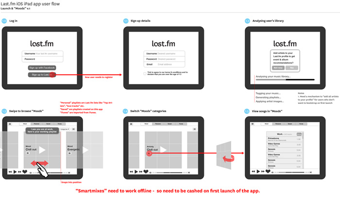
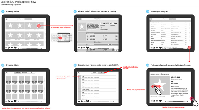
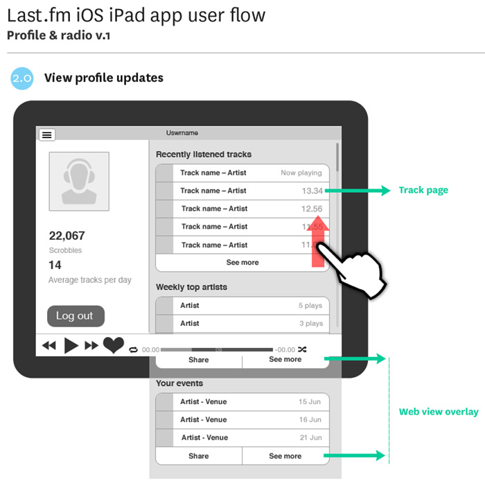
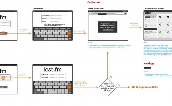
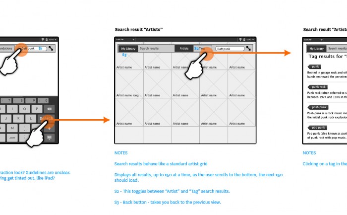
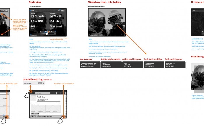
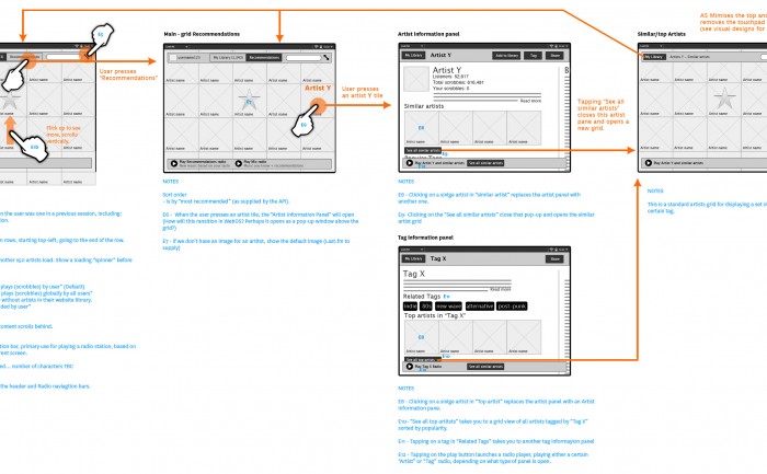
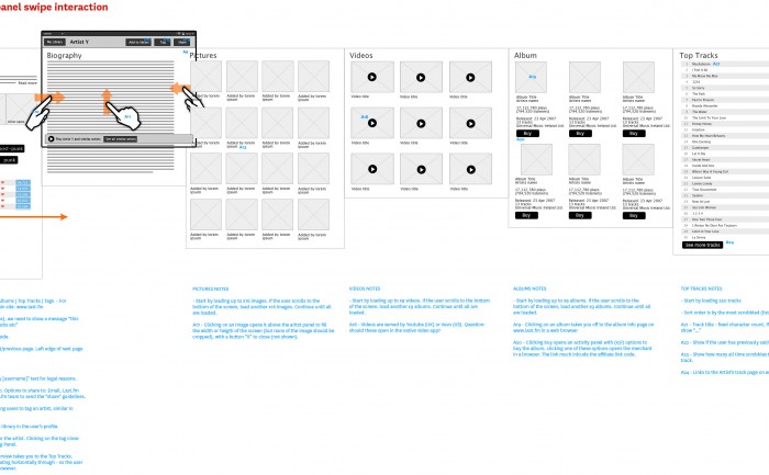
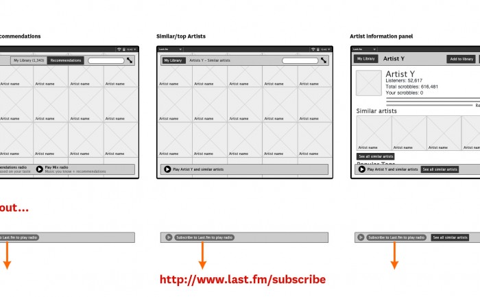
Scrobbler tablet & mobile music app design – wireflows
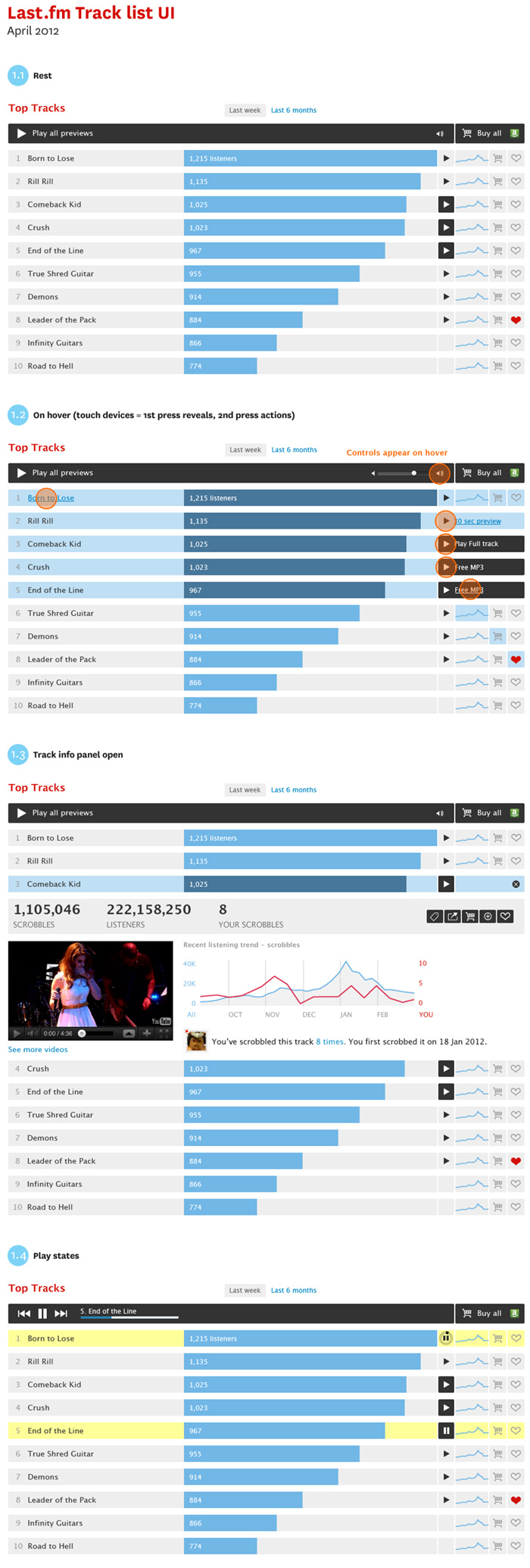
Prototype music track list UI
New playable track list UI style for artists and catalogue pages.
Objectives:
- Make a distinction betwen full playable tracks and 30 second previews
- Create a player module to play all tracks avaible
- An expandable ajax panel to get track info, stats and content in position to increase engagement.
- Add improved e-commerce features, including the ability to buy a list of tracks in one.
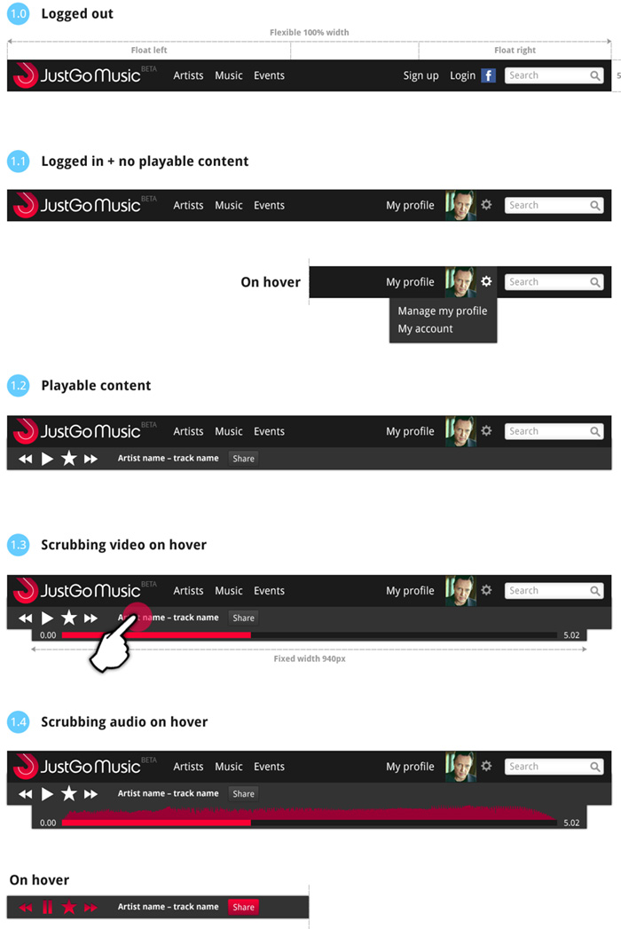
JustGo Music – Beta design specification
Responsive design for navigation
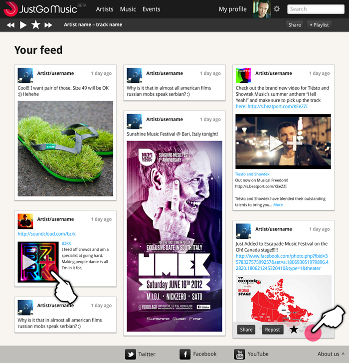
Here is some work I’ve been doing on the Beta site for JustGo Music, which has just gone live. We’re worknig in agile, so designing by component rather than finished pages. The UI designs feature responsive behaviour for tablet and mobile, and a baseline grid to align posts across columns. See justgomusic.com
Radio hack day – sketches
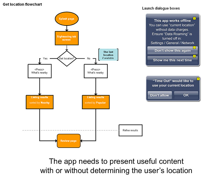
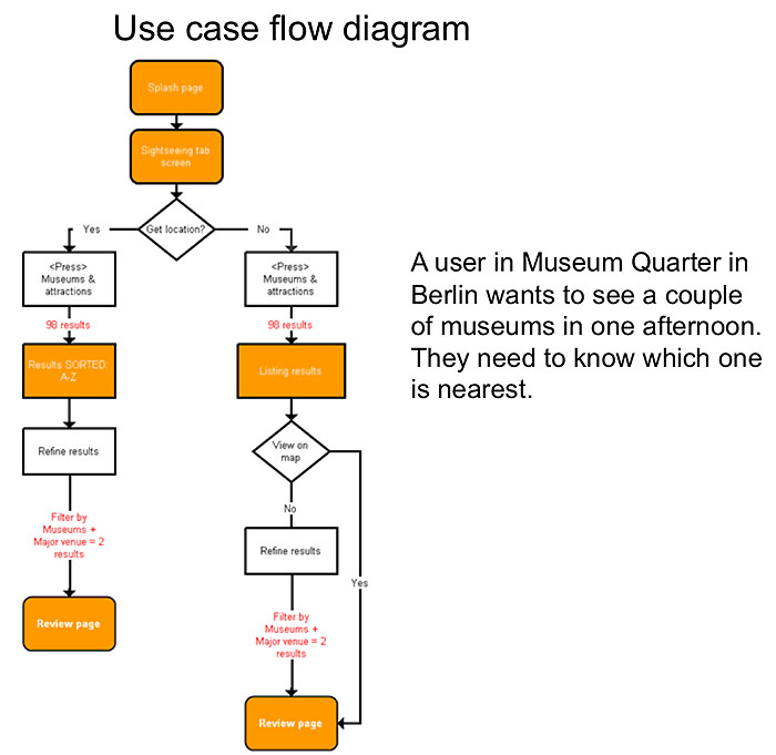
Time Out City Guide iOS mobile apps – user flows
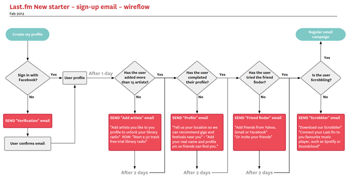
New starter email campaign user flow
This is a quick user flow to sketch out an email stratergy for communication with new starters, offering prompts to fill profiles, engage with the service, or hints and tips as a response to (or lack of) user activity.
The flow chart was done in Omnigrafle, with which I have a love/hate relationship. I think the auto alignment features are incredible, but as a designer it feels a bit like backseat driving.
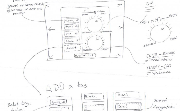
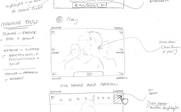
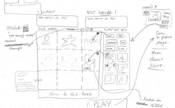
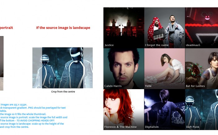
Last.fm tablet music discovery app concept sketches
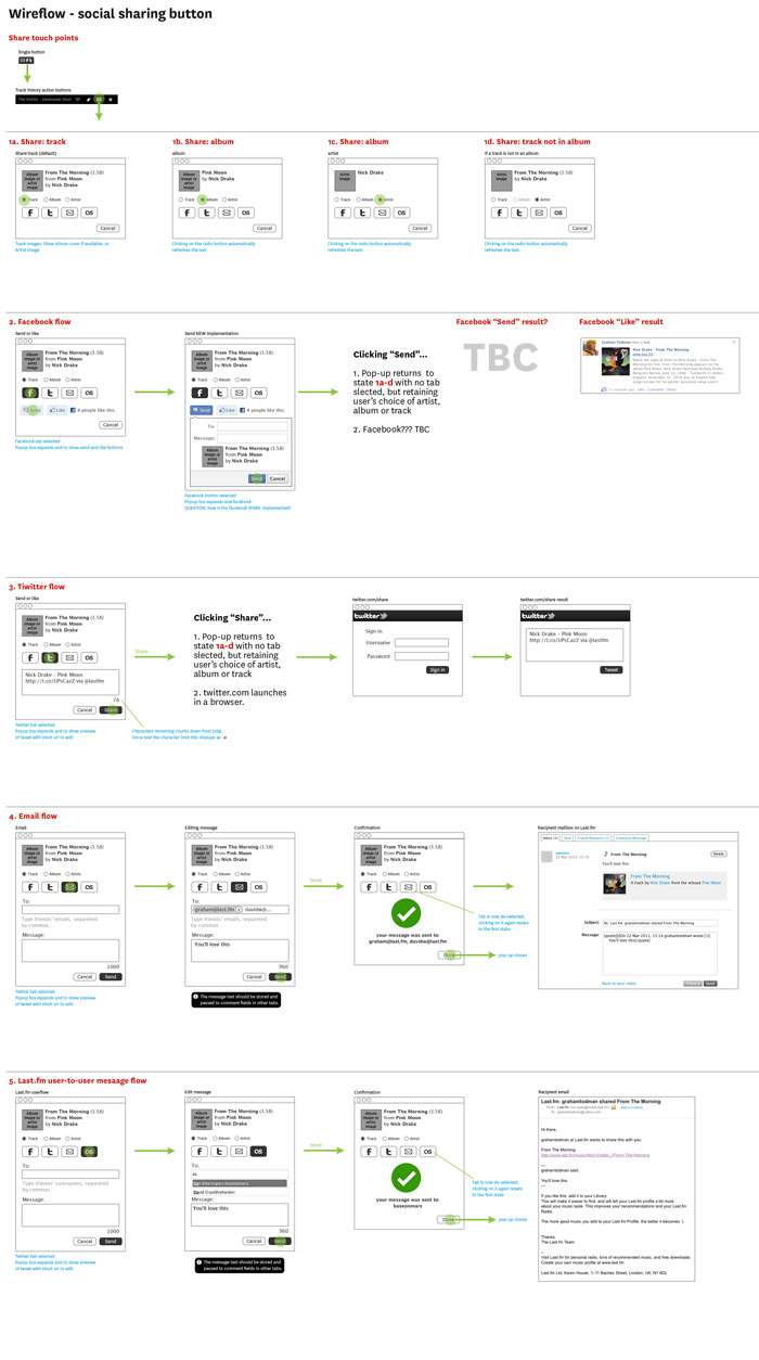
Social share UI wireframe
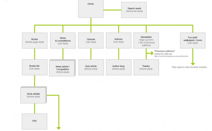
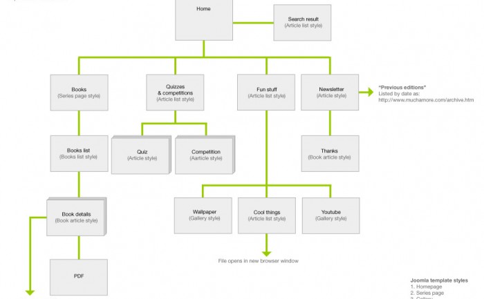
Books With Bite site map
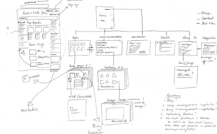
Books With Bite skteches
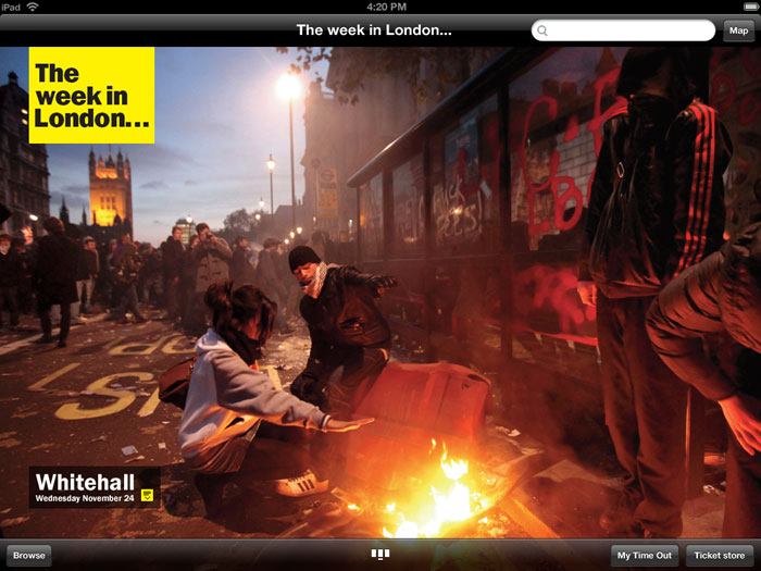
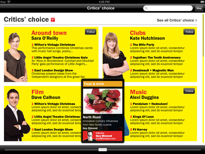
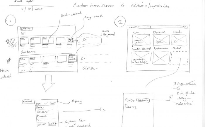
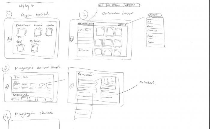
iPad app concepts for Time Out
iPad app concept sketches for Time Out
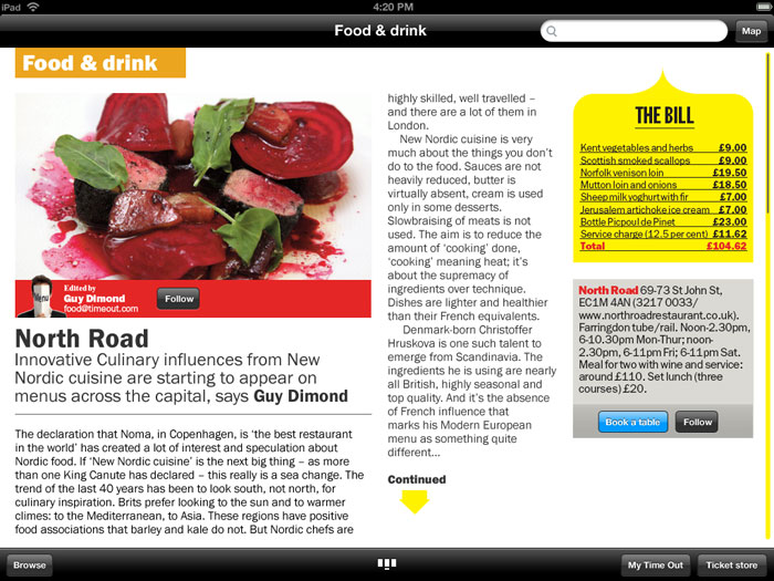
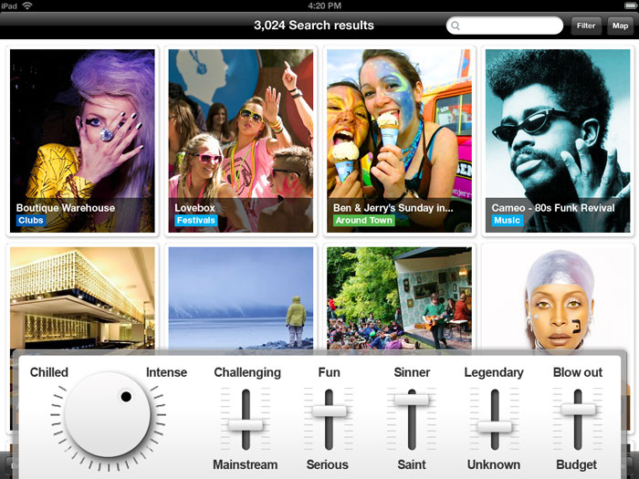
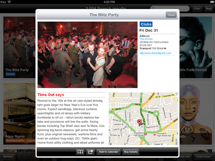
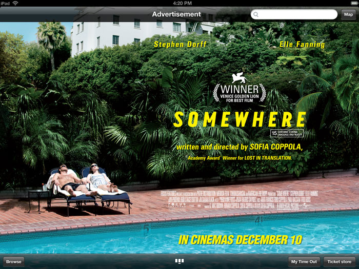
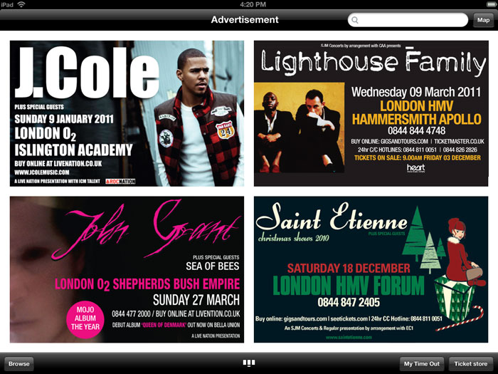
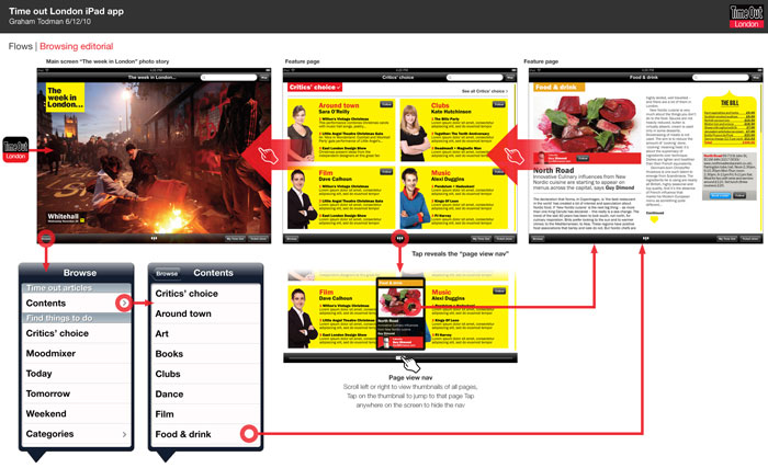
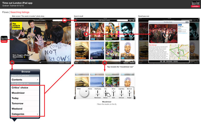
In my last few months at Time Out I was asked to create some concepts for a Time Out London iPad app. The designs were intended as a discussion point for possible commercial opportunities such as advertising and paid-for content, but also to have something visual to get excited about.
Time Out are the best known for providing “What’s on” information for London to help people find something to do, but they also have strong editorial content on life in London, such as: opinion pieces, cultural commentary and reviews.
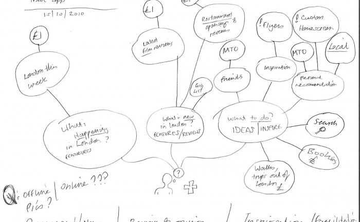
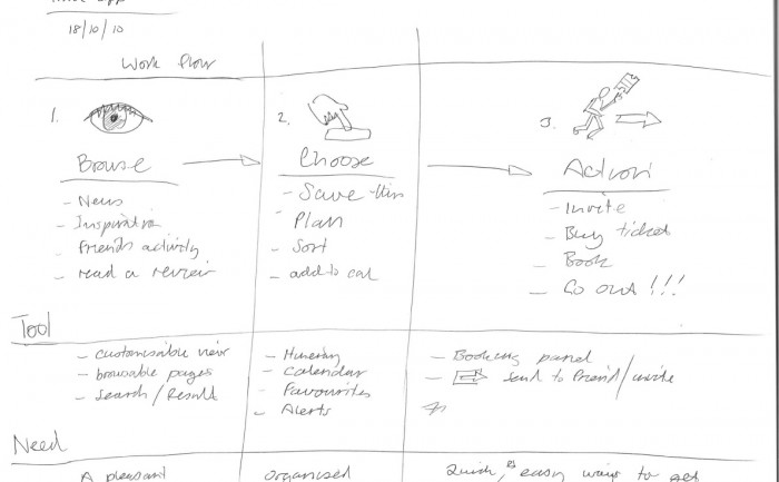
The brief I was given for this app concept was that it should feel like a magazine, but have a prominent search facility, however as started mapping out the use cases (below) I quickly came to the conclusion to that there should be a browsable magazine style app (this was a whole year before Newstand and Adobe’s iOS publishing tools), and a separate productivity app for finding things to do. In general, apps are best when they are focused on one purpose or solving one user goal, which makes for a simpler UI. For me, the use case of a productivity tool and a sit back and browse a magazine felt somewhat at odds with each other.
