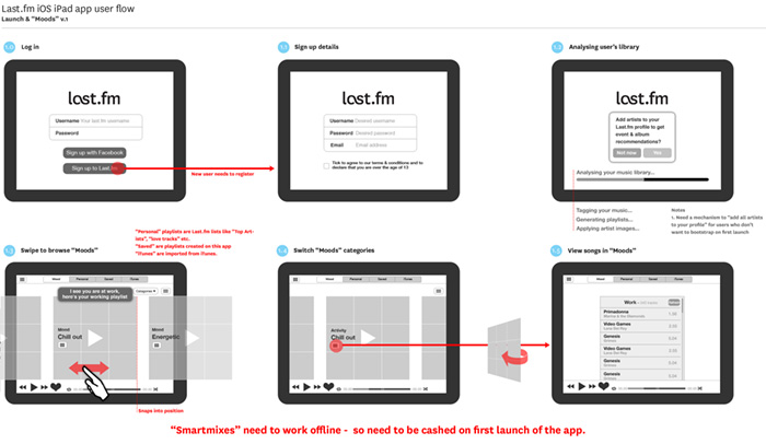
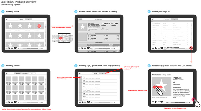
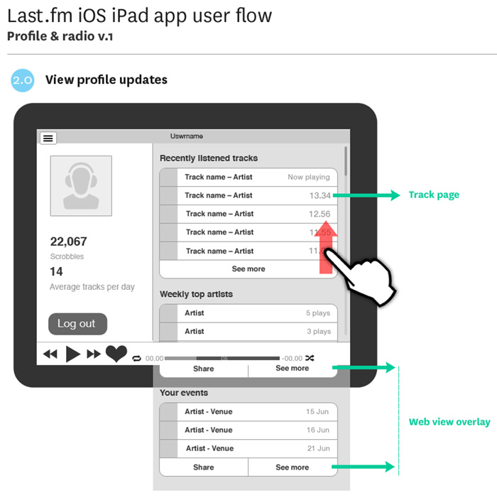
Wireflows for the local music library stats and playlists app I’m working on.
New playable track list UI style for artists and catalogue pages.
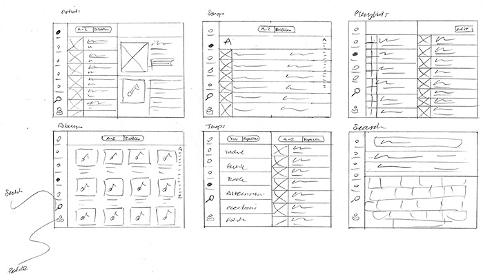
Here are some sketches on an iOS app I’m currently working on, laying out possible ways to interact with your local music collection using listening data.
or even better, here…
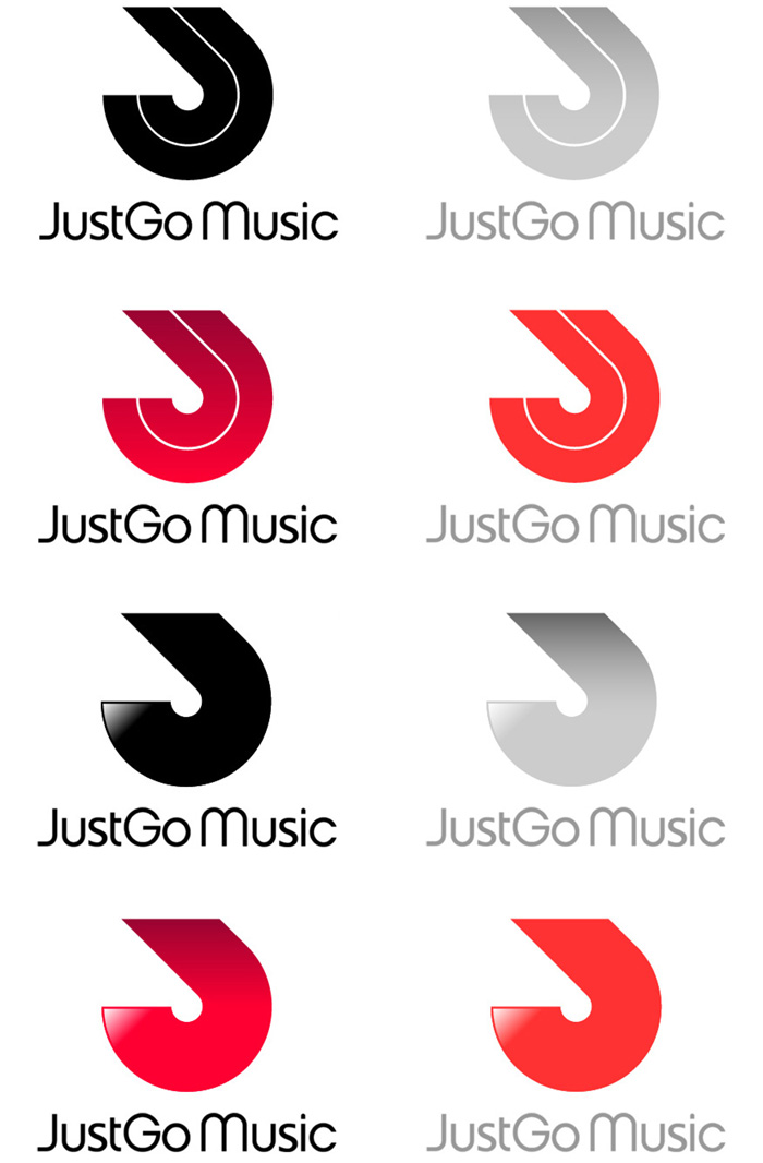
In the second iteration I was asked to try a more minimal logo based around the “J”. We also had a font we really liked called Chalet London 1970 by House Industries.
The client liked the last two ideas, a combination of the clean J shape with a bit of movement.
After some thought, the client decided they actually quite like the rotated “J” logo, an wanted to see some development on that version with colour option. Nearly there. Replaced the funky Chalet “S” with a customised “S” from Lucida.
Thanks to Jake Burke for the hoodie vector art template
It’s funny, I can’t see a lead balloon in there ; )
I’ve been working on the branding of a new product creating a social space for the electronic dance music scene.
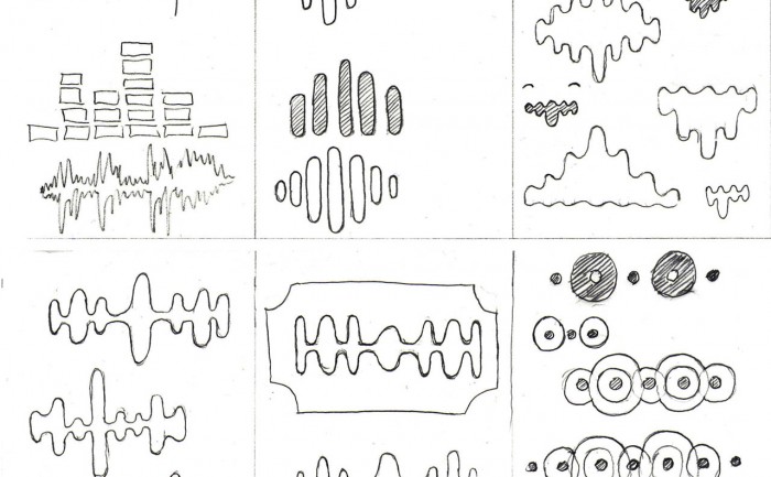
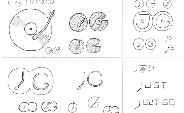
After doing some research into the scene and some broad thinking on possible themes that might add personality to the brand, I start to sketch ideas using a “morphological matrix” as a way of organising the ideas, it also helps to make those lateral connections. Here’s the matrix as a whole…
In an effort to maintain consistency and quality of our application icons, I have been collating a GUI (Graphical user interface) reference doc. As we produce applications on different devices and platforms, we need to take native UI styles and features into account. Although there can be no “generic” iconon all platforms, we can still achieve a consistency of drawing shape and general ‘character’ of icons across apps. For instance: to create tab and activity icons in iOS you provide white shapes on transparent backgrounds, the “blue gloss” styling is added dynamically within the app.
This matrix is more of “how are we doing” document to see if Last.fm style shines through the veneer of native UI styling. The grid shows platforms in columns (names removed for confidentiality of work in progress) and the rows display the various activity states: rest, hover, press)
My favorite place: testing stuff in the lab behind a one-way mirror. I moderated a couple of the sessions, which were with existing LFM users. We hired the excellent user research fascilities at Flow Interactive in Clerkenwell, mostly because they have air-con and a fridge full of coke.
We made notes on post-its, one observation per note, with quotes from users to back up observations. We used rolls of brown paper to collect and store the notes for taking away later, the paper was divided into the broad themes we were testing. Back at the office we sorted the post-its more thoroughly into columns under more exacting topics. Several people were taking notes so we had to de-dupe, however it was important to keep similar comments if made by different users, as this indicates that the issue might be more common to a wider group.
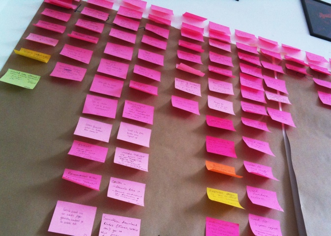
The next step is to do an “affinity sort” to look at each comment individually and sort them into groups based on perceived patterns, rather than features. It’s important to start quite freely and not to place a heading above the group or draw a conclusion too quickly. It’s basically finding groupings based on a gut feeling that different users were having similar issues. In this research session we were testing different features, such as “Events & Festivals” and “Artist Library”. In afinity sorting I noticed that a user who couldn’t find their recommended events was probably having a similar issue to a user who couldn’t find their recommended artists in the “library” section. These two notes were moved from their former “feature” headings into a new group called: “Issue with finding personal recs”. The issue had nothing to do with events or radio, it was a issue around users needing a uniform place to access all their personalised info.
There are lots of boffins and whiz kids at Last.fm, and I’ve been task with conceptualising something they could make based on RFID tags for interacting with music data and streams. (RFIDs are little stickers with antennaes for use in contactless technology – like Oyster cards)
I’ve been sketch ideas for a fun way to change the genre of music on the reception radio stream using physical objects that have RFID stickers on them.
The first idea is for a stand-alone player using the guts of a Mac mini, stuffed in a box made of plywood, that has a slot in it for fluorescent perspex tag cards. Ram in the “pink” card and the box would light-up and the radio stream would switch to pure FUNK-FUNK. Other cards would be available… but only if you need something better than funk.
The other idea is to make little action figures based on the Last.fm “scrobblin” brand characters, with RFIDs on their feet that you place on a miniature stage containing the RFID reader. You could then make a mix stream by putting a number of scrobblin tags together to form a band, for instance: “electro emo funk rock”.
Some random sketches, thinking about a way to visualise the tricky concept of scrobbling. These are based on new stuff floating around in my head mixed with exisiting ideas and metaphors. So far I have: clouds, “scrobblins” (my new name for the brand characters created by the Rehab Studio), hearts, headphones & stethoscopes.
Based on existing illustration work from the excellent Rehab for the Best of 2010 site, this icon will be the new face of a desktop player app. I took the more anatomical heart drawing and simplified it, then added the woofer and tweeters for play-your-music-love-metaphor-iconess.
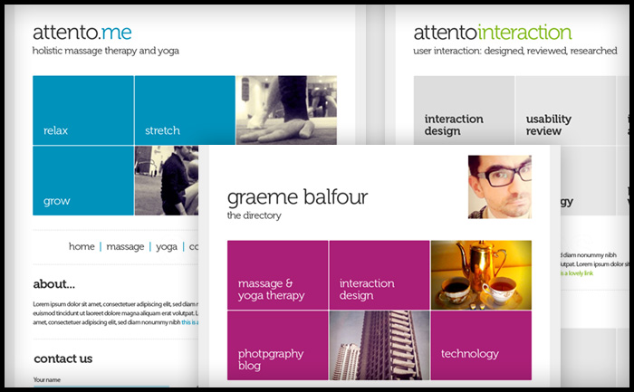
Second iteration ideas for my Graeme Balfour, who needs a unified personal/professional identity and website design. The gesturecons from the first iteration are still planned, but the more urgent issue is to get the web presence sorted.
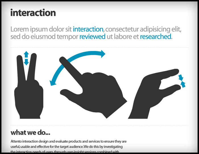
I love a challenge ; )
These are sketches for a professional identity for a friend who has a very diverse skill-set: massage therapist, yoga teacher and usability consultant.
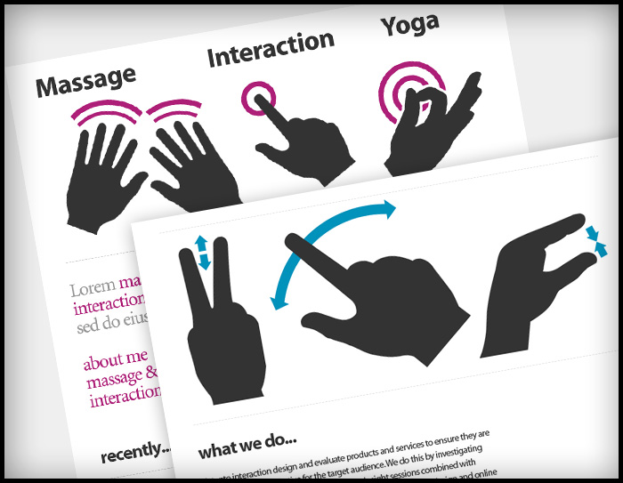
The easy route would be to treat each strand separately. But that’s no fun. There was already a nice idea of using hands as a conceptual image for the massage, the leap was to tie that into “interaction and usabilty”… oh and “Yoga”.
As often happens, there was a bit of serendipity: earlier that week a colleague had introduced me to a really nice set of “gesturecons” (illustrations used in diagrams to demonstrate how to use software on touc-screen devices) for a user-flow diagram I was doing. Massage is about touch, so why not use gesturecons to illustrate massage movements?
Trying to tie this concept into yoga was a but more work. Then I remembered that in yoga books you often have figurative diagrams to demonstrate postures, and in yoga there are postures just for the hands, called “mudras”.
It seemed to fit quite nicely as an idea, hands that massage, a hand in a meditative mudra, and a hand performing an interactive gesture.
I spent some time last night drawing the final logo artwork for Easy Gourmet. The font is Bodoni Script Pro by Parachute, chosen for the classic heritage of Fuller Benton’s Bodoni, and the script fulfilled the client’s desire for curviness and femininity. I converted the font to outlines in Adobe Illustrator so I could attached the “Heart signature” to the flourish of the “G”.
If you’re unfamiliar with Bézier curves, they are tool to draw curves and make shapes in a computer. A shape in a drawing program, such as Abode Illustrator, is made of points called “vectors” connected by lines, called “paths”, and filled with either a colour or a blend of colours called “gradients”. Initially you draw a shape using a shape tool (ovals, rectangles) or using a virtual pen tool. To change or “edit” a shape you click on or near the edge of the shape, this brings up the points as little black squares, clicking on one of these squares reveals the “control points”, which are like little sea-saw levers. Over time, using these control levers becomes quite intuitive, although at first they can drive you nuts.
It’s a skill I picked up creating hundreds of clipping paths for images at Dorling Kindersley, where the famous style was text flowing around cut out images on white backgrounds. The only way to do this then was a cruder version of the curves in the “path” tool in Photoshop.
Bézier curves were developed by Pierre Bézier (Wikipedia), a French engineer who pioneered computer-aided design at Renault where the curves were used to design care bodies.
The Wikipedia page on Bézier curves has really nice animations on the maths behind the little handles and pivots you use to control the curve. I don’t understand them, but they are pretty in a geeky sort-of-way…
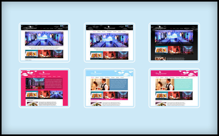
I had good meeting last night to agree the new logo for a (not to be named yet, but look really closely at the pics and you might be able to make it out) catering company and to discuss colour ways.
It was way too early to be coming up with designs for the site but, as I always get over-excited and had done a whole bunch of work to test out the new logo. Generally it’s not good practice to show such early design work to clients as it can confuse the issue, rather than presenting complete work that you are confident in. Also, if you show to many options you can end up getting asked for: “a bit of this design A mixed with a bit of that design B”, which might not work well together – and then you have a camel on your hands!
In this case I had a good feeling about the work so far and I thought it would be helpful to show the client how the identity would work in a real context. And I thought “hey, they’re chefs, they understand about mixing the right ingredients”.
20 minutes later and not only was the logo signed off, but we were well on our way to agreeing the website look and feel. This was followed by Guinness at Wiltons Music Hall. I was very happy : )
I’m just showing off really ; ) … trying to make this whole “designer” thing seem glamourours. It’s actually just a lot of squinting at screens for long hours getting eye-strain and swearing furiously at feedback emails!
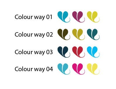
Above are 4 sample colour ways for a new brand and website. Choosing colour is a complex problem, not only are there countless choices, there are also: gut reactions, personal tastes & physical differences in each person’s perception of colour to take into account.
With everything I do, I take inspiration from what the client gives me, in this case it was the photography of the food this company produces, as well as the table wear they use to present their food. I then select complimentary and accent colours to use as highlights, rollovers or side-boxes, to give site contrast and pace.
One handy tool is Adobe’s http://kuler.adobe.com which has user generated pallets as well as a tool to find complimentary or contrasting colours based on the standard principles of colour theory. I use “triad” to give a strong contrast.
Mostly though, I use my own judgement. This tool just helps to play around a little.
In the photograph I was using to draw this logo, which represents the decoration made from a drop of cream in a fruit coulis, it looked like a leaf. They are in fact hearts. So I have updated my Illustrator rendering for this logo mark. The shape is more feminine now and will compliment the image of the (still secret) company and it’s owners. Original design is below.
This is a little “day range” selector to help manage the feed list in My Time Out, which can get quite long and unwieldy. Being developed soon. The next iteration will allow you to select a weekend move that selection forward in time. Getting closer to the “browse by time” concept I came to Time Out ages ago.
Work is progressing on the build of the Books With Bite site, a site for Hachette Publishing to increase engagement with their range of “Supernatural romance ” titles. The site will be based on Joomla to offer the client to manage and update the site.
I’ve designed the site and created the logo, the Joomla build is being handled by Lurex Lounge. The deadline is Halloween!