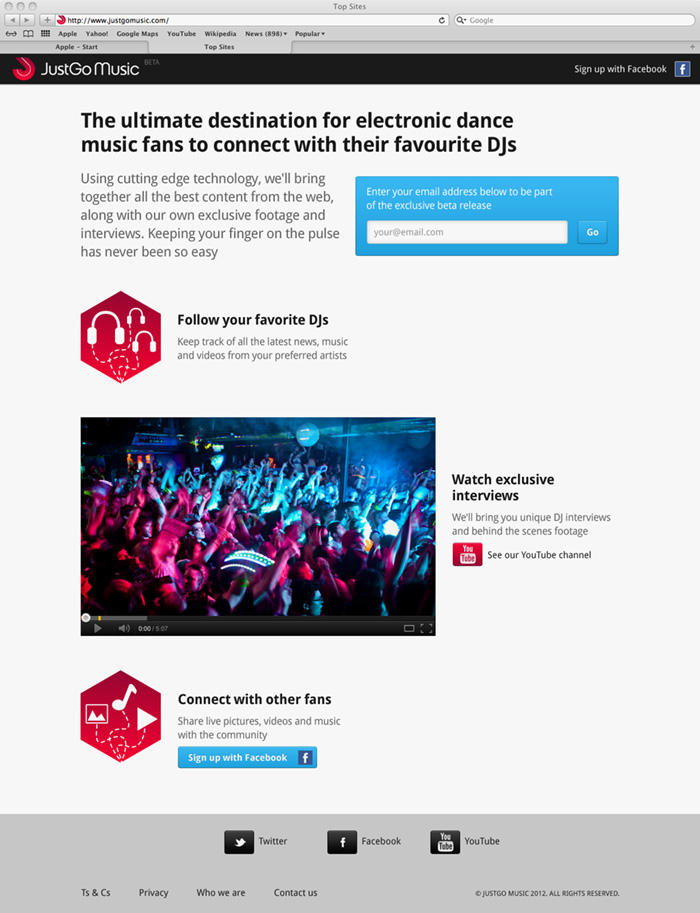
This is the holding page I designed for JustGo Music which has just gone live. The CSS isn’t mine, and was done without my sign-off, so it’s not been picked to death for detail ; )
Category: Work out in the wild
Valentine’s Day Logo for Last.fm


A logo for a Valentine’s Day feature on Last.fm. I’m not very romantic and chintz makes me nauseous, so I wanted to avoid the cliches on this logo. As this was for a music site, I felt the Ziggy Stardust lightning bolt was a better representation of love than the typical Clintons Cards heart shape. I knew I’d found the right solution when someone commented “it looks like a heavy metal band logo!”.
The font is set in Eagle Black. The colour came about by chance… When you add a colour overlay to a layer in Adobe Photoshop, the application default colour it always applies is #ef4836 (M: 87% Y:84). I’ve always like that colour and wanted an excuse to use it.
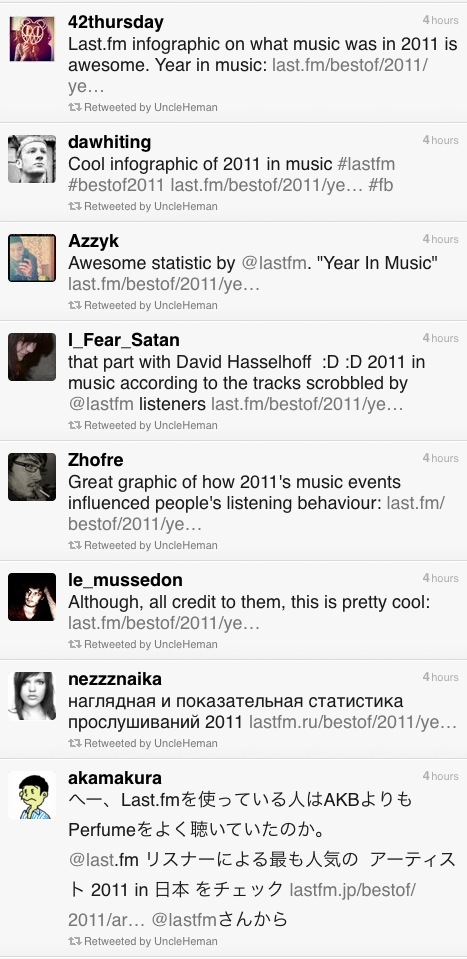
Feedback for Last.fm Best of 2011 music infographic
Getting some good tweets on the Last.fm Best of 2011 infographic…
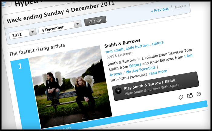
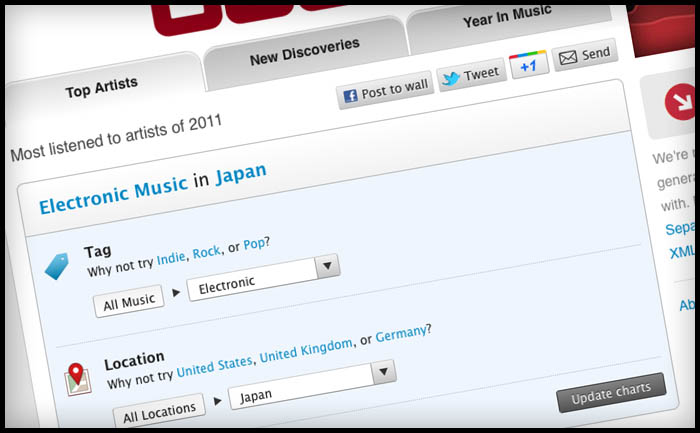
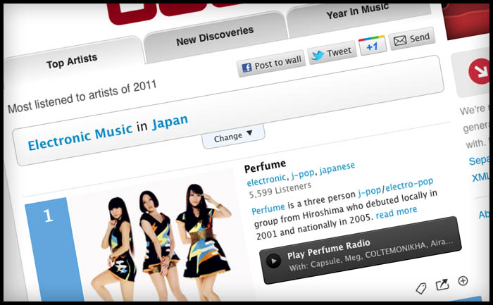
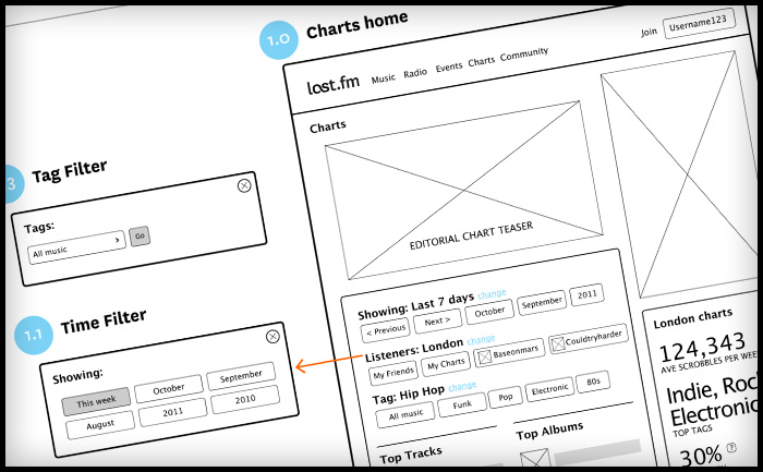
Last.fm charts UX & visual design
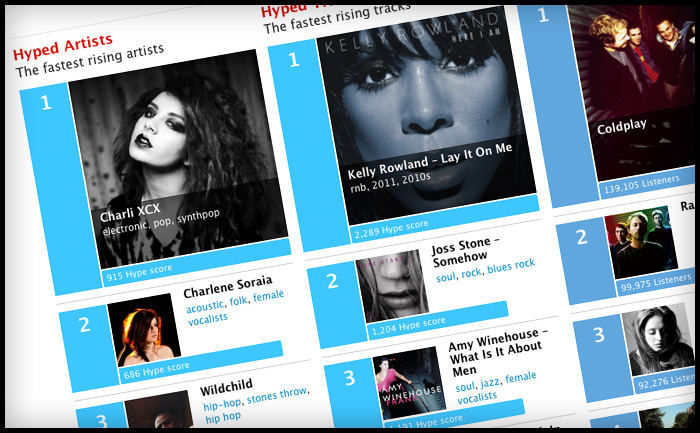
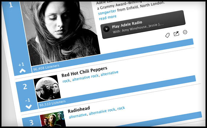
I’ve been working on a refresh of the “Charts” section of the Last.fm site, including a new filtering options for “Hype”, “Top Artists” and “Top Loved Track”. This first launch only includes filtering by date, a later release will include “genre” and “location” filters, so that you’ll be able to can see the best “electronic” music or “black death metal” in your home town. Have a play at last.fm
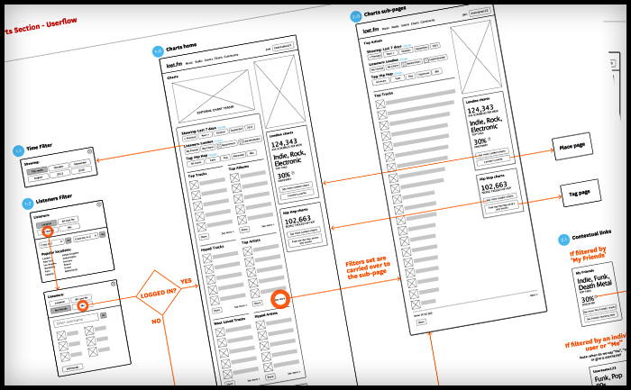
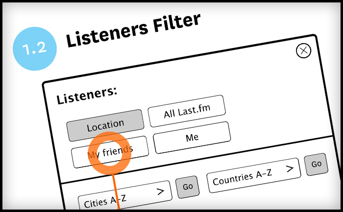
Last.fm artist charts wireframes and user flows
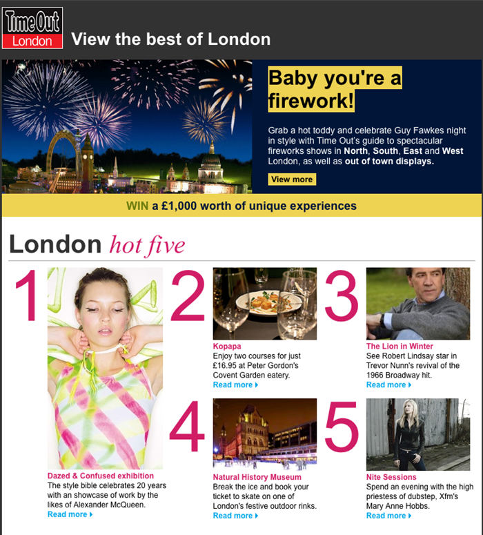
Time Out London newsletter
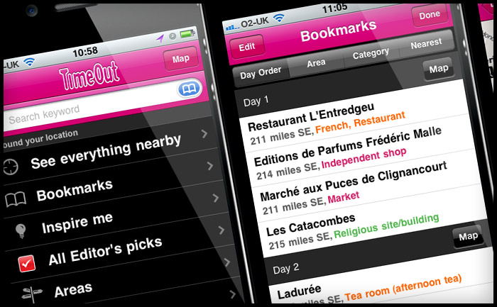
Time Out City Guide iOS mobile apps – User Reviews
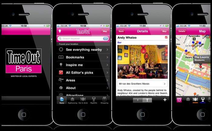
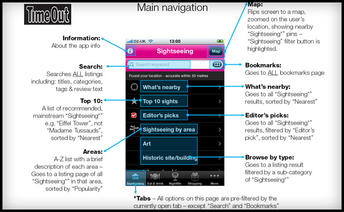
I’ve been checking the reviews for the Time Out Travel Guide apps I worked on last year. It’s good to think of someone using a product you’ve designed and even better that it’s helping them have a good holiday. Dubrovnik, London, New York, Paris, & Zagreb
iTunes reviews
Berlin – Take full advantage
This is a great app and successfully navigated us to some top spots in Berlin over Easter. Currently free, which is an absolute gift – take full advantage. By Sazzle_81
Paris – Discovered a new Paris
I have been to Paris hundreds of times and have even lived there, but I discovered a completely new side to it this weekend through this app. We followed the editor’s picks and used the what’s nearby part of the app and we had the best weekend ever! Next time I will plan more and use the bookmarks to organise each day. No Improvements necessary. By Dysynni
Berlin – Absolutely essential
We used this app around 10 times a day instead of getting charged for data raoming and it was brilliant. I would have paid for this so can’t believe it’s free. If you’re travelling to Berlin, why haven’t you downloaded it already!!! By Tom Hughes
Barcelona – Absolutley indispensible…
Almost flawless in execution, this app is all you need if you turn up to Barcelona without a guide book or any clue what to do.We spent 6 days there and filled them with things we found on here. The user interface is superb, the ability to bookmark and then view on the map was genius, and all without using any data allowance.
Only occasionally was the GPS slightly off and one or two places weren’t quite where the map thought they were, but overall it’s the best and most useful city guide app that I’ve ever used. By Doug Bryson
New York – Amazing
It made my trip to New York much easier when wandering around. Offline map, great restaurant recommendations, nice photos. I am totally getting the London and Paris guides. Please make a Lisbon one. By syt8
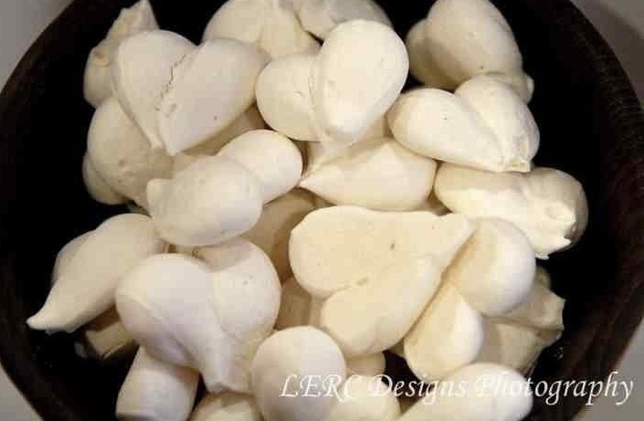
Logo design in Meringue
The new Last.fm Festivals app


Last.fm Festivals app won a 2012 W3 Silver Award for the Music & Audio Mobile App category and a 2012 Mobile WebAward from the Web Marketing Association. You can download the app on iTunes here.
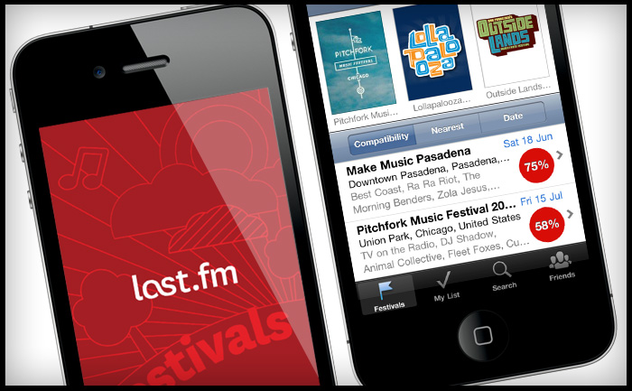
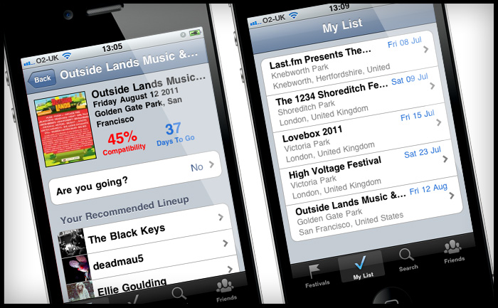

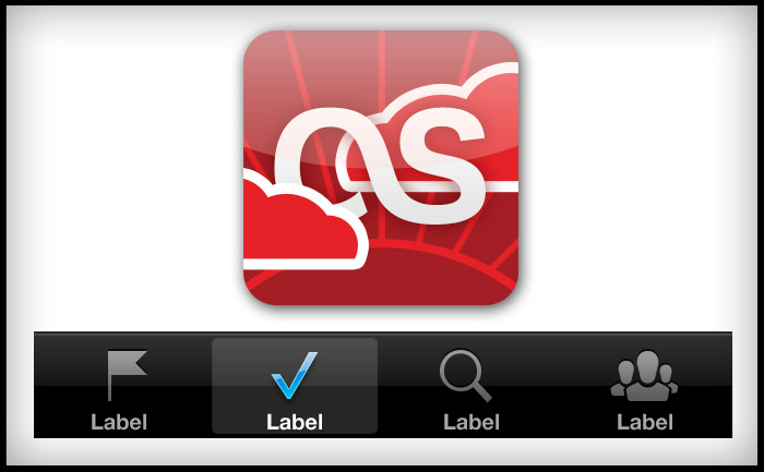
My part in the project was to: create a set of wireframes, work out the userflows, provide UI and marketing assets, and follow up with QA and bug testing.
Features
- Festival compatibility – find the best fesitval for you based on the artists you listen to.
- Recommended line-up – picks out the artists you listen to most in each festival.
- Sort by location – people travel for festivals, your ideal festival may be on another continent!
- My List – plan your summer festival season and save festivals you’re interested in
- Friends – see all the festivals your friends are attending.
Read more about it on the Last.fm blog
Comments from around the web
With the addition of their new Festivals app, 5 years of Last.fm data just became even more useful for me bit.ly/ettmpZ – @MattHurst
Last.fm Launches Amazing New Festivals App — t.co/egA2wjr #music – @Acecentric
Awesome new #lastfm smartphone application recommends music festivals according to your musical preferences t.co/EcleOJF – @Florianmaganza
Last.fm aims to making choosing which to attend easier with its new Festival application – Mashable
Deli Gourmet logo
easygourmetcatering.co.uk – Live!
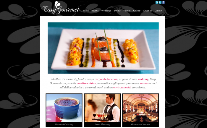
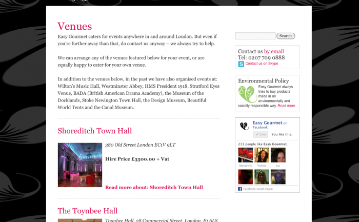
Easy Gourmet Catering’s new CMS site is live. I designed and developed the site, as well as creating a new logo and brand. Still some holes in the content, but it’s good to get it live to let Google start indexing.
I started what I though would be the slow process of switching the DNS with the current host (the mammothlyg expensive Netbenefit) only to find things happened super quick. Then had to migrate 8 pop email accounts and set up the necessary forwarding the client was using – which meant learning how to migrate pop email FAST! Always a good way to learn 😉
The design and build of the site took 2 months and was completed in January, however putting the content has taken much longer. Easy Gourmet had great help from my friend Michael, who is an excellent editor and travel writer. However, this kind of content is quite personal to the business and needed a lot of involvement and consultation with the client, Marie, and running a successful catering company keeps her very busy.
Better SEO
The most exciting part of this project is the SEO opportunity. The old site was poorly structured and not at all optimised. I did an audit of the 40 most likely customer search queries in Google for page rank (e.g. Wedding caterer”, “Catering London”, “wedding reception catering”). I found only the exact company name “Easy Gourmet Catering” returned a page 1 listing, and that was compromised by a competitor with a similar name in the second position. For all the other search terms there was no listing at all. The new CMS structure and some basic copy alone should give this site a decent presence in search results, but with Michael’s rich copy and some “white hat” optimisation tricks of mine, I think this site will start to be SEO competitive. Google generally takes between 7-14 days to re-index a change on a site; there is an unconfirmed theory that Google is slow to react because it “sandboxes” changes.
Easy Gourmet Catering is a successful business now, even without the aid of natural search listings, woth this new site it should explode! If, that is, people really choose caterers from the web, or if it’s more of a word-of-mouth reputation based business.
www.bookswithbite.co.uk new logo
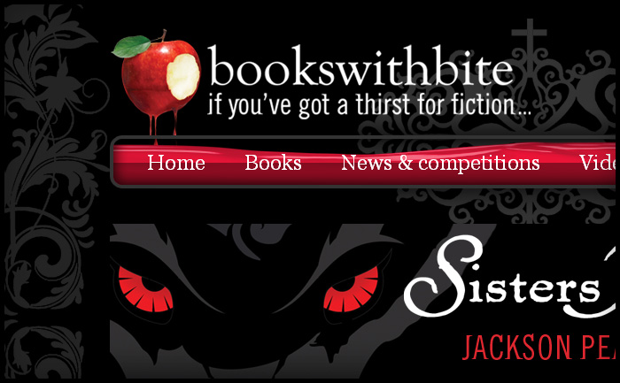
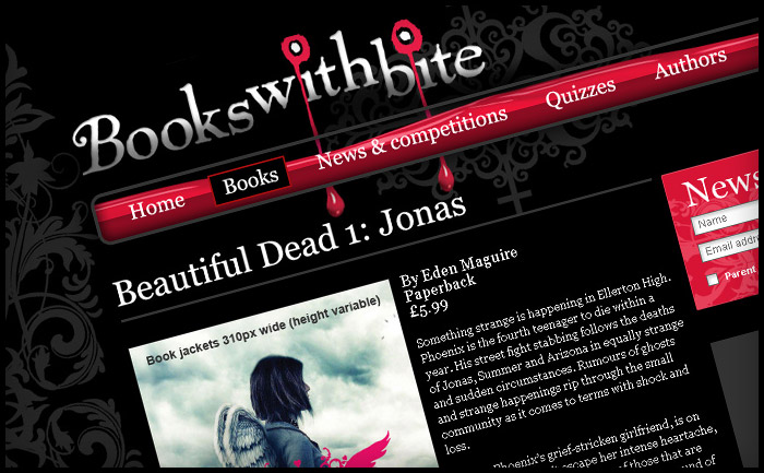
When I first designed the Books With Bite site Hachette didn’t have a logo ready, so I quickly mocked one up (below) and they were happy to keep it. Now the in-house team have a new logo, made from one of the cover illustrations and the house fonts Goudy Old Style and some other funky distressed font called “Beach”. The new logo fits the site really well and still has dripping blood to fill the “glass vial” nav panel, though I think my treatment was more sublte ; )
Time Out City Guide apps get a good review in the Guardian
Benji Lanyado from the Guardian has written a good preview for the City Guide app.
Read the Guardian Time Out City Guide app review
Easy Gourmet identity & logo

First iteration
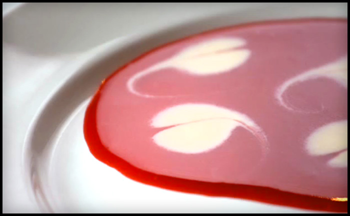
In the photograph I was using to draw this logo, which represents the decoration made from a drop of cream in a fruit coulis, it looked like a leaf. They are in fact hearts. So I have updated my Illustrator rendering for this logo mark. The shape is more feminine now and will compliment the image of the (still secret) company and it’s owners. Original design is below.
www.bookswithbite.co.uk now live
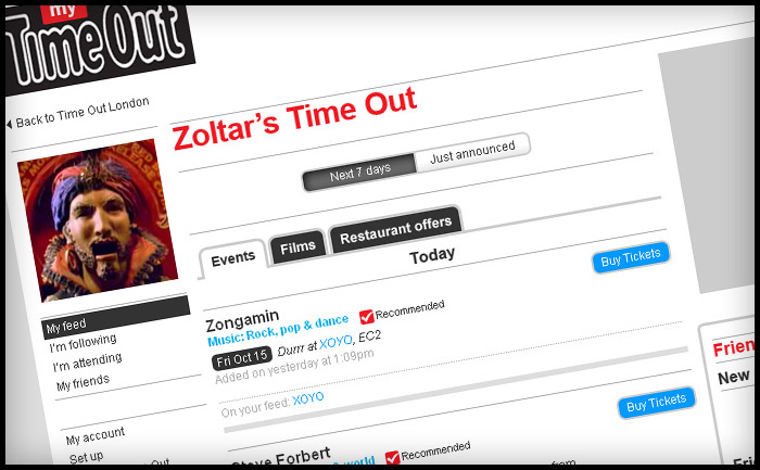
My Time Out – about to leave beta
My Time Out allows you to save the events you’re attending, follow your favourite venues, restaurants and cinemas and brings relevant content to you via email alerts and a profile feed. It’s managed by Facebook Connect so you’ll be hooked up to any friends that also connect, allowing you to see their upcoming events and things they like to follow.
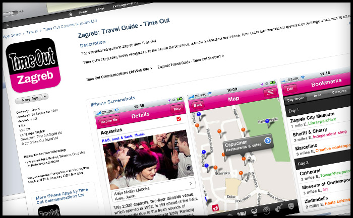
First Time Out City Guide hits iTunes – Zagreb
The first Time Out City Guide app is in the app store. It’s Zagreb and it’s FREE.
Zagreb may seem like a strange choice for a launch, but it was brought to the top of the production list following interest from the tourist board. Thanks to their sponsporship we were able to offer this first app free, allowing users a chance to see if they life the City Guide apps before purchasing other guides. It will also give us a good chance to get user feedback and do a lot more de-bugging before the first paid-for guide goes live.
Paris and London (for visitors) will follow soon.
Download The Time out City Guide to Zagreb on iTunes app store
