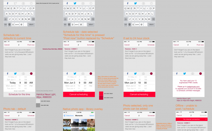
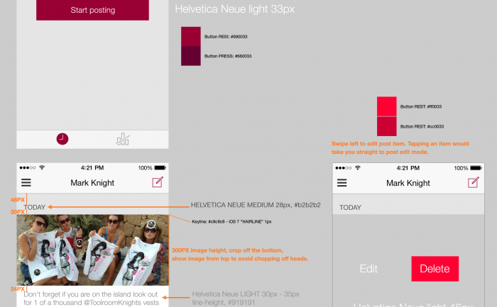
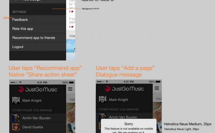
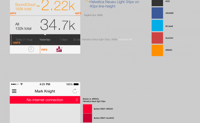
The JustGo Music app helps DJs manage their social media presence with combined posting to Facebook and Twitter, and engagement statistics.
Category: icon design
Grape app iPhone app UI design
![]()
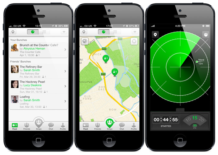
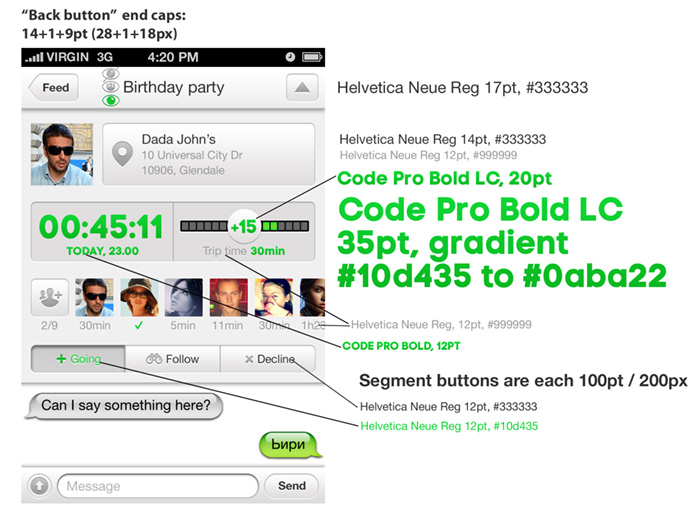
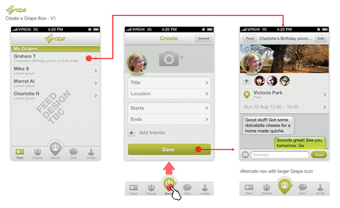
I’m pleased to see Grape has launched. Grape is a full-featured mobile messenger with functionality to coordinate get-togethers with friends. I worked on the UI design and styling of the beta release.
Download the Grape app on iTunes
Scrobbler tablet & mobile music app design – icon family V1
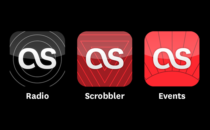
Following the iOS design principle of “do one thing really well” we decided to spilt the Last.fm service into three distinct apps which serve clearly different use: radio streaming, exploring and scrobbling your music collection, and finding events to see. This meant coming up with a family of icons that were different enough to be distinct, yet belonged together and clearly reflected the brand.
The solution was inspired in part by the style of exisiting brand illustrations, but simplified and using geometric shapes. Each icon has a loose concept:
Radio: (Obvious!) is personal radio, so radiating waves… no brainer.
Scrobbler: The Scrobbler enhances your local music collection with Last.fm UGC tagging data and creates automated personal playlists. The icon shows inverted triangles, representing focusing lots of music down to the point of the tracks you really want to listen to.
Events: The icon shows a horizon with points radiating out, representing the points of a globe where you can see your music live.
Quick icons for hack day
![]()
![]()

Escapade Festival iPhone / mobile App
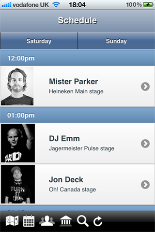
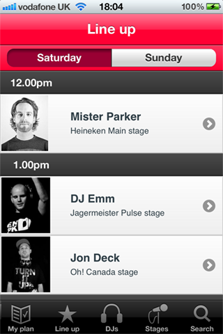
My friends @JustGoMusic needed some help tidying up their app for the Escapade Dance Music Festival. The app needed to be submitted to iTnes the next day, so I had great fun coming up with icons under the stopwatch.
You can download the App here

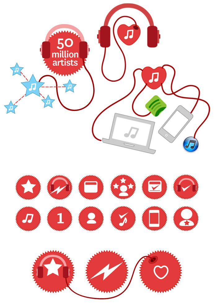
Last.fm “About us” illustrations
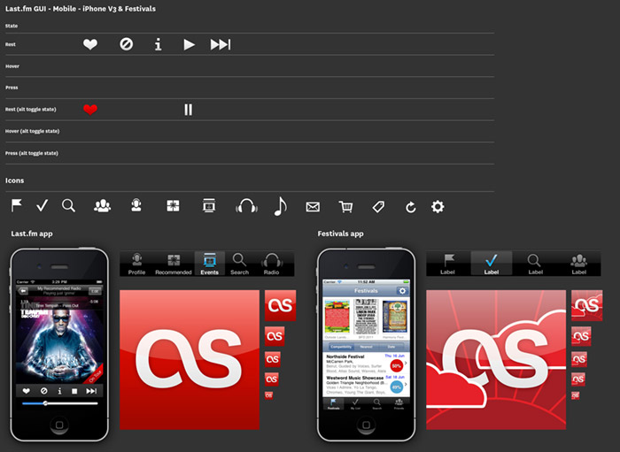
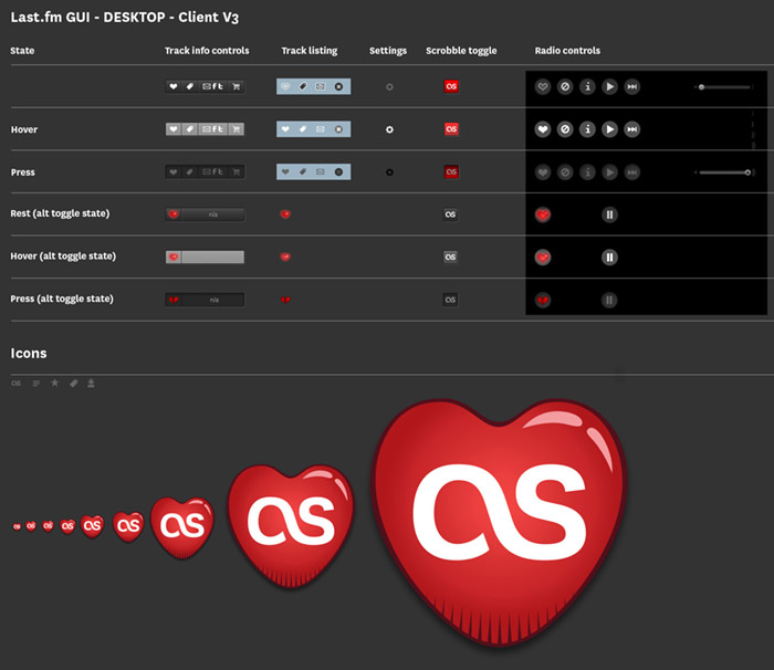
GUI elements
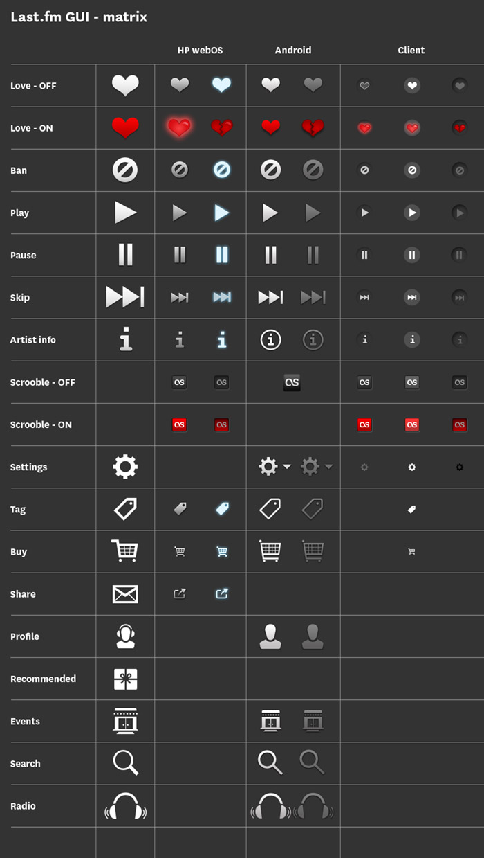
For services that work across multiple platforms it’s important to keep a consistent style across UI elements. Various platforms and operating systems have their own native UI elements, but you can still add brand characteristics. At the end of each project I put together a grid of all the UI elements, as a quick reference for any future project. There is also a master UI matrix comparing elements across platforms, i.e. how does a play icon look on iOS compared to Android, and can it still reflect the brand?
iOS GUI schema
Desktop version schema
Time Out City Guide iOS mobile apps – User Reviews
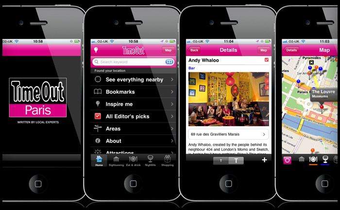
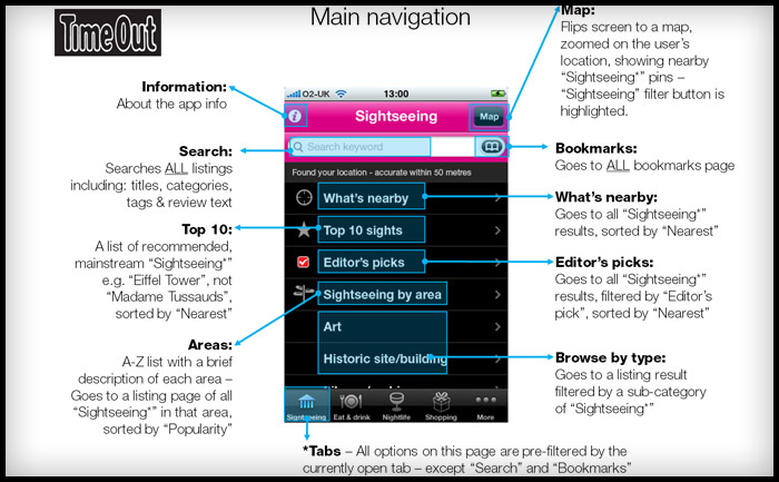
I’ve been checking the reviews for the Time Out Travel Guide apps I worked on last year. It’s good to think of someone using a product you’ve designed and even better that it’s helping them have a good holiday. Dubrovnik, London, New York, Paris, & Zagreb
iTunes reviews
Berlin – Take full advantage
This is a great app and successfully navigated us to some top spots in Berlin over Easter. Currently free, which is an absolute gift – take full advantage. By Sazzle_81
Paris – Discovered a new Paris
I have been to Paris hundreds of times and have even lived there, but I discovered a completely new side to it this weekend through this app. We followed the editor’s picks and used the what’s nearby part of the app and we had the best weekend ever! Next time I will plan more and use the bookmarks to organise each day. No Improvements necessary. By Dysynni
Berlin – Absolutely essential
We used this app around 10 times a day instead of getting charged for data raoming and it was brilliant. I would have paid for this so can’t believe it’s free. If you’re travelling to Berlin, why haven’t you downloaded it already!!! By Tom Hughes
Barcelona – Absolutley indispensible…
Almost flawless in execution, this app is all you need if you turn up to Barcelona without a guide book or any clue what to do.We spent 6 days there and filled them with things we found on here. The user interface is superb, the ability to bookmark and then view on the map was genius, and all without using any data allowance.
Only occasionally was the GPS slightly off and one or two places weren’t quite where the map thought they were, but overall it’s the best and most useful city guide app that I’ve ever used. By Doug Bryson
New York – Amazing
It made my trip to New York much easier when wandering around. Offline map, great restaurant recommendations, nice photos. I am totally getting the London and Paris guides. Please make a Lisbon one. By syt8
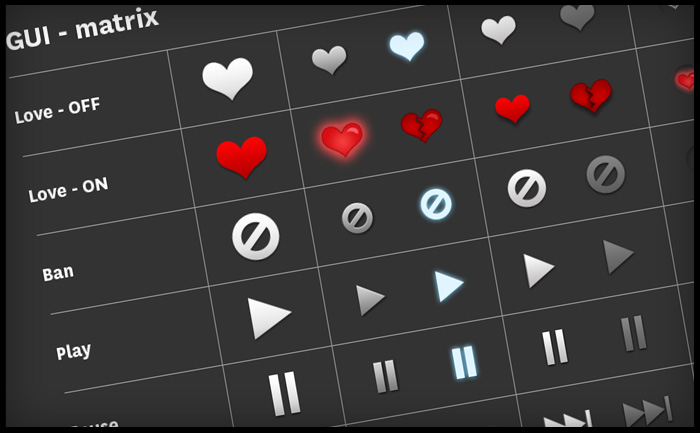
GUI matrix – consistency of brand assets on different platforms
In an effort to maintain consistency and quality of our application icons, I have been collating a GUI (Graphical user interface) reference doc. As we produce applications on different devices and platforms, we need to take native UI styles and features into account. Although there can be no “generic” iconon all platforms, we can still achieve a consistency of drawing shape and general ‘character’ of icons across apps. For instance: to create tab and activity icons in iOS you provide white shapes on transparent backgrounds, the “blue gloss” styling is added dynamically within the app.
This matrix is more of “how are we doing” document to see if Last.fm style shines through the veneer of native UI styling. The grid shows platforms in columns (names removed for confidentiality of work in progress) and the rows display the various activity states: rest, hover, press)
Player icon design for..
Based on existing illustration work from the excellent Rehab for the Best of 2010 site, this icon will be the new face of a desktop player app. I took the more anatomical heart drawing and simplified it, then added the woofer and tweeters for play-your-music-love-metaphor-iconess.
