Category: visual design
Audiu: music review service – user interface design
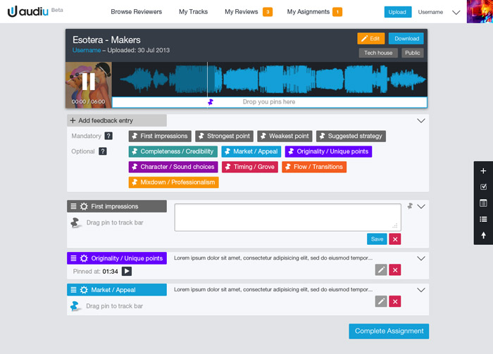
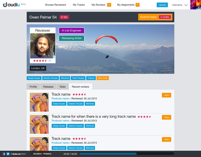
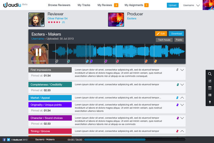
I helped the Audiu guys with a new user interface design for their music service that pairs music producers with professional reviewers to get feedback and advice on how to improve their tracks. Take a look at the Audiu Beta site here
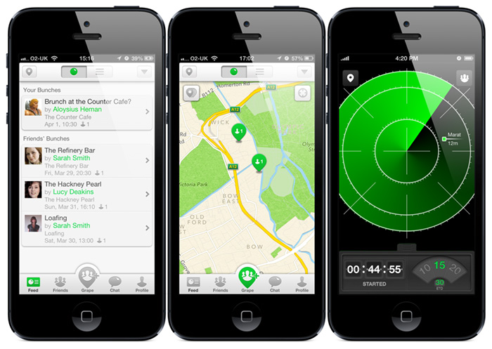
Grape app iPhone app UI design
![]()
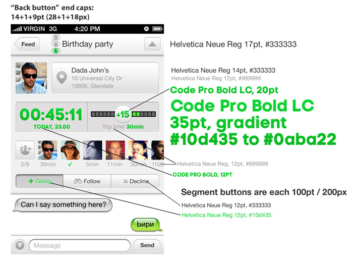
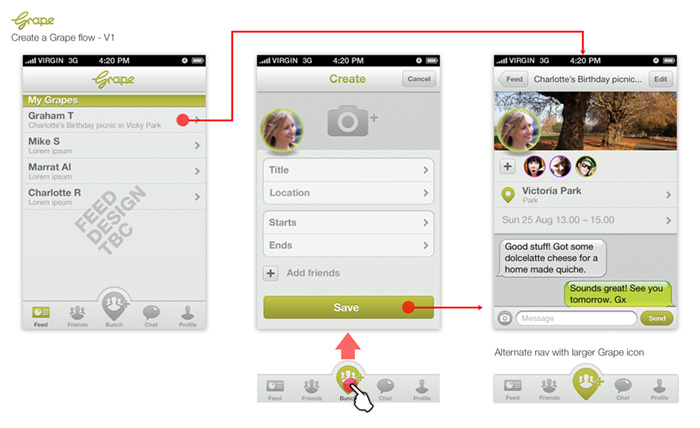
I’m pleased to see Grape has launched. Grape is a full-featured mobile messenger with functionality to coordinate get-togethers with friends. I worked on the UI design and styling of the beta release.
Download the Grape app on iTunes
How to start designing Android apps in Photoshop & what is a dp?
July 2014 EDIT: Android’s “L” design guidelines now supply templates in Adobe Illustrator, making it even harder for designers user to Photoshop or Fireworks. They don’t provide an answer for how you should crop and optimise your assets for the developer (I assume they’d rather you didn’t and just use their native stuff).
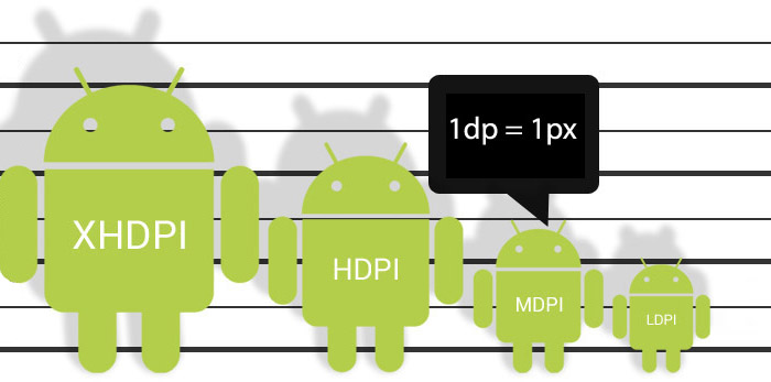
July 2014 EDIT: On consideration of comments from NexogenDev, I have removed the more explicit reference to 72dpi in the graphic above to “1dp = 1px” as this is a more literal starting point and probably better. My point was that Android supplied templates and assets tend to open by default in Photoshop as 72dpi, but dpi in general is misleading in this context.
I found it hard to know where to start designing for Android in Photoshop.
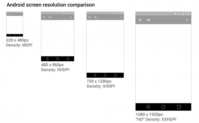
Google tries to help by providing extensive Android user Interface Design Guidelines. There are many devices running Android that have different screen sizes and shapes. There are also different screen densities, which means the quality of the definition of the screen or how many pixels fit in the same sized area on the screen – e.g. medium screen density has 160 pixels in every inch on the device’s screen, whereas an extra high density screen has twice as many, 320 pixels, crammed in an inch. To cover the different densities you need to supply graphics and icons at various densities.
Creating a design that will work for all these devices can be daunting. You also need to create different density icons and graphics.
1. Minimum handsetscreen size
I started with a minimum mobile handset size screen first. Starting with the smallest and most limited screen size first makes sure your content and UI will fit, removing any features that aren’t completely necessary to the core purpose of the app. Then you can work out how your app will behave on larger and tablet sized screens. You need to decided if your app is going to stretch to fit larger screens, or if you’re going to have a completely different layout and design for tablet sized screens.
2. Photoshop image size
I choose to start with a small mobile handset and a small 7″ tablet screen as a base for design and then think of how that could scale elagantly. You may need to create portrait and landscape versions if you plan on allowing users to change orientation.
Here are some Photoshop templates
3. Download Android design templates
If you are new to designing for Android, and are confused by dpi, I STRONGLY RECOMMEND you use native Android styling and assets, rather than doing a completely custom design at first.
It is important to keep the icons at the same proportion to maintain the correct “hit” area for the user’s finger.
4. Scale down
It’s easier to work at the higher pixel density, XXHDPI. It is always advisable to create icon art as vectors in “Smart Objects, or as “shapes” in Photoshop so they can be scaled up or down without loosing quality.
The benefit of working at XXHDPI is that you can be sure you are not loosing any quality.
XXHDPI – 300% – x3.o
XHDPI – 200% – x2.o
HDPI – 150% – x1.5
MDPI – 100% – x1.0
LDPI – 75% (don’t bother with this!) – 0.75
When using vectors, you may want to adjust your line art to tighten up any half pixels or it can look blurry at the edges (if you’re a perfectionist like me).
5. Workflow
- Create you design PSD at XXHDPI
- Crop out your graphic assets and icons as separate PSDs
- Scale them down to the various densities: XHDPI, HDPI, MDPI
My method is to design one PSD, crop out the icons assets as PSDs, then scale them to the different densities. I often start with a PSD at XXHDPI or MDPI (providing my artwork is vector and can be scaled up or down), then I crop out the icons and assets out, then resize them.
The reason this is easier is that when you need to make design changes, you don’t have to change multiple PSDs.
What the frakk is a DP?
Here’s what I discovered after a few hours of scratching my head and moaning…
- “dp” is a magic, made-up measurement that only exists in the world of The Matrix & Tron.
- Android icons are 32dp x 32dp @ the medium density MDPI
- Android supply sample icons (Edit: they don’t any more the gits) and if you open an icon from the MDPI folder in Photoshop, the icon is 32px x 32px with “image size”.
- SO, in Photoshop:1dp = 1px @ MDPI – 100%
1dp = 1.5px @ HDPI – 150%
1dp = 2px @ XHDPI – 200%
1dp = 3px @ XXHDPI – 300%
1dp = 4px @ XXXHDPI – 400% - It doesn’t matter what DPI you have set in PHOTOSHOP, it’s the canvas size (the number of pixels available) that counts.
If you have a better way of getting started designing in Android, or if I’ve made an errors, please let me know.
Here are some Photoshop templates at MDPI and HDPI to give you an idea.
Please see my new guide: How to design for new iPhone 6 Plus resolutions in Photoshop
Attention to detail – tablet & mobile app design
Obsessive, fussy… Me?
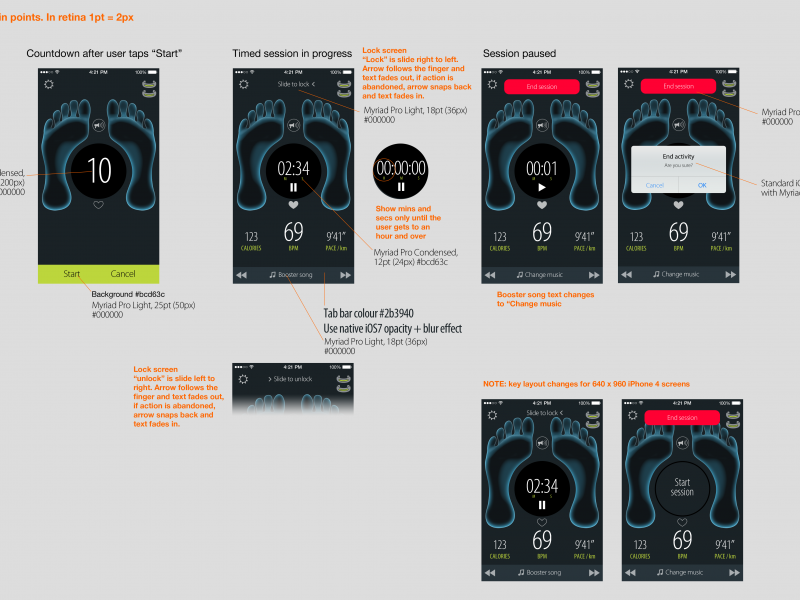
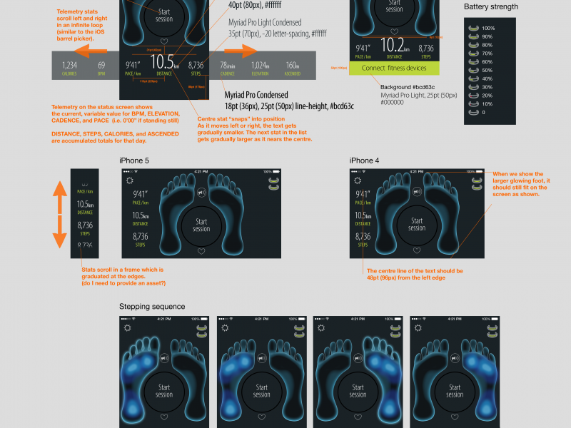
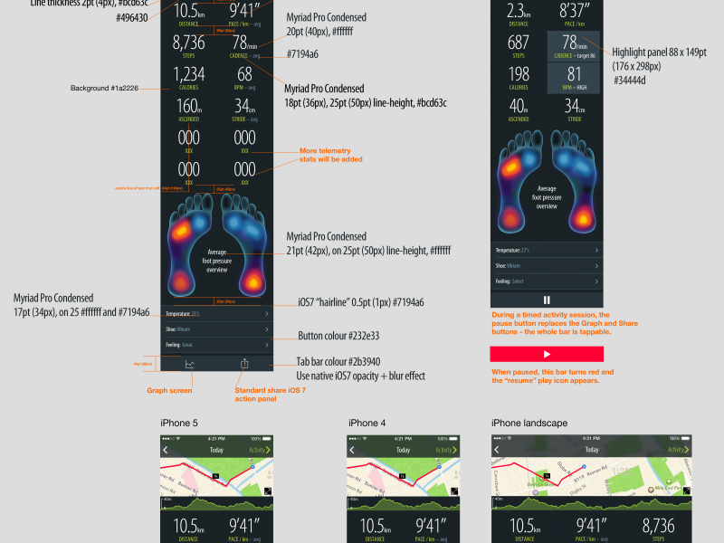
When designing an appdesigners take great care over the UI and the fine details. Apple provide a lot of built-in UI styling in the SDK for developers to produce apps of a consistent quality. However, when Apple create their own apps they add an extra layer of detail and finish that is not supplied in the SDK, this extra quality is hard to achieve out-of-the-box.
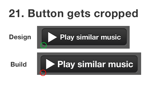
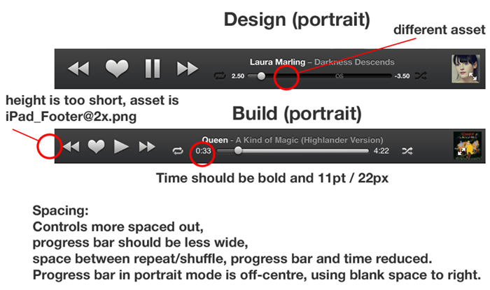
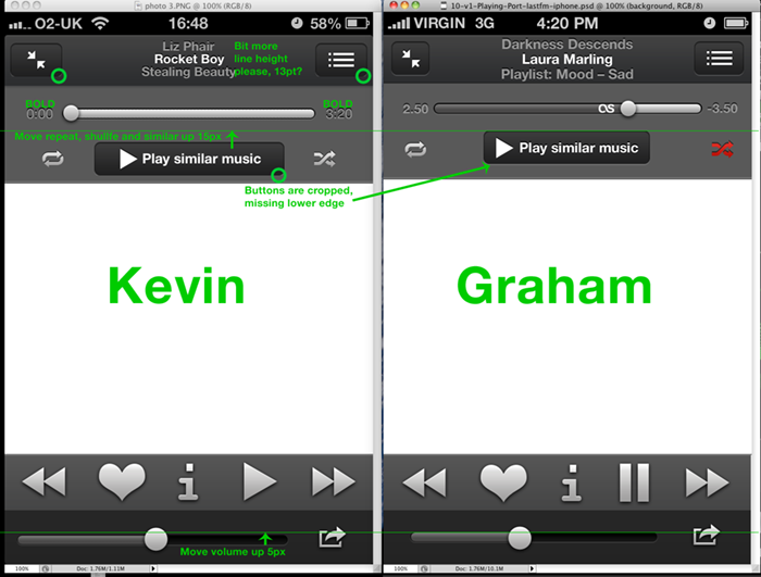
Designers are fussy by trade, and communicating this obsessive level of detail via email or Skype to a remote developer can be challenging. I have great sympathies for developers, espcially when I find myslf sending them the following documents with design revisions… 😉
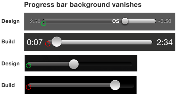
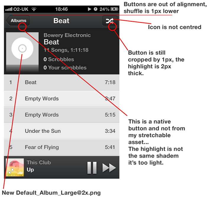
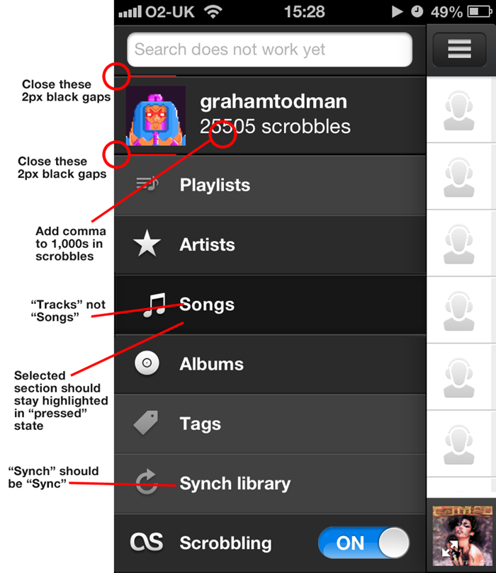
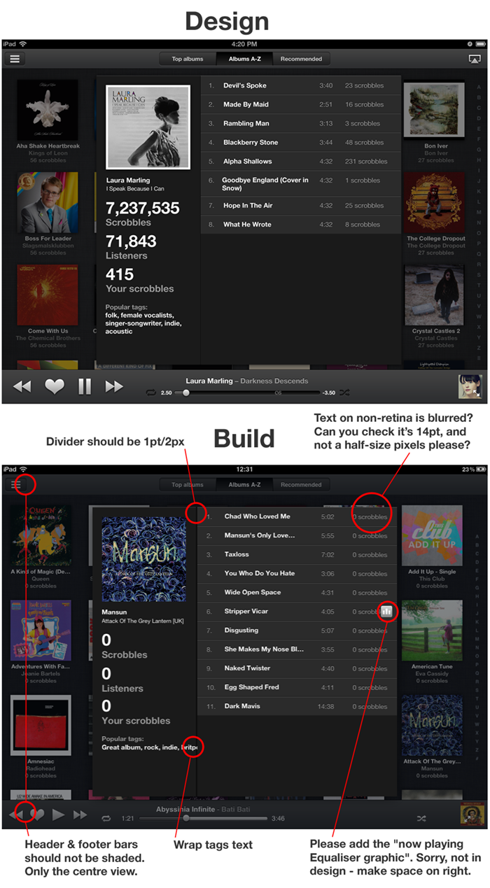
Kevin was as keen as me to get this right, so I hope doesn’t he hate me too much 😉
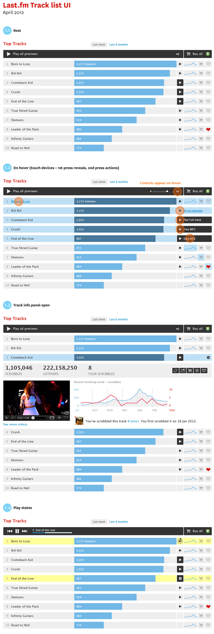
Prototype music track list UI
New playable track list UI style for artists and catalogue pages.
Objectives:
- Make a distinction betwen full playable tracks and 30 second previews
- Create a player module to play all tracks avaible
- An expandable ajax panel to get track info, stats and content in position to increase engagement.
- Add improved e-commerce features, including the ability to buy a list of tracks in one.
Last.fm Chrome plugin design
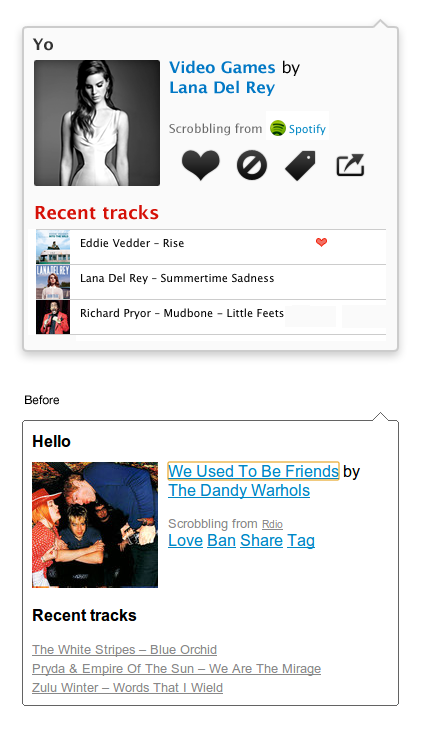
Helping out @marekventur style up his Last.fm plug in for Chrome. It’s a 10% project (* staffers are given 10% of their time to work on self-driven projects, providing the work is related to music data (I have been told off for spending too much time working on a diorama of Jabba’s palace for my Star Wars figures)
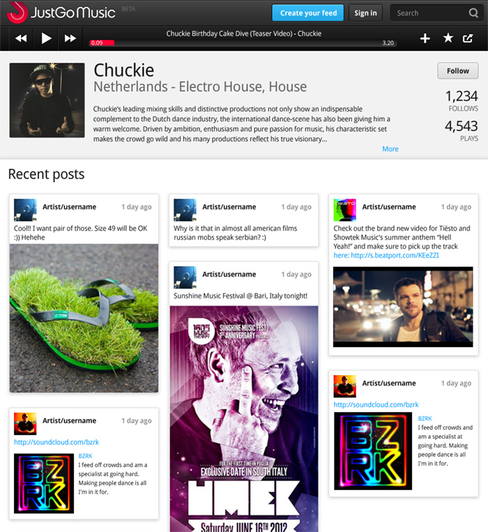
Justgo Music – more effects please
In this iteration we are moving away from the flat navigation styling, and adding some depth and detail. I’m designing an iOS app at the moment, so I’m at home doing this stuff. Although, I think clean and minal is a better way to go online as, like the “little black dress”, it never goes out of fashion.
Visit Justgomusic.com
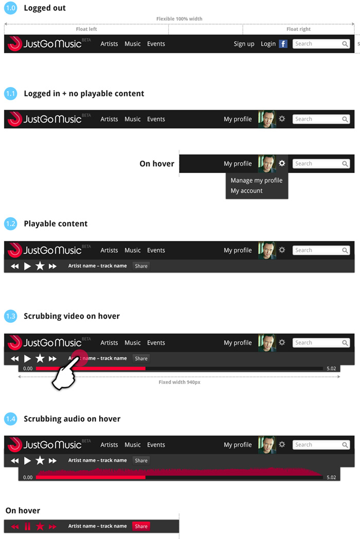
JustGo Music – Beta design specification
Responsive design for navigation
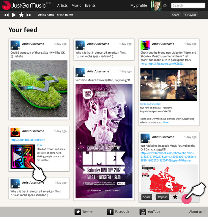
Here is some work I’ve been doing on the Beta site for JustGo Music, which has just gone live. We’re worknig in agile, so designing by component rather than finished pages. The UI designs feature responsive behaviour for tablet and mobile, and a baseline grid to align posts across columns. See justgomusic.com
Escapade Festival iPhone / mobile App
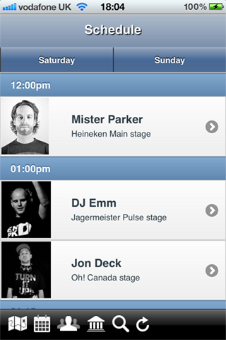
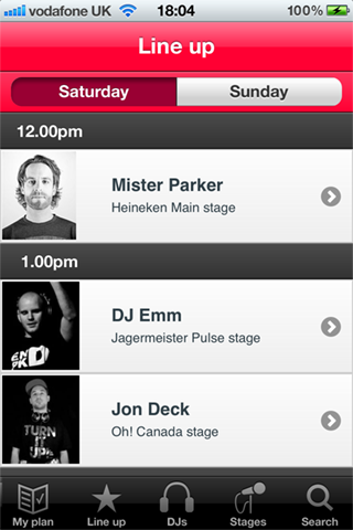
My friends @JustGoMusic needed some help tidying up their app for the Escapade Dance Music Festival. The app needed to be submitted to iTnes the next day, so I had great fun coming up with icons under the stopwatch.
You can download the App here

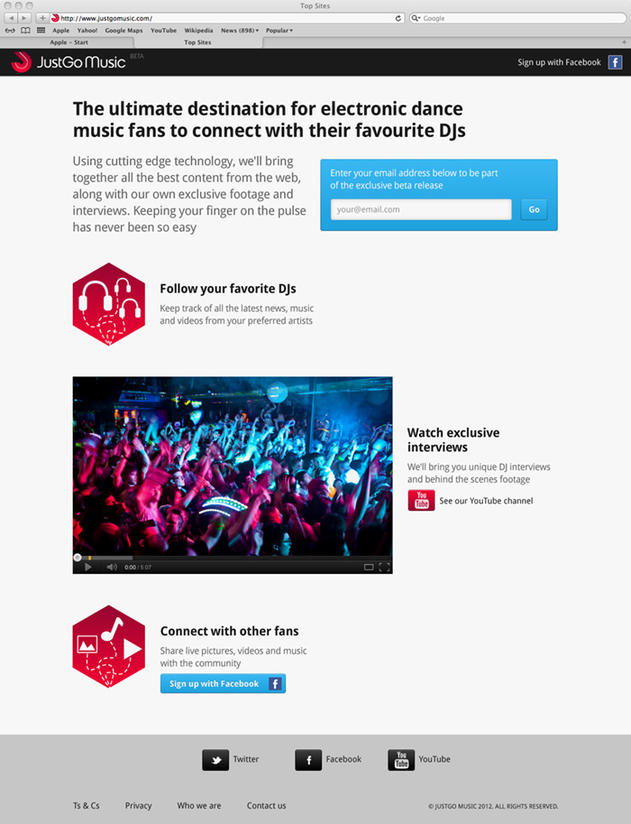
JustGo Muusic Beta sign-up page live
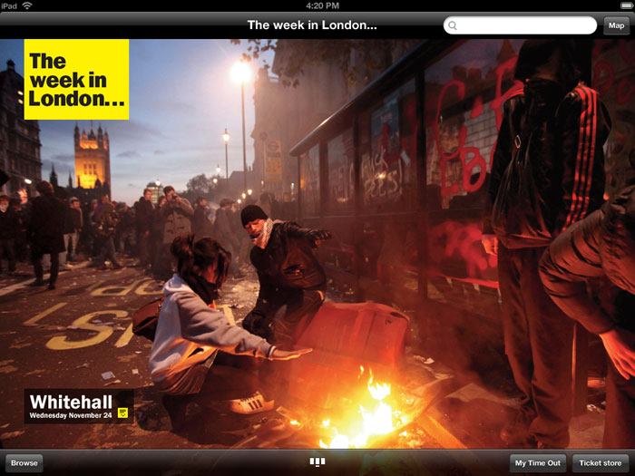
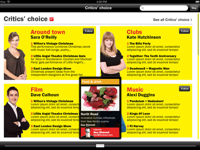
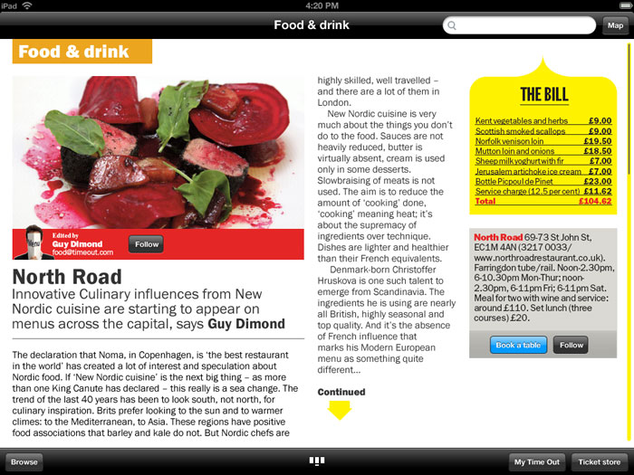
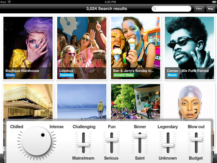
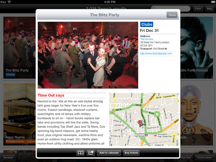
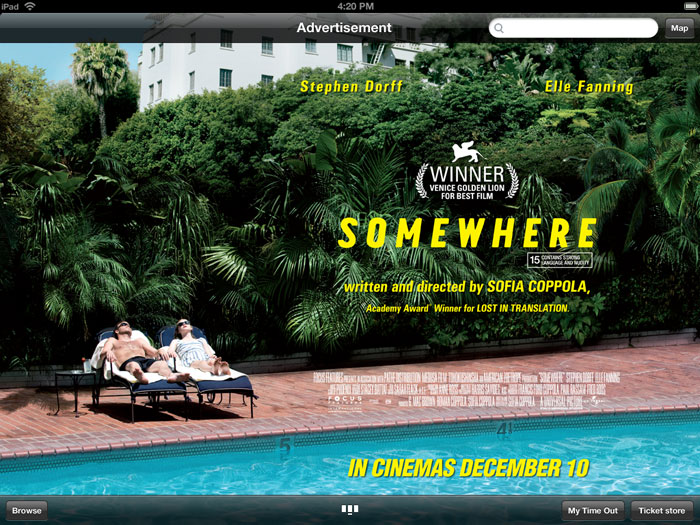
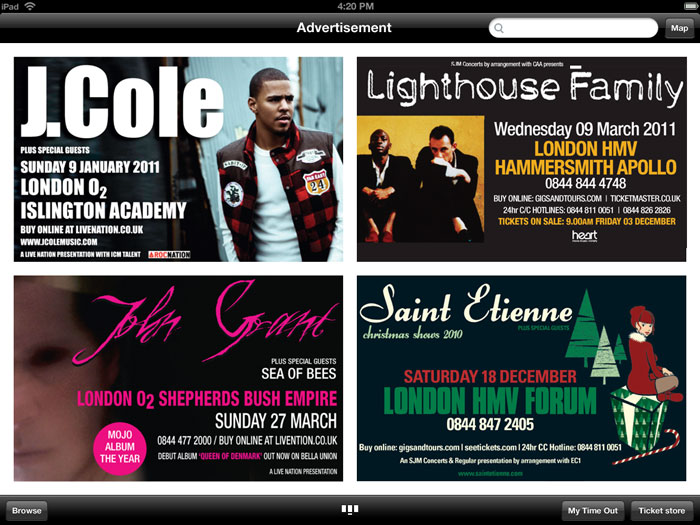
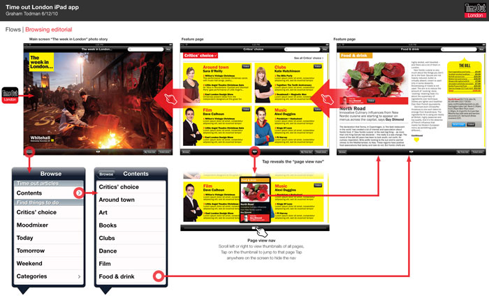
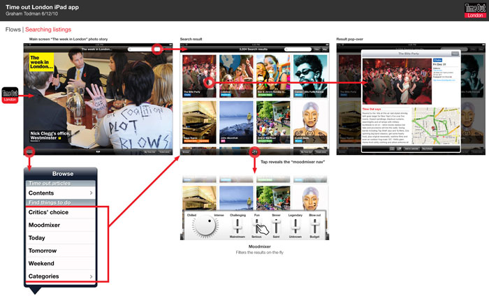
iPad app concepts for Time Out
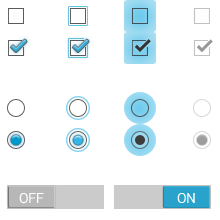
GUI elements
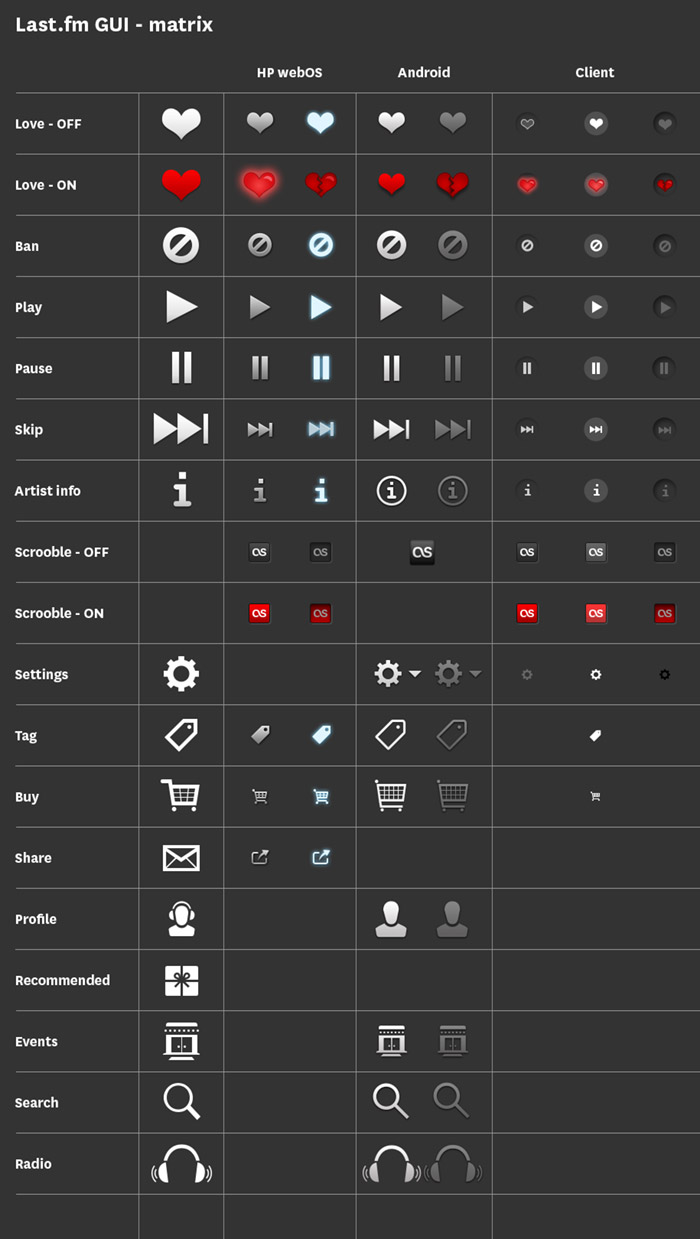
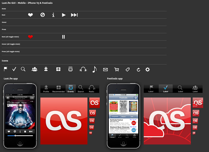
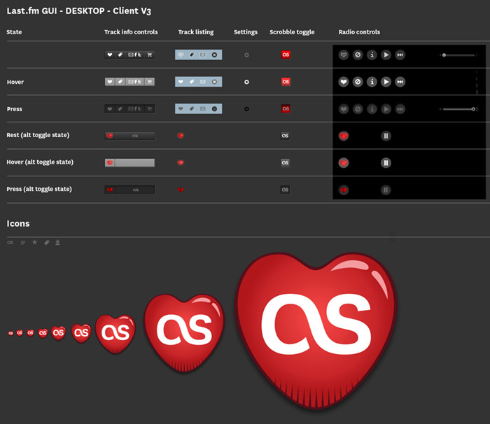
For services that work across multiple platforms it’s important to keep a consistent style across UI elements. Various platforms and operating systems have their own native UI elements, but you can still add brand characteristics. At the end of each project I put together a grid of all the UI elements, as a quick reference for any future project. There is also a master UI matrix comparing elements across platforms, i.e. how does a play icon look on iOS compared to Android, and can it still reflect the brand?
iOS GUI schema
Desktop version schema
Last.fm music data visualisation (datavis / inforgraphic)
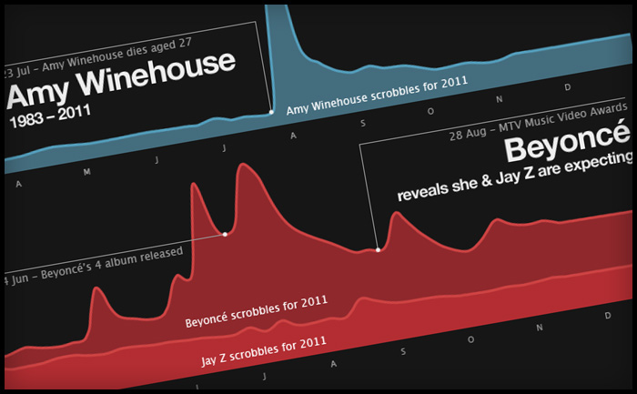
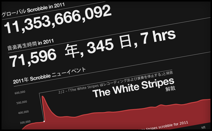
Every year at this time, most music sites give you a run down on the best acts of the year. Generally, sites start rolling out “Best of” features in December, however at Last.fm we decided to wait until January so that we can show a complete year’s worth of data. This year we’ve also added a datavis feature, which shows key Last.fm stats, including the music news events of the year that made a noticeable change in an artist’s listening levels – or scrobbles.
Making of
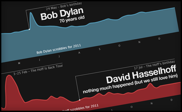
To create this, we polled our colleagues across the CBS Interactive group for what they felt were the key music events of the year. I then used our internal trends tool to see if the artists featured in these events had any corresponding spikes in their listening data, based on actual total daily scrobbles. To my surprise, most of the shortlisted news events had encouraged listening, showing clear spikes. The only HUGE event that hadn’t really had any effect on listening was David Hasselhoff’s birthday. The Hoff is the Last.fm mascot and his birthday is always big news here in Old Street, but sadly not with the wider world. However he did have some huge spikes in 2011, which a quick check on Wikipedia proved to be related to a come back tour in Germany and Austria, who also have great taste in idols.
A tribute to Steve Jobs
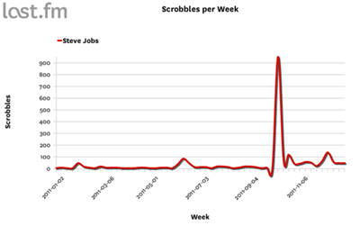
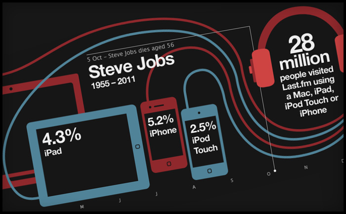
The Steve Jobs tribute was the last one to go in. I wanted to do a tribute to Steve (mostly because I am addicted to my iPhone and iPad), but mostly due to his huge impact on the world of music. The trouble is he’s not an actual artist (or so I thought), so he doesn’t have listeners to create a graph from. Instead, I used our site statistics to show how Apple devices are represented in Last.fm visitor levels. It was only later that I learned Steve Job DOES have an artist page, as many of his keynote speeches and addresses have been shared as audio files and podcasts, which do actually “scrobble” … and yes, there was a spike after his death in October.
Translation issues in web design
Last.fm is a global company and provides translations in 10 languages. Translation is usually added into the html, but as the datavis was a graphic, yours truly had to edit the translations by hand, which was fun, as not all the character sets would work in the cut of Helvetica Neue I had. Also, sentence length in translations can be a huge layout issue, especially if tabs are used. In this case the annotation of the charts took up a lot of room and needed to be considered early on. Contrary to popular belief German wasn’t the most problematic in terms of sentence length; Russian caused the most formatting problems, followed closely by Polish.
Time Out City Guide iOS mobile apps – User Reviews
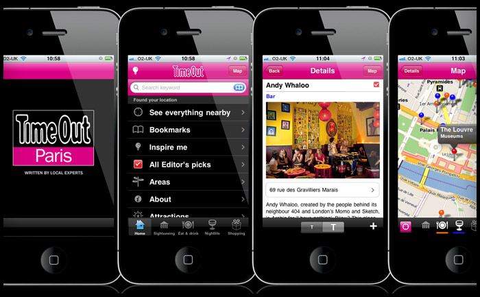
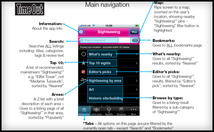
I’ve been checking the reviews for the Time Out Travel Guide apps I worked on last year. It’s good to think of someone using a product you’ve designed and even better that it’s helping them have a good holiday. Dubrovnik, London, New York, Paris, & Zagreb
iTunes reviews
Berlin – Take full advantage
This is a great app and successfully navigated us to some top spots in Berlin over Easter. Currently free, which is an absolute gift – take full advantage. By Sazzle_81
Paris – Discovered a new Paris
I have been to Paris hundreds of times and have even lived there, but I discovered a completely new side to it this weekend through this app. We followed the editor’s picks and used the what’s nearby part of the app and we had the best weekend ever! Next time I will plan more and use the bookmarks to organise each day. No Improvements necessary. By Dysynni
Berlin – Absolutely essential
We used this app around 10 times a day instead of getting charged for data raoming and it was brilliant. I would have paid for this so can’t believe it’s free. If you’re travelling to Berlin, why haven’t you downloaded it already!!! By Tom Hughes
Barcelona – Absolutley indispensible…
Almost flawless in execution, this app is all you need if you turn up to Barcelona without a guide book or any clue what to do.We spent 6 days there and filled them with things we found on here. The user interface is superb, the ability to bookmark and then view on the map was genius, and all without using any data allowance.
Only occasionally was the GPS slightly off and one or two places weren’t quite where the map thought they were, but overall it’s the best and most useful city guide app that I’ve ever used. By Doug Bryson
New York – Amazing
It made my trip to New York much easier when wandering around. Offline map, great restaurant recommendations, nice photos. I am totally getting the London and Paris guides. Please make a Lisbon one. By syt8
Deli Gourmet logo
Player icon design for..
Based on existing illustration work from the excellent Rehab for the Best of 2010 site, this icon will be the new face of a desktop player app. I took the more anatomical heart drawing and simplified it, then added the woofer and tweeters for play-your-music-love-metaphor-iconess.
www.bookswithbite.co.uk new logo
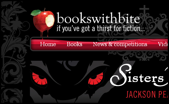
When I first designed the Books With Bite site Hachette didn’t have a logo ready, so I quickly mocked one up (below) and they were happy to keep it. Now the in-house team have a new logo, made from one of the cover illustrations and the house fonts Goudy Old Style and some other funky distressed font called “Beach”. The new logo fits the site really well and still has dripping blood to fill the “glass vial” nav panel, though I think my treatment was more sublte ; )
