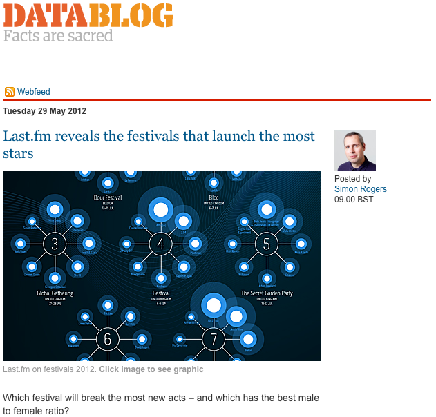
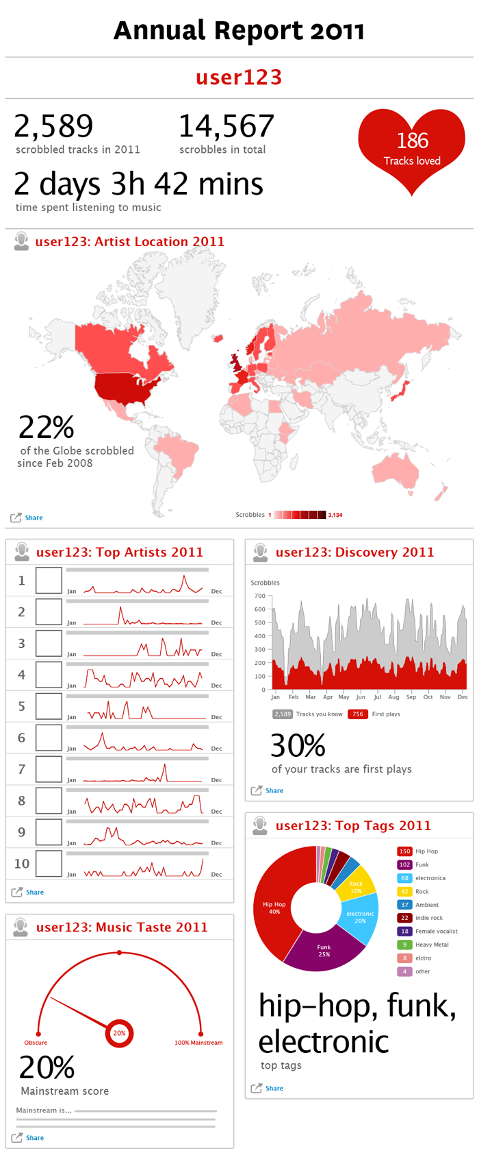
A nice post from Simon Rogers on the Festivals data visualisation I created with @Omar711. He rightly points out that Last’fm’s data scientists are also pretty good at visualisations, a refernce to Omar’s excellent “Day in music” visualisation which he designed.
Blog
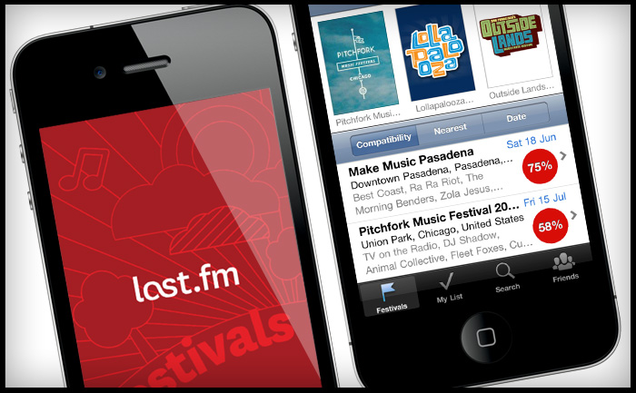
Last.fm Festivals app wins 2012 Mobile WebAward
The Last.fm Festivals app I worked on with @c99Koder and @y0b1tch has won the 2012 Mobile WebAward from the Web Marketing Association. You can download the app on iTunes here.
Radio hack day – sketches
Radio hack day
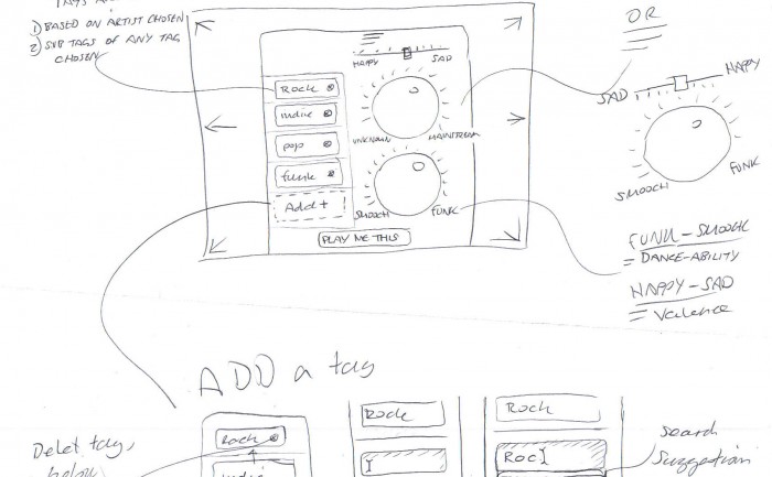
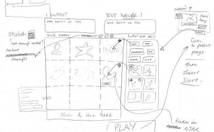
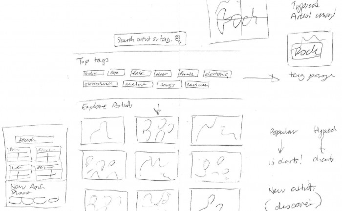
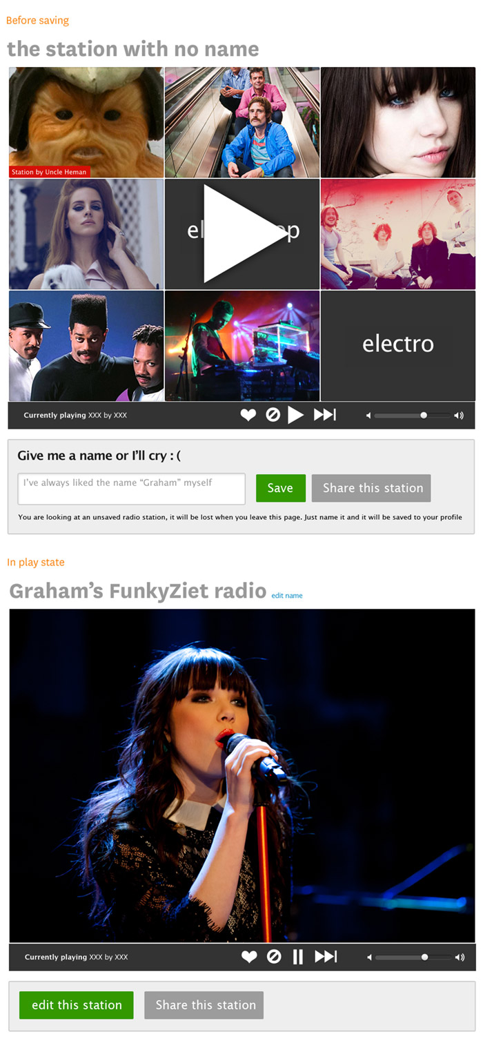
We had a hack day at Last.fm to develop ideas for better web radio products. I got together with @tdhooper @marekventur to design an interface for creating customised radio stations.
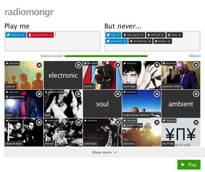
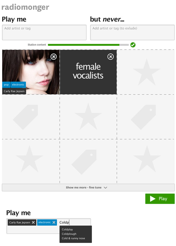
The interface consisted of two input boxes, one to put in what you wanted to play using a mix of tags, artists, and user profiles, and one that would exclude things you don’t like (e.g. Coldplay, Adele and “industrial house” in my case!). To get a flavour of the music the station would play, we added a quilt of artists and tags, that you could fine tune by deleting tiles from the quilt. Once you were happy, you could then play, save or share the station.
We called it “Radiomongr”. Unfortunately the prototype isn’t available for public viewing, but hopefully it can be used as a model for a releasable product at some point.
User interface design
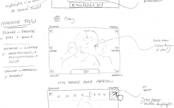
Play state
Music brands (plus a couple that are not)
I’ve been collecting a board of brands, mostly around music. There’s a definite resurgence of the graphic logo rather than a logotype alone, which makes practical sense when it comes to designing a small graphic for an app icon (like the fin of Grooveshark, or the cloud of Soundcloud). Aweditorium got around this by emphasising “AWE” on their icon. You’re onto a winner if you can claim a single letter – and happne to be a dominant social network: “f”, “p”, “t”,”v”, and “w” are gone now of course ; )
I’m impressed by the stand-out of Pinterest’s cursive “p”, Beats Aduio circle, and the clarity of thisismyjam.com branding.
As well as researching music brands, I also find it’s good to have a set of brands to study and admire just because they’re cool.
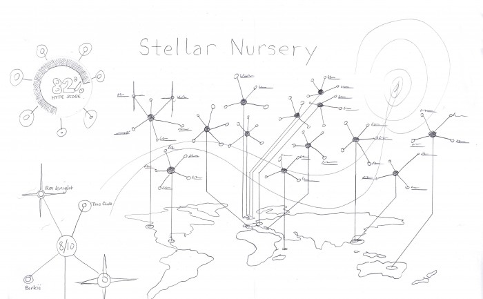
Last.fm Festivals “Brightest stars of 2012” infographic
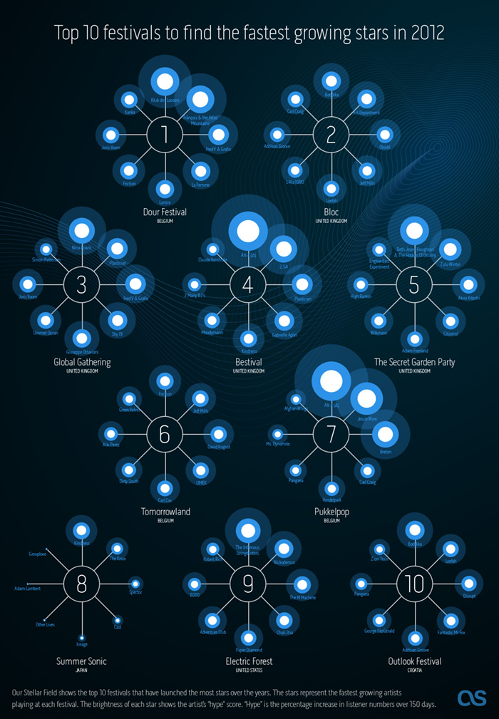
Last.fm can already recommend the most compatible festivals based on your current music taste, but what about discovering new music? We decided to use a bit of 10% time* to see if Last.fm listening data could be used to recommend the best festivals for seeing the future stars of summer 2012.
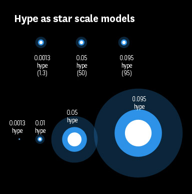
@Omar711, Last.fm’s data scientist, started by looking at new artists playing in festivals this summer to see which have a high “hype score”. Hype is our measurement of how fast an artist’s audience is growing over a short period of time. Then Omar looked at historical data for all festivals over the last few years to see how many artists had become successful (i.e. grew in audience) directly following the festival. This gave us a ranking of how influencial festivals were in growing new artists. We pulled out the top 10 for our infographic, and then highligthed the artists with the most hype.
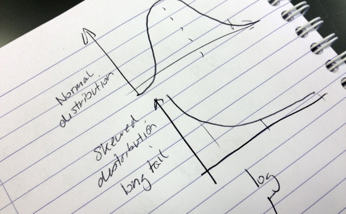
As we tend to call artists that have big audiences “stars” I thought I would use stars in my infographic (I find these dazzling leaps of lateral thinking exhausting). The hype scores would be represented as the brightness of the star. However, when I tried to convert the hype scores into percentages to scale the circles in my infographic, some were massive and other came out microscopic. So I called Omar over and he said “ah yes, skewed distrubution. Just use log or square root”.
Eh?
It must be strange for Omar to be working so closely with an idiot. A short math lesson later and I had a nice range of percentages to play with (and I felt a bit smarter, almost ready for my own PHD ;).
* staffers are given 10% of their time to work on self-driven projects, providing the work is related to music data (I have been told off for spending too much time working on a diorama of Jabba’s palace for my Star Wars figures)
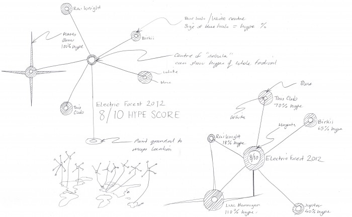
Last.fm Festivals “Brightest stars of 2012″ infographic – sketches
First print advert in 12 years!
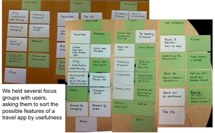
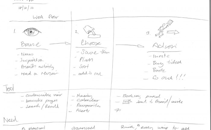
Time Out City Guide iOS mobile apps – card sorting exercise
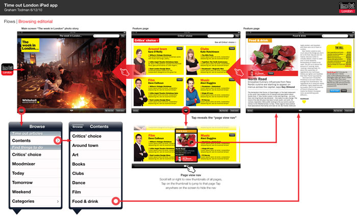
Time Out City Guide iOS mobile apps – user flows
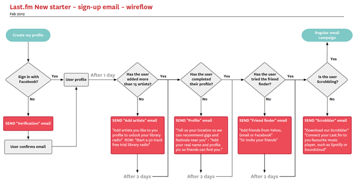
New starter email campaign user flow
This is a quick user flow to sketch out an email stratergy for communication with new starters, offering prompts to fill profiles, engage with the service, or hints and tips as a response to (or lack of) user activity.
The flow chart was done in Omnigrafle, with which I have a love/hate relationship. I think the auto alignment features are incredible, but as a designer it feels a bit like backseat driving.
Last.fm “About us” illustrations
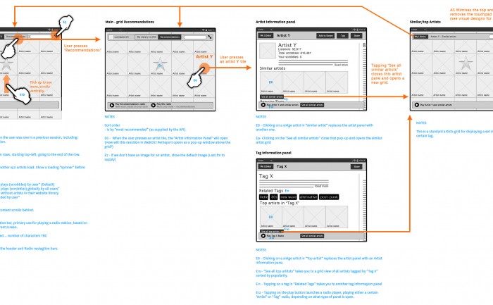
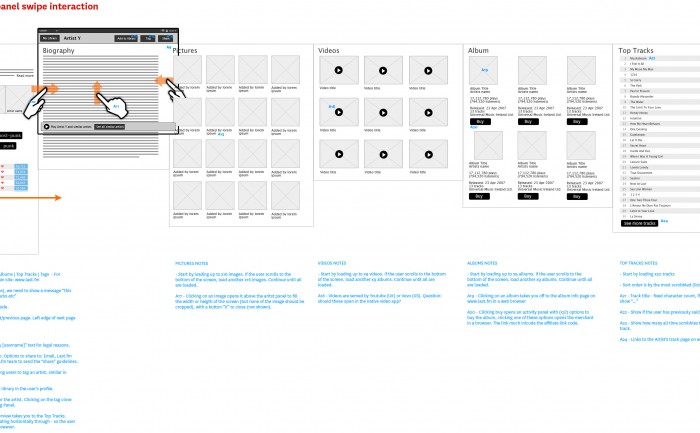
Last.fm tablet music discovery app concept sketches
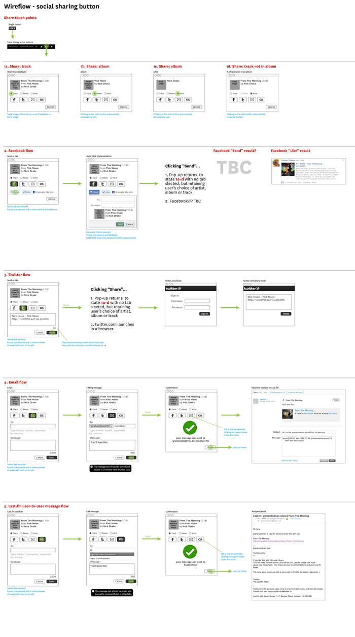
Social share UI wireframe
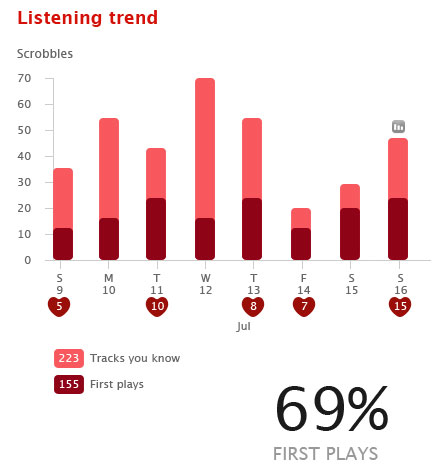
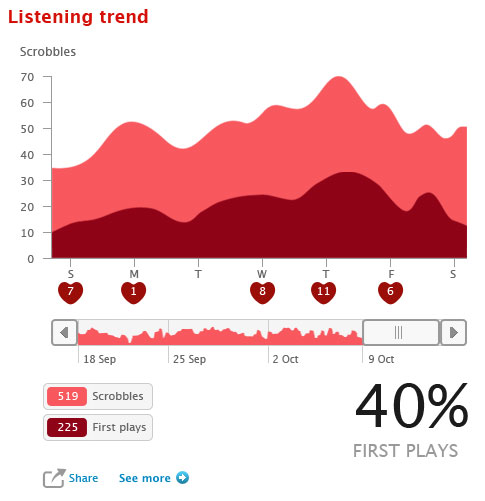
Last.fm charts concept wireframes
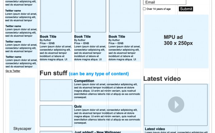
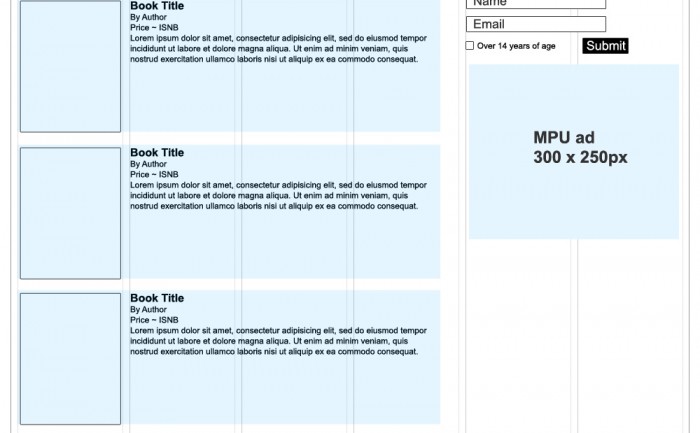
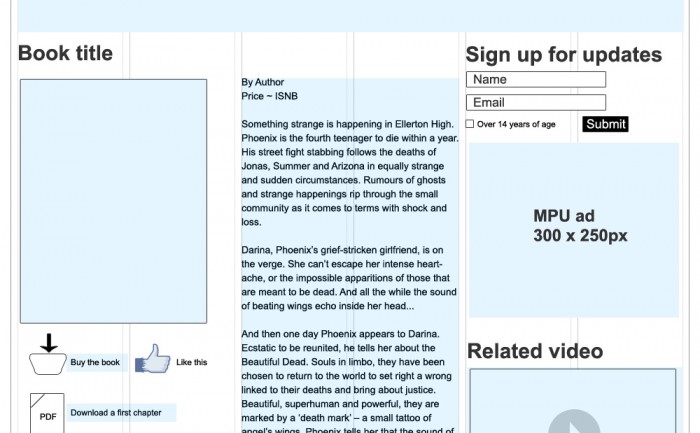
Books With Bite wireframes
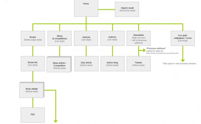
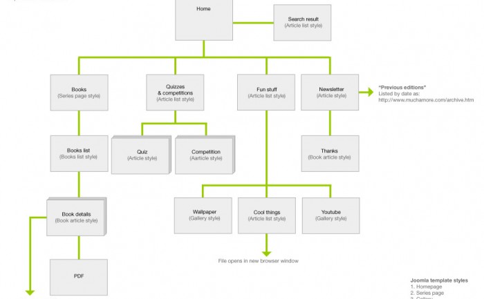
Books With Bite site map
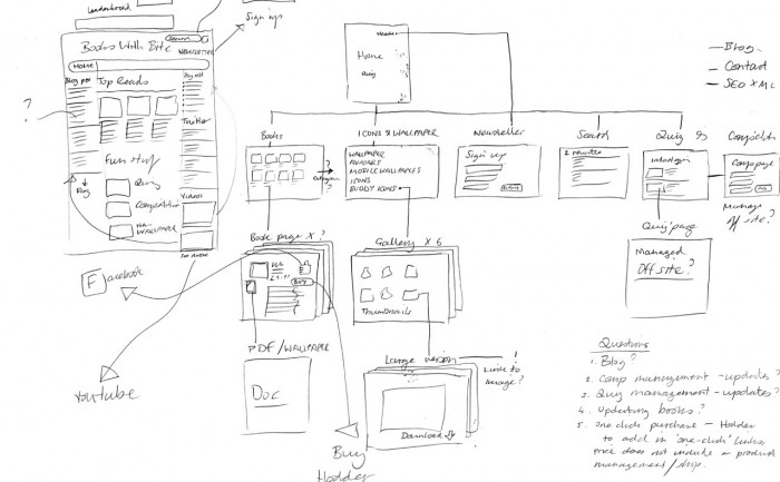
Books With Bite skteches
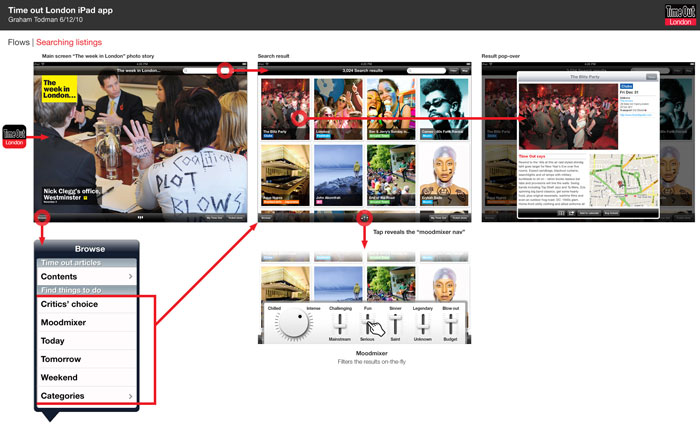
iPad app concepts for Time Out
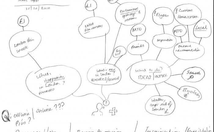
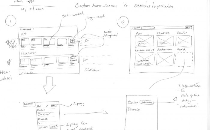
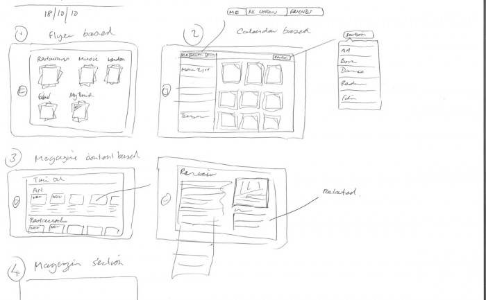
iPad app concept sketches for Time Out
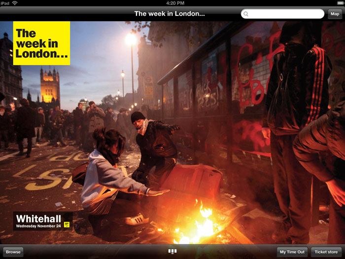
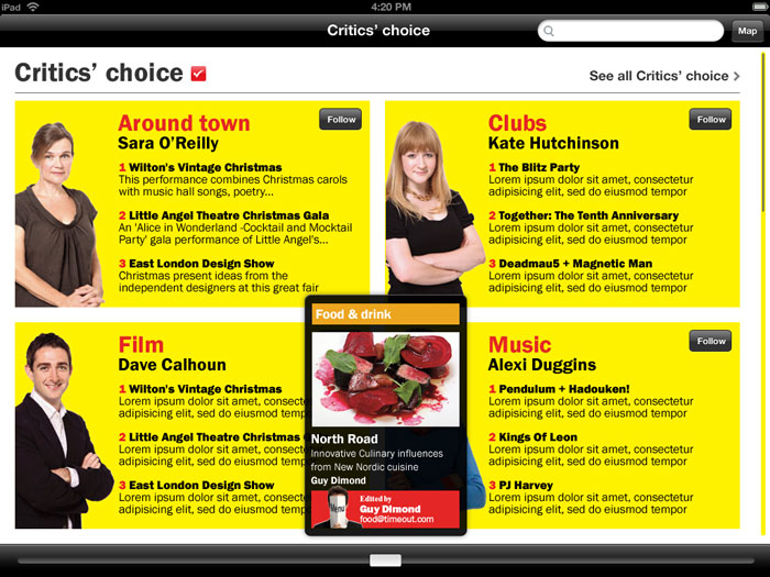
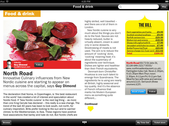
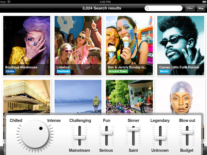
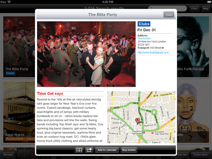
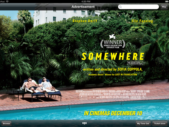
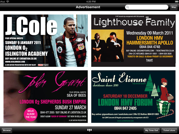
In my last few months at Time Out I was asked to create some concepts for a Time Out London iPad app. The designs were intended as a discussion point for possible commercial opportunities such as advertising and paid-for content, but also to have something visual to get excited about.
Time Out are the best known for providing “What’s on” information for London to help people find something to do, but they also have strong editorial content on life in London, such as: opinion pieces, cultural commentary and reviews.
The brief I was given for this app concept was that it should feel like a magazine, but have a prominent search facility, however as started mapping out the use cases (below) I quickly came to the conclusion to that there should be a browsable magazine style app (this was a whole year before Newstand and Adobe’s iOS publishing tools), and a separate productivity app for finding things to do. In general, apps are best when they are focused on one purpose or solving one user goal, which makes for a simpler UI. For me, the use case of a productivity tool and a sit back and browse a magazine felt somewhat at odds with each other.
GUI elements
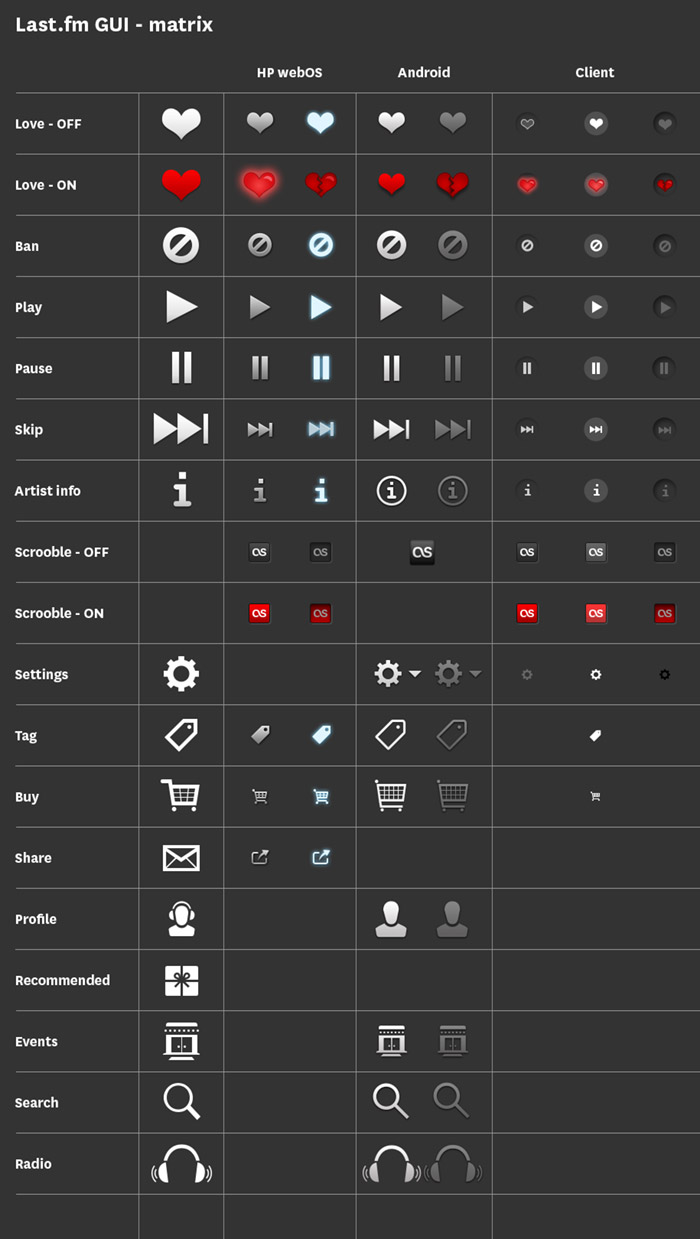
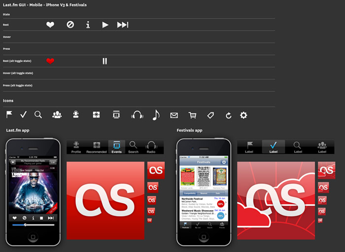
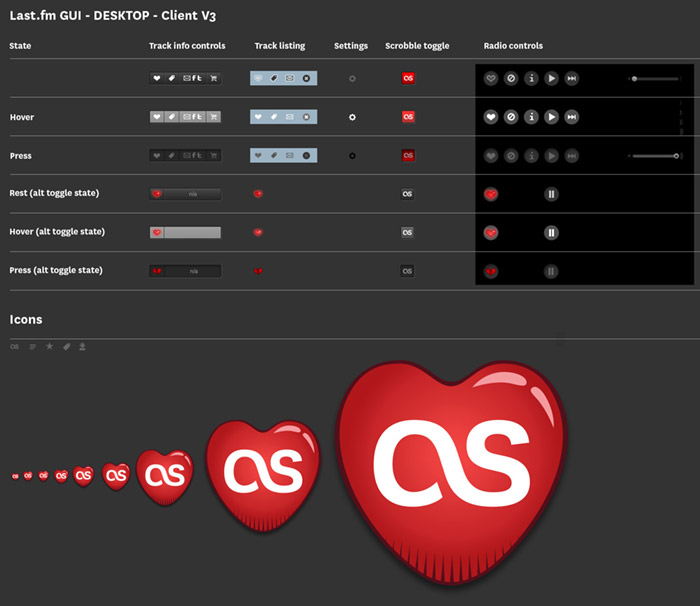
For services that work across multiple platforms it’s important to keep a consistent style across UI elements. Various platforms and operating systems have their own native UI elements, but you can still add brand characteristics. At the end of each project I put together a grid of all the UI elements, as a quick reference for any future project. There is also a master UI matrix comparing elements across platforms, i.e. how does a play icon look on iOS compared to Android, and can it still reflect the brand?
iOS GUI schema
Desktop version schema
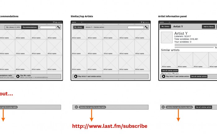
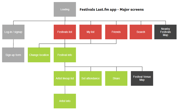
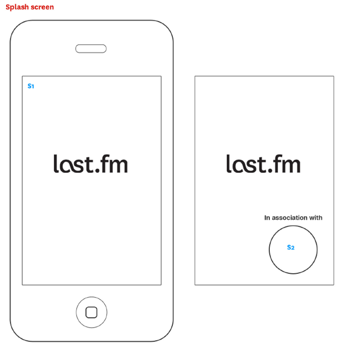
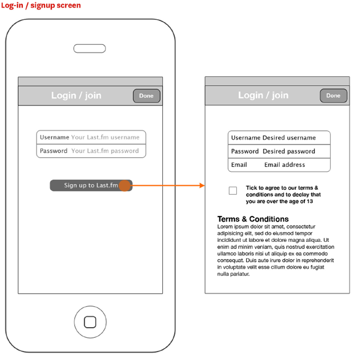
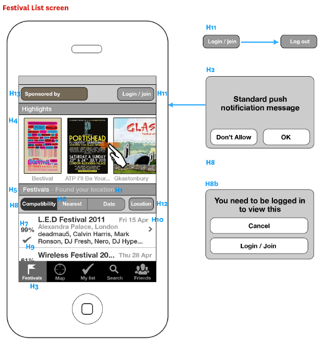
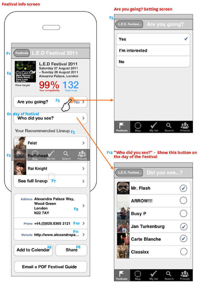
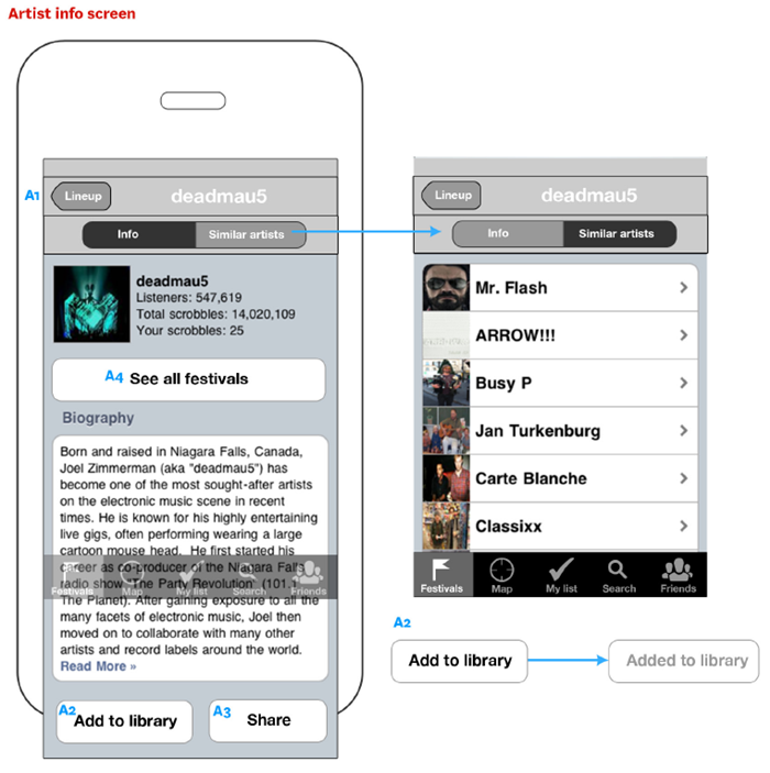
Last.fm Festivals app – wireframes
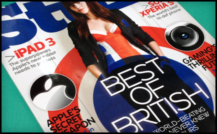
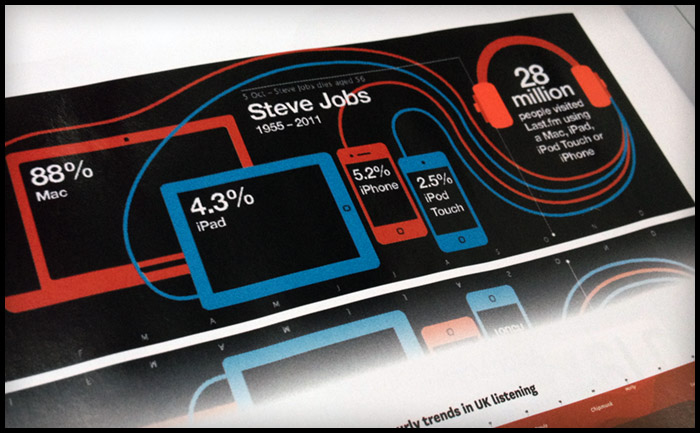
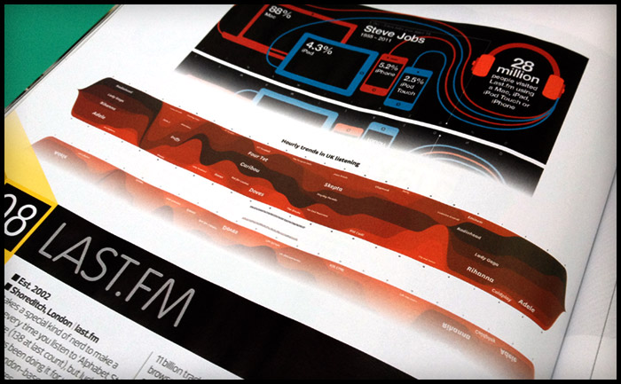
Last.fm infographic in Stuff magazine
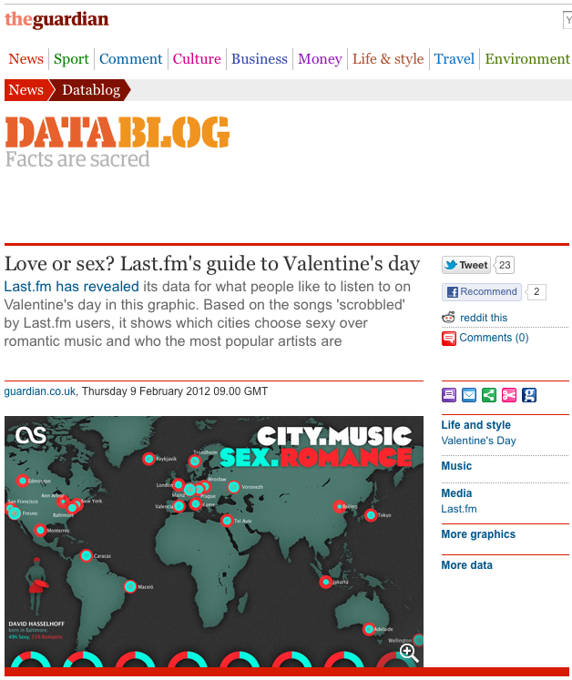
Last.fm Valentines infographic posted on the Guardian Datablog
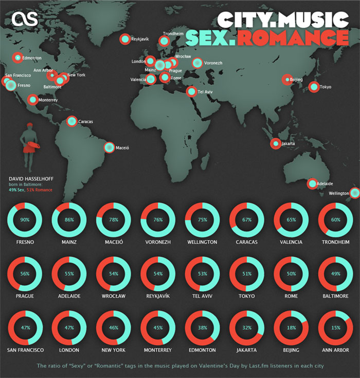
Valentine’s Day Infographic on last.fm
“We don’t have the time for psychological romance”
– Larry Blackmon, Cameo
As my missus will testify, I’m not very romantic and greetings cards make me nauseous. So I wasn’t looking forward to designing a feature for Valentine’s Day.
Then I realised it might be interesting to use music data to see if anyone else felt the same or if Valentine’s day was full of hopeless romantics playing “Somebody To Love” by Jefferson Airplane back-to-back like saps.
So I went to see Omar…
Omar the Oracle
I don’t pretend to understand what Omar does, I like to think his job involves “running things through the computer”. He is always very patient with me, even when I ask him silly questions like: “Do you think David Hasselhoff’s audience was affected by the drunken cheeseburger + floor-as-plate incident?” (it did, the Hoff gained an extra 400 scrobbles that week). Omar was more than happy to dig into the Valentine’s Day stats, especially when I said I wanted to compare the music tags “romantic” with “sex”. I’m always running the word “sex” through the computer and it never takes long.
To get a clean set of Valentine’s data to analyse, Omar compared the listening behaviour on 14 Feb over a number of years to the behaviour on any other day of the year, normalised it to remove erroneous “new release” spikes, thereby sifting out the tracks unique to Valentine’s Day. Then we went to work with the location and genre tags.
This gave us a list of cities ranked from Sexy to Romantic and the proportion of sexiness for each.
Looks like I need to head to Fresno on 14 Feb!
