July 2014 EDIT: Android’s “L” design guidelines now supply templates in Adobe Illustrator, making it even harder for designers user to Photoshop or Fireworks. They don’t provide an answer for how you should crop and optimise your assets for the developer (I assume they’d rather you didn’t and just use their native stuff).
See www.google.com/design/
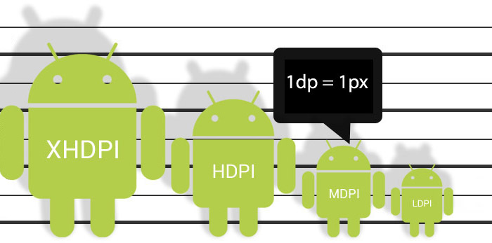
July 2014 EDIT: On consideration of comments from NexogenDev, I have removed the more explicit reference to 72dpi in the graphic above to “1dp = 1px” as this is a more literal starting point and probably better. My point was that Android supplied templates and assets tend to open by default in Photoshop as 72dpi, but dpi in general is misleading in this context.

I found it hard to know where to start designing for Android in Photoshop.
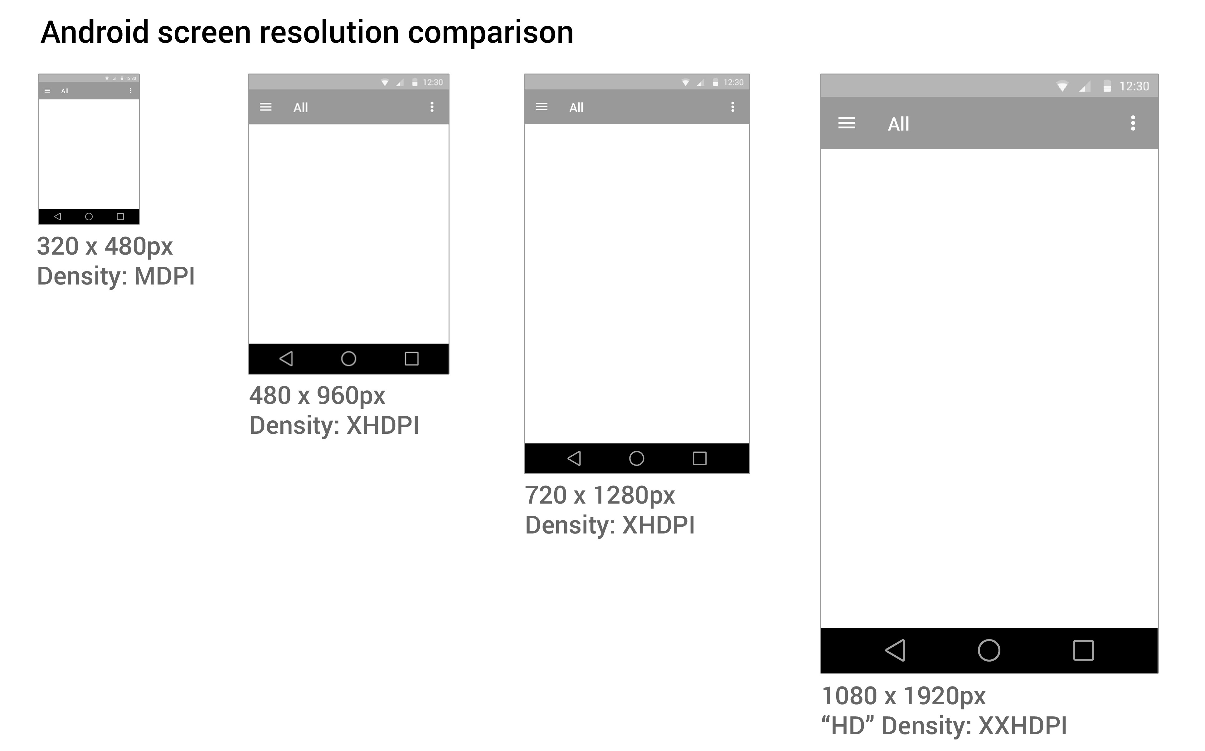
Google tries to help by providing extensive Android user Interface Design Guidelines. There are many devices running Android that have different screen sizes and shapes. There are also different screen densities, which means the quality of the definition of the screen or how many pixels fit in the same sized area on the screen – e.g. medium screen density has 160 pixels in every inch on the device’s screen, whereas an extra high density screen has twice as many, 320 pixels, crammed in an inch. To cover the different densities you need to supply graphics and icons at various densities.
Creating a design that will work for all these devices can be daunting. You also need to create different density icons and graphics.
1. Minimum handsetscreen size
I started with a minimum mobile handset size screen first. Starting with the smallest and most limited screen size first makes sure your content and UI will fit, removing any features that aren’t completely necessary to the core purpose of the app. Then you can work out how your app will behave on larger and tablet sized screens. You need to decided if your app is going to stretch to fit larger screens, or if you’re going to have a completely different layout and design for tablet sized screens.
2. Photoshop image size
I choose to start with a small mobile handset and a small 7″ tablet screen as a base for design and then think of how that could scale elagantly. You may need to create portrait and landscape versions if you plan on allowing users to change orientation.
Here are some Photoshop templates
3. Download Android design templates
If you are new to designing for Android, and are confused by dpi, I STRONGLY RECOMMEND you use native Android styling and assets, rather than doing a completely custom design at first.
See www.google.com/design/
It is important to keep the icons at the same proportion to maintain the correct “hit” area for the user’s finger.
4. Scale down
It’s easier to work at the higher pixel density, XXHDPI. It is always advisable to create icon art as vectors in “Smart Objects, or as “shapes” in Photoshop so they can be scaled up or down without loosing quality.
The benefit of working at XXHDPI is that you can be sure you are not loosing any quality.
XXHDPI – 300% – x3.o
XHDPI – 200% – x2.o
HDPI – 150% – x1.5
MDPI – 100% – x1.0
LDPI – 75% (don’t bother with this!) – 0.75
When using vectors, you may want to adjust your line art to tighten up any half pixels or it can look blurry at the edges (if you’re a perfectionist like me).
5. Workflow
- Create you design PSD at XXHDPI
- Crop out your graphic assets and icons as separate PSDs
- Scale them down to the various densities: XHDPI, HDPI, MDPI
My method is to design one PSD, crop out the icons assets as PSDs, then scale them to the different densities. I often start with a PSD at XXHDPI or MDPI (providing my artwork is vector and can be scaled up or down), then I crop out the icons and assets out, then resize them.
The reason this is easier is that when you need to make design changes, you don’t have to change multiple PSDs.
What the frakk is a DP?
Here’s what I discovered after a few hours of scratching my head and moaning…
- “dp” is a magic, made-up measurement that only exists in the world of The Matrix & Tron.
- Android icons are 32dp x 32dp @ the medium density MDPI
- Android supply sample icons (Edit: they don’t any more the gits) and if you open an icon from the MDPI folder in Photoshop, the icon is 32px x 32px with “image size”.
- SO, in Photoshop:1dp = 1px @ MDPI – 100%
1dp = 1.5px @ HDPI – 150%
1dp = 2px @ XHDPI – 200%
1dp = 3px @ XXHDPI – 300%
1dp = 4px @ XXXHDPI – 400%
- It doesn’t matter what DPI you have set in PHOTOSHOP, it’s the canvas size (the number of pixels available) that counts.
If you have a better way of getting started designing in Android, or if I’ve made an errors, please let me know.
Here are some Photoshop templates at MDPI and HDPI to give you an idea.
Please see my new guide: How to design for new iPhone 6 Plus resolutions in Photoshop