The plan for the new charts page was to make it more dynamic by including location and tag/genre filtering. In addition to this we were considering intergrating personal user listening charts. Although user charts were for a later iteration, this wireframe needed to workout the overall IA to prepare for the later development work.
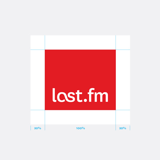
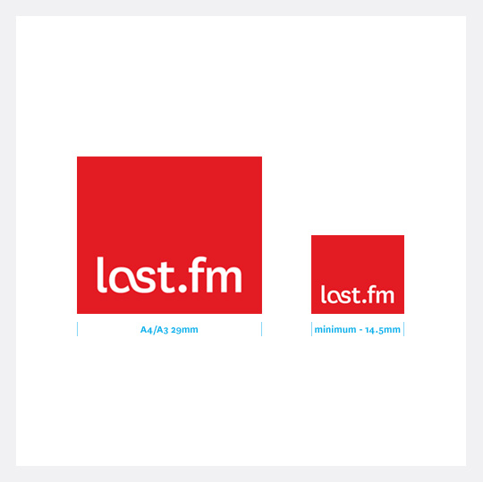
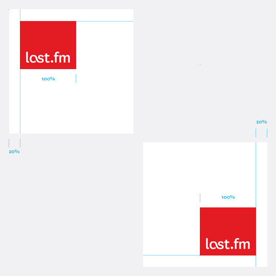
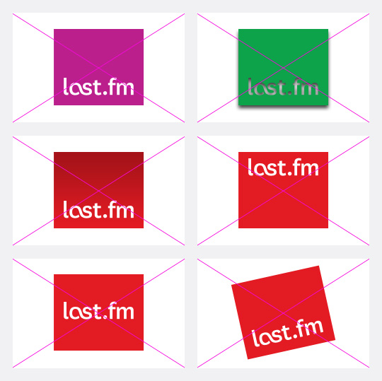
I’ve been updating the Last.fm brand guidelines site to include the new “refined logo”. The site is not open to the public, so here are a few logo usage illustrations from the site.
Last.fm logo exclusion areaLFM_Ticket_sizeLast.fm logo sizesLFM_Ticket_sizeLast.fm logo placementLFM_Ticket_sizeLast.fm logo – inproper usage
Sketches for the “logged out” homepage of Last.fm. The purpose of the page is: to introduce the service, encourgae signup, and offer a taster of the content. In these initial sketches I was exploring the idea of focusing the page on the different use cases: listening to radio, scrobbling listening history, and music recommendations.
Smart playlists created for your mood and favourite genres
Artist galleries and listening stats
Scrobble* music to your Last.fm profile
See who’s on tour
*scrobble: skrob·bul (ˈskrɒbəll) [verb]
To automatically add the tracks you play to your Last.fm profile with a piece of software called a Scrobbler
If I’m not scrobbling the music I hear, it doesn’t count!
To mark the 10th anniversary of scrobbling, my colleague @stefansperber and I created this infographic showing how the top music genres have changed over the last 10 years. Stefan ran the data queries and produced vectors for the stream graph, I did the final infographic.
My dear colleague @dawhiting had the idea of looking at the scrobble graphs for the top 10 Christmas songs leading up to the 24th Dec. Over the last few years there has been a consistent spike. I did a bit of “pretty” work and now we have this year’s Christmas card design.
The Audioscrobbler software is 10 years old and Last.fm is celebrating this revolutionary innovation.
The logo takes elements from exisiting branding assets.
Sketch
scrobble: skrob·bul (ˈskrɒbəll) [verb]
To automatically add the tracks you play to your Last.fm profile with a piece of software called a Scrobbler
If I’m not scrobbling the music I hear, it doesn’t count!
Following the iOS design principle of “do one thing really well” we decided to spilt the Last.fm service into three distinct apps which serve clearly different use: radio streaming, exploring and scrobbling your music collection, and finding events to see. This meant coming up with a family of icons that were different enough to be distinct, yet belonged together and clearly reflected the brand.
The solution was inspired in part by the style of exisiting brand illustrations, but simplified and using geometric shapes. Each icon has a loose concept:
Radio: (Obvious!) is personal radio, so radiating waves… no brainer. Scrobbler: The Scrobbler enhances your local music collection with Last.fm UGC tagging data and creates automated personal playlists. The icon shows inverted triangles, representing focusing lots of music down to the point of the tracks you really want to listen to. Events: The icon shows a horizon with points radiating out, representing the points of a globe where you can see your music live.
When designing an appdesigners take great care over the UI and the fine details. Apple provide a lot of built-in UI styling in the SDK for developers to produce apps of a consistent quality. However, when Apple create their own apps they add an extra layer of detail and finish that is not supplied in the SDK, this extra quality is hard to achieve out-of-the-box.
Designers are fussy by trade, and communicating this obsessive level of detail via email or Skype to a remote developer can be challenging. I have great sympathies for developers, espcially when I find myslf sending them the following documents with design revisions… 😉
Kevin was as keen as me to get this right, so I hope doesn’t he hate me too much 😉
I’ve been working with our MIR team (Music Information Retrieval) on the new instant playlisting engine, designed to provide instant playlists from collections of any size.
The guys have created a playlisting demo which you can try out against your Last.fm profile. Please ty it out give us your feedback. You can also read Mark Levy’s background to the technology on the Last.fm blog.
My part in this has been to think about the user experience and ensure that the catagories we choose to create fit with the natural expectation and behaviors that people use when making their own playlists. This engine will form part of a new iOS product I’m designing for Last.fm.
Last.fm Festivals app won a 2012 W3 Silver Award for the Music & Audio Mobile App category and a 2012 Mobile WebAward from the Web Marketing Association. You can download the app on iTunes here.
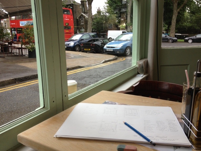
Here are some sketches on an iOS app I’m currently working on, laying out possible ways to interact with your local music collection using listening data.
This first sketch was a quick pass of how to lay the app out using floating frames, before I moved onto simpler and more interesting interactions.
Continued from my previous post, my data team colleague Mark Levy has adjusted the mood chart to only show the percentage of moods in total music listening per week, removing the scaling that showed how much music a user was listening too. This makes it easier to see the variance in mood.
Helping out @marekventur style up his Last.fm plug in for Chrome. It’s a 10% project (* staffers are given 10% of their time to work on self-driven projects, providing the work is related to music data (I have been told off for spending too much time working on a diorama of Jabba’s palace for my Star Wars figures)
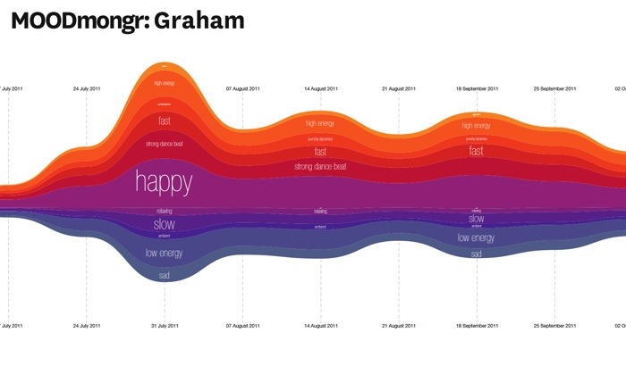
Sketch for an idea for a hack day at Last.fm. The theme is “user profiles”. I’m working on a project with Mark Levy, who leads the Music Information Retrieval team, to chart the mood of a user’s listening over time using new audio analysis tagging. We will be testing it on the team first!
I call it MOODmongr
The results
In general, the moods were pretty even across the year’s listening of my test group; my team mates. This was largely due to the fact that we all have varied music tastes and use radio steams and playlists for variety. However there were a few spikes and points of interest:
We had a hack day at Last.fm to develop ideas for better web radio products. I got together with @tdhooper@marekventur to design an interface for creating customised radio stations.
The interface consisted of two input boxes, one to put in what you wanted to play using a mix of tags, artists, and user profiles, and one that would exclude things you don’t like (e.g. Coldplay, Adele and “industrial house” in my case!). To get a flavour of the music the station would play, we added a quilt of artists and tags, that you could fine tune by deleting tiles from the quilt. Once you were happy, you could then play, save or share the station.
We called it “Radiomongr”. Unfortunately the prototype isn’t available for public viewing, but hopefully it can be used as a model for a releasable product at some point.
Last.fm can already recommend the most compatible festivals based on your current music taste, but what about discovering new music? We decided to use a bit of 10% time* to see if Last.fm listening data could be used to recommend the best festivals for seeing the future stars of summer 2012.
@Omar711, Last.fm’s data scientist, started by looking at new artists playing in festivals this summer to see which have a high “hype score”. Hype is our measurement of how fast an artist’s audience is growing over a short period of time. Then Omar looked at historical data for all festivals over the last few years to see how many artists had become successful (i.e. grew in audience) directly following the festival. This gave us a ranking of how influencial festivals were in growing new artists. We pulled out the top 10 for our infographic, and then highligthed the artists with the most hype.
As we tend to call artists that have big audiences “stars” I thought I would use stars in my infographic (I find these dazzling leaps of lateral thinking exhausting). The hype scores would be represented as the brightness of the star. However, when I tried to convert the hype scores into percentages to scale the circles in my infographic, some were massive and other came out microscopic. So I called Omar over and he said “ah yes, skewed distrubution. Just use log or square root”.
Eh?
It must be strange for Omar to be working so closely with an idiot. A short math lesson later and I had a nice range of percentages to play with (and I felt a bit smarter, almost ready for my own PHD ;).
The difference between normal and skewed distribution.Last.fm festivals infographic "star" scale
* staffers are given 10% of their time to work on self-driven projects, providing the work is related to music data (I have been told off for spending too much time working on a diorama of Jabba’s palace for my Star Wars figures)
My initial idea for the infographic was based around a map, however when the data was ready it turned out the festivals at the top of the list were mostly in the UK and Belgium.